16 min read
The Zeigarnik Effect: Why Unfinished Courses Pull Harder

A waiter who forgot the bill the moment it was paid
The story usually told about this effect starts in a Vienna cafe in the 1920s, with a waiter who carried a long list of unpaid orders in his head without writing anything down. The moment the bills were settled, he could no longer recall what any table had ordered. The open orders stayed sharp. The closed ones vanished almost instantly.
That observation is generally credited to Kurt Lewin. Bluma Zeigarnik, a psychologist working with Lewin’s group in Berlin, is the one who turned it into an actual study. She gave people a series of small tasks, letting them finish some and interrupting others partway through, then asked them afterward to recall what they had worked on.
People remembered the interrupted, unfinished tasks noticeably better than the ones they had completed. This became known as the Zeigarnik effect, and it has been quoted in psychology classrooms and marketing decks ever since.
We build course and community software for a living, and this effect shows up constantly in the products we build and the platforms our customers run. A progress bar stuck at sixty percent pulls at a learner in a way a blank course listing never does. A half-written forum reply nags at someone in a way an empty compose box does not. The pull is real. It is also easy to misuse, and this post is about using it honestly.
What the Zeigarnik effect actually shows, and what it does not prove
Before applying anything, it is worth being straight about the evidence. Zeigarnik’s original studies are a century old, run on small samples, in conditions that do not map cleanly onto a modern web app.
Later attempts to replicate the effect have produced mixed results: sometimes the recall advantage for unfinished tasks shows up clearly, sometimes it is weak, and sometimes it depends heavily on how “interruption” and “completion” are defined in the experiment.
That mixed replication record does not mean the idea is useless. It means we should treat it the way working designers treat most cognitive-effect research: as a reliable intuition about attention and memory, not as a precise law with a fixed size or a percentage you can plug into a spreadsheet.
The core claim, that an open task tends to occupy attention more than a closed one, holds up well enough as a design heuristic even where the strict memory-recall version of the experiment is contested.
We already wrote about the companion side of this in our piece on the forgetting curve, which is about how quickly learners lose material after a lesson ends. That post and this one describe two ends of the same problem.
The forgetting curve says finishing a lesson does not mean the material stuck. The Zeigarnik effect says finishing a course is also the point where the pull that kept a learner coming back switches off.
Put those together and the practical lesson is not “keep things unfinished forever.” It is “understand exactly when tension is doing useful work for the learner, and when it is just noise you added because it felt like engagement.”
The progress bar is the open loop made visible
A progress bar is the clearest real-world instance of an open loop in software. It takes an abstract idea (some work remains) and turns it into a shape the eye tracks automatically: a bar that is not yet full. At sixty percent, the bar is a visible, specific, small unfinished task. That is the pull the Zeigarnik effect describes, rendered as a UI element.
This is why a course dashboard with visible per-course progress tends to bring learners back more reliably than a flat list of course titles with no state attached. The list is neutral.
The bar is an open loop sitting in front of the learner every time they see the dashboard, and closing it is a small, concrete, achievable act rather than a vague intention to “get back to learning.”
It also explains something that surprises a lot of course teams the first time they see it in their own data: completion often ends engagement rather than deepening it.
Once the bar hits one hundred percent, the tension the bar represented is resolved. The learner’s brain has closed the loop. There is no longer a specific, visible reason to return to that course, which is exactly why the next section of this post matters as much as the progress bar itself.
- A visible, per-item progress bar is doing real cognitive work, not just decoration.
- The bar’s pull comes from being unfinished and specific, not from being attractive.
- Completion resolves the pull. Plan for what happens the moment it does.
Zero percent is worse than no bar at all
Here is the part that trips up a lot of course platforms, including early versions of tools we have built ourselves. A bar sitting at zero percent is not a mild version of the pull described above. It communicates something closer to the opposite: “you have not started this,” which reads to most people as a fresh obligation rather than an open loop worth resuming.
An open loop, in the Zeigarnik sense, requires something to already be in motion. Zero percent has nothing in motion. There is no partial order for the waiter to remember, because nothing was ordered yet.
A zero-percent bar next to ten other zero-percent bars on a dashboard just reads as a list of debts, and a list of debts is something people avoid looking at, not something they feel pulled toward.
The fix is a design pattern researchers call endowed progress: give the learner a small amount of completed progress before they have done any of the substantive work, so the very first thing they see is a bar that is already slightly full.
An account created, a learning goal selected, or a two-minute preview of lesson one can all count as the first “step,” provided it is marked complete on the bar the learner actually sees.
| Onboarding action | Counted as | Effect on the bar |
|---|---|---|
| Account created | Step 1 of 8 | Bar opens at 12 percent, not 0 |
| Learning goal chosen | Step 2 of 8 | Bar moves to 25 percent before any lesson content |
| First lesson previewed | Step 3 of 8 | Bar crosses 35 percent, learner is “resuming” by lesson two |
None of this is dishonest as long as the steps are real and disclosed. The learner did create an account and did choose a goal. Endowed progress is not fake progress, it is progress that was previously invisible made visible, so the bar reflects work already done instead of starting the count at the first “real” lesson.
This connects directly to a mistake we cover in our piece on cognitive load and onboarding: a beginner’s first minutes should never ask for more thinking than the value they have received so far justifies.
Endowed progress solves two problems at once. It reduces the felt weight of a long course, and it turns the very first screen a learner sees into an open loop instead of a blank obligation.
What each progress state actually signals
The same bar means very different things at different fill levels, and the difference is not linear. It is worth being explicit about it, because “add a progress bar” is not a single decision.
| What the learner sees | What it signals | What it does to motivation |
|---|---|---|
| No progress indicator at all | State is unknown; the course is a flat, undifferentiated item on a list | Neutral. Nothing pulls, nothing pushes away. Resuming takes a deliberate act of memory |
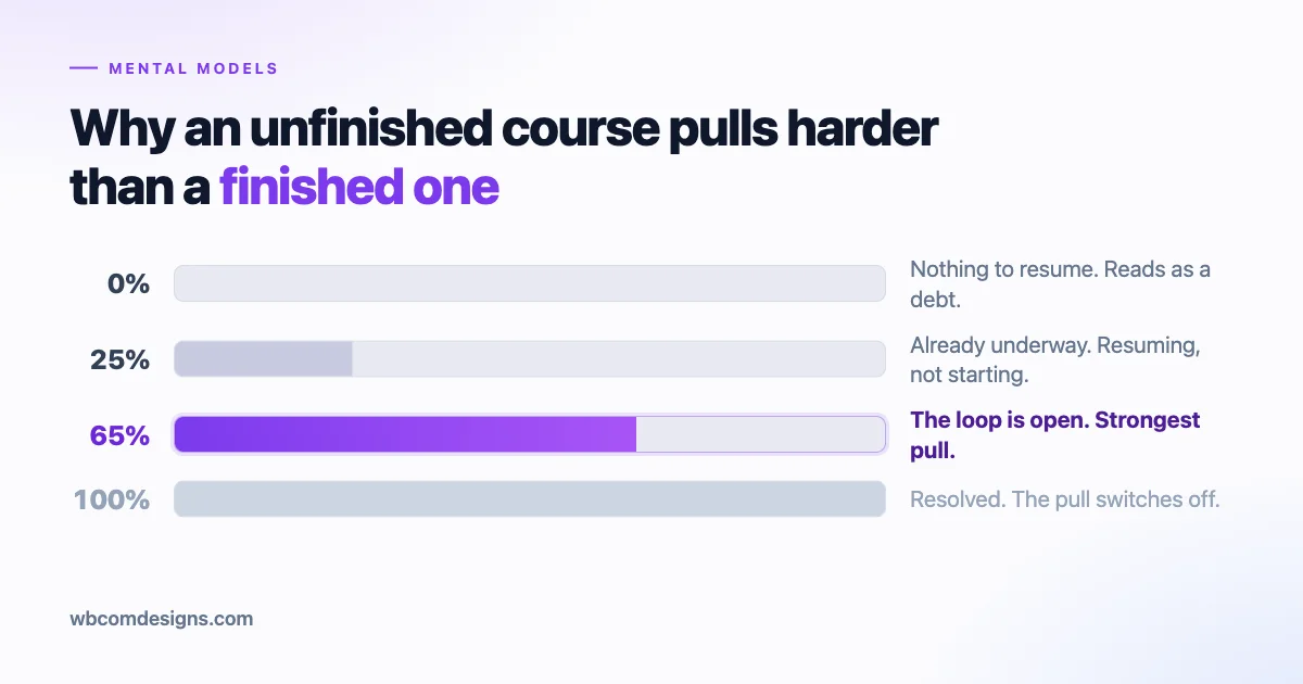
| 0 percent | “You have not started.” A fresh obligation rather than unfinished work | Mildly negative. Reads as a debt, especially when stacked next to other zeroes |
| A small non-zero start (endowed progress) | “You are already underway.” Something is in motion and can be resumed | Positive. Converts beginning into continuing, which asks less willpower |
| Roughly 40 to 70 percent | Genuinely unfinished, with real work visibly behind and ahead | Strongest pull. This is the Zeigarnik zone, where the loop is most clearly open |
| 85 to 95 percent | “Nearly done.” The remaining gap is small and specific | Very strong, and the cheapest place to spend a nudge. The end is in sight |
| 100 percent | Resolved. The loop is closed | Pull switches off. Satisfaction, then most likely departure unless something else is offered |
The practical consequence of that last row is the whole reason completion screens deserve design attention, which we come back to below.
Where to leave a deliberate open loop
Once the mechanism is clear, placing an open loop deliberately is mostly a matter of ending things at the right moment rather than the tidy moment. A lesson that stops at a clean chapter break, with a summary and a “you are done” tone, closes the loop and lets attention move on. A lesson that stops mid-arc, right after a question is posed but before it is answered, leaves the loop open.
We are not suggesting cliffhangers for their own sake. The arc has to be real. If lesson four ends by posing the exact problem lesson five solves, stopping there is honest pacing, not a trick.
The learner knows precisely what is unresolved and precisely where to go to resolve it, which is the difference between a useful open loop and a cheap one.
Concretely, here is where that placement earns its keep across a course or community platform:
- Mid-lesson stopping points. End on the setup of a problem, not its resolution, whenever the content structure supports it honestly.
- “Continue where you left off.” A named, specific entry point on the dashboard, showing the exact lesson and even the exact timestamp or paragraph, beats a generic “resume learning” button.
- A partially filled profile. A community member who has added a name and photo but not a bio has a small, specific, low-effort loop left open, one that a nudge can close in under a minute.
- A draft reply saved but unsent. Autosaving an unfinished forum reply and surfacing it back to the author the next time they visit the thread respects an already-open loop instead of discarding it.
- A cohort discussion thread with one unread reply. Specific and small beats vague and large; “one new reply on your thread” pulls harder than “new activity in the community.”
In every case, the loop is doing the same job: making a real, already-in-progress piece of work visible and specific enough that resuming it takes less willpower than starting from nothing would.
Where an open loop is the wrong tool
Not every task benefits from staying open, and treating every screen like an opportunity for tension is how products end up feeling naggy instead of engaging. The test is whether the user experiences the task as something they are interested in or something they are obligated to do.
Interest responds well to open loops. Obligation does not; it just responds to being over with. A few categories where closing the loop fast, rather than dangling it, is the kinder and more effective design choice:
- Compliance training. Nobody wants a lingering, visible reminder that they still owe the company a safety module. Let them finish it and forget it existed.
- A required form. Tax details, shipping addresses, payment information. These are chores, and a progress bar on a chore just adds a second layer of dread on top of the first.
- Mandatory onboarding gates. If a learner cannot use the product at all until five setup steps are done, those steps are not an inviting open loop, they are a locked door. Shorten the door, do not decorate it.
- Account verification or security steps. Anything the user did not choose to start should be resolved as quickly as the system allows, not stretched out to “keep them engaged.”
The general rule: open loops work on things the person already wants to finish for their own reasons. Applied to things they are finishing only because the interface is making them, the exact same mechanism just reads as friction, and friction on a required task is where support tickets and refund requests come from.
The line between a useful open loop and a manipulative one
This is the part of the post where the honest version of this advice and the exploitative version start to look similar on a screenshot and very different in practice. Both use unfinished states. Both use progress indicators. The difference is what happens when the loop closes.
A useful loop points at something the person already wants, and helps them get back to it faster than they would have on their own. A manipulative loop manufactures incompleteness for its own sake, purely to keep a metric moving, with no real value waiting on the other side of it.
A short test that holds up across most of these cases: if the loop closed right now, would the person feel glad they finished, or would they feel like they were farmed for another few minutes of attention? Apply that test to the common patterns below.
| The loop | Useful or manipulative | Why |
|---|---|---|
| “Continue where you left off” on the dashboard | Useful | Points at real, already-started work the learner chose; closing it delivers the thing they were already doing |
| A lesson that ends mid-arc, on a real unresolved problem | Useful | The gap is honest content structure, not an artificial withholding of value that was ready to give |
| A profile-completeness meter engineered to never reach 100 | Manipulative | The unreachable ceiling exists purely to keep the bar visible; nothing real is behind the missing percentage |
| A streak counter that resets to zero and is shown publicly | Manipulative when paired with public shame | Punishes a missed day instead of rewarding a resumed one; the open loop becomes a threat, not an invitation |
| A certificate that needs one final real step (a project submission) | Useful | The step has genuine value to the learner and to anyone who later checks the credential |
Two of these deserve a further note. Fake progress bars, artificial multi-step gates inserted only to create more “steps” to feel busy through, and badge collections designed so one badge is always structurally out of reach are all the same move: manufacturing an open loop with nothing real behind it.
Once a learner notices the pattern, and most do eventually, trust in every other progress indicator in the product drops with it.
The other note is about permanence. A loop that can never close stops functioning as an open loop and starts functioning as a permanent low-grade irritant. The Zeigarnik pull depends on the possibility of resolution.
Remove that possibility, whether through a badge that can never be earned or a streak that punishes rather than rewards return, and the tension it produces turns into resentment rather than motivation.
Completion is a real ending, and it should be designed as one
Because finishing a task releases the tension that was holding attention, the moment a learner finishes a course is one of the more likely moments for them to leave the platform entirely. This is not a flaw in the learner. It is the direct, predictable consequence of the mechanism this whole post is about.
Treating course completion as a clean finish line, then, is a design mistake, not a neutral choice. The right response is not to fake more work into the finished course to keep it artificially open.
That is exactly the manipulative pattern described above, and learners notice when a “final module” appears out of nowhere right after they thought they were done.
The better response is to place the next open loop before the current one fully closes. Not a fabricated one bolted onto the same course, but a genuine next thing that was already going to be worth pointing at: the next course in a sequence, an invitation into a cohort discussion, a community thread where other graduates are comparing results, or a certificate that requires one more real, valuable step.
This is the same pattern we described in our piece on the Diderot effect, where owning one thing quietly creates the pull toward the next thing that matches it. A finished course is the “one thing.”
The job of the platform is to have a genuine “next thing” ready and visible at exactly the moment the first loop closes, not three weeks later in a re-engagement email that arrives after the attention has already moved elsewhere.
- Show the next course, the cohort, or the community thread on the completion screen itself, not in a follow-up email days later.
- If a certificate is involved, make the last step before issuing it a genuine action (a short project, a peer review, a reflection post) rather than a formality.
- Resist the urge to insert a fake “bonus module” purely to keep the progress bar from hitting 100. Let it hit 100. Then point at what is real and next.
It is also worth separating “the learner keeps going because they want the next thing” from “the learner keeps going because of what they already put into the first thing.” That second pattern is closer to sunk cost than to a genuine open loop.
The two feel similar from a dashboard’s point of view but produce very different long-term relationships with a platform. One is a learner choosing to continue. The other is a learner who feels they cannot afford to stop, which does not build the kind of community or course business that lasts.
The metric trap: when completion rate becomes the target
Course teams almost always end up watching completion rate as a headline number, and it is a reasonable thing to watch. The trouble starts once it stops being a number you observe and becomes a number you are directly incentivized to move.
Completion rate is exactly the kind of metric that degrades once it becomes the target rather than the measurement. We wrote about this dynamic in general terms in our post on Goodhart’s law and community metrics: when a measure becomes a target, it stops being a good measure.
Suppose a ten-lesson course has a completion rate a team wants to raise. There are two very different ways to raise that number, and only one of them is actually good for the learner.
| Tactic | Raises completion rate? | Improves what the learner actually gets? |
|---|---|---|
| Splitting lessons into shorter, clearer chunks | Often, yes | Usually yes, if the content is genuinely easier to follow |
| Cutting lesson length without cutting content, just pacing faster | Yes | Frequently no, comprehension drops even as the checkbox gets ticked |
| Auto-marking a lesson complete when the video merely starts playing | Yes, sharply | No, the number now measures nothing real |
| Trivial one-question quizzes that anyone passes without reading | Yes | No, it removes the one checkpoint that verified learning happened |
The pattern to watch for is simple: any change that moves completion rate without moving anything a learner can actually feel (skill, confidence, a finished project they are proud of) is optimizing the metric instead of the outcome.
Once “shorter lessons” and “easier quizzes” start being justified purely by their effect on the completion number, the number has stopped meaning what it used to mean.
The fix is not to ignore completion rate. It is to pair it with at least one metric that is harder to game by shortening content: a project submission rate, a post-course assessment score, or return visits to a cohort community weeks after the course ends.
If completion rate rises while those secondary signals fall, that is the metric trap showing up in the data, and it is worth catching before the whole curriculum is quietly re-engineered around ticking a box.
A working checklist for course and community builders
Pulling the whole argument together into something usable on a Monday morning:
- Every course, module, or profile that can show progress should show it, and the state should be genuinely tied to real, completed work.
- Never let a new user’s first view of a progress bar be zero. Give real early actions credit before the “real” content starts.
- Place at least one deliberate, honest mid-arc stopping point per course, with a specific “continue where you left off” entry point back to it.
- Keep open loops out of anything the user experiences as an obligation rather than an interest: compliance content, required forms, mandatory setup gates.
- Run every progress mechanic through the farmed-versus-glad test before shipping it.
- Design the completion screen with a genuine next step already on it, not a fabricated one and not a three-week-later email.
- Watch completion rate alongside at least one metric that resists gaming, and treat a rising completion rate paired with a falling secondary signal as a warning, not a win.
None of this requires exotic tooling. A course platform built on something like Learnomy can express endowed progress, mid-arc stopping points, and a genuine next-step screen with fairly ordinary features: per-lesson completion tracking, a dashboard resume link, and a completion hook that surfaces the next course or cohort.
A community layer such as BuddyNext can carry the same logic into profile completeness meters and thread-level “you have an unread reply” indicators, provided the same honesty rule applies: only show tension for something real.
The waiter in that cafe story was not trying to manipulate anyone. He simply held open orders in his head because they were, in fact, open, and let go of them the instant they were resolved. That is the whole model.
Build progress indicators, stopping points, and next-step prompts that track something actually open, actually resolvable, and actually wanted by the person looking at them, and the pull takes care of itself without any need to manufacture it.
Related reading