
27 min read
Why Affluent Clients Trust Judgment, Not a Feature List

A dermatologist with a six-month waitlist does not need a website that explains what a dermatologist does. A private wealth advisor managing eight-figure portfolios does not need a homepage that defines “diversification.” Yet walk through the websites of most businesses that serve affluent clients and you will find exactly that: a list of services, a row of stock photography, and a contact form that could belong to any competitor in the same city.
The premise behind this piece is simple to state and harder to act on. Websites built for affluent clients earn trust through philosophy, judgment, and the experience of being handled, not through a catalogue of what you offer. This is not a branding opinion. It shows up in how high-net-worth buyers actually behave, how fast they form an opinion of a site, and what they say afterward about why they picked one advisor, designer, or firm over another that looked, on paper, identical.
This piece walks through why that happens, what it looks like built into an actual site, three scenarios, the research behind it, and a framework you can apply without rebuilding anything you already have.
Worth saying up front: none of this is an argument against clarity. A visitor should still be able to tell what you do within a few seconds. The argument is about what carries the persuasive weight once that baseline is established. Clarity earns a visitor’s attention. Philosophy, judgment, and experience are what earn the decision.
In this post
- The fifty-millisecond problem
- Why a feature list falls flat with affluent buyers
- Philosophy: a website with an opinion
- Judgment: proof you can be trusted to decide
- Client experience: the website as the first appointment
- How this plays out across different industries
- The data behind the shift
- A four-part framework for building trust before the first call
- Six ways affluent-client websites undercut their own trust
- The same business, two different websites
- What to measure instead of traffic
- Frequently asked questions
The Fifty-Millisecond Problem
Researchers at Carleton University found that people form an opinion about a website’s credibility in about fifty milliseconds. That is faster than a blink. It is also faster than any visitor could possibly read a single word of your service list, which means the list is not what is building or losing the trust. The layout is. The typography is. The restraint, or lack of it, is.
A separate body of research on professional-services sites puts a number on what happens next. Seventy-five percent of users judge a company’s credibility by design and content quality within five seconds, and in that same window, corporate jargon and stock imagery measurably reduce trust in high-stakes, professional contexts. For a client choosing who manages their estate, designs their home, or represents them in a transaction with real consequences, five seconds is the entire pitch.
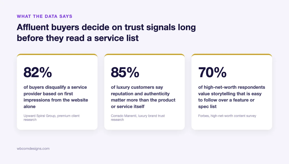
Eighty-two percent of buyers disqualify a service provider based on first impressions from a website before any conversation takes place. Not after a bad call. Not after a disappointing proposal. Before anyone picks up the phone.
That is the real cost of a feature-list homepage. It is not that it looks unpolished. Plenty of feature-list sites are technically well designed, fast, and mobile-friendly. The cost is that it answers the wrong question. It tells a visitor what you do. An affluent buyer already assumes you can do the thing, competence is the entry ticket, not the differentiator. What they are actually scanning for in that fifty-millisecond window is whether you are the kind of person or firm they want making decisions on their behalf.
Why a Feature List Falls Flat With Affluent Buyers
A feature list is a hedge. It tries to cover every possible objection by naming every possible capability, which is a reasonable instinct when you are not sure what the buyer cares about. The problem is that affluent clients are rarely shopping blind. By the time someone with real assets or a complex decision reaches your site, they have usually already ruled out the businesses that cannot do the work. What remains is a shortlist of people who are all, on paper, competent.
Inside that shortlist, a feature list cannot differentiate anything, because every competitor on the list has roughly the same features. “Estate planning, tax strategy, retirement income planning.” Every advisor in a fifty-mile radius offers those three things. “Custom design, project management, ongoing support.” Every agency offers those three things too. Listing them does not build a case for you specifically. It builds a case for the category.
Eighty-five percent of luxury customers say a brand’s reputation and authenticity matter more than the product or service itself. That statistic is usually read as a marketing truism. It is closer to a literal description of the buying process. Reputation and authenticity are not features. They cannot be bulleted. They have to be demonstrated, and a demonstration requires the site to take a position rather than catalogue an inventory.
There is a second, quieter reason feature lists fail this audience. Affluent clients are frequently delegating a decision they used to make themselves, or one they do not have the time or expertise to make at all. A founder who sold a company and now needs a family office. A couple who built a seven-figure portfolio and now needs tax strategy beyond what a generalist can offer. What they are buying is not a checklist of deliverables. They are buying someone else’s judgment, because their own time has become too expensive to spend learning the domain from scratch.
A website that only lists services never demonstrates judgment. It demonstrates scope.
There is also a volume argument that gets missed. A business serving affluent clients does not need thousands of monthly visitors. It needs a handful of the right ones, people who already have the budget and the problem, choosing to take a call instead of closing the tab. A feature list is written for a visitor who is still comparing categories, still deciding whether they even need this kind of service at all. The visitor a high-value business actually wants has already made that decision before arriving. What they need from the page is permission to believe this particular business is the right one, and a list of capabilities does not grant permission. A specific point of view does.
Philosophy: A Website With an Opinion
Philosophy, in this context, has nothing to do with a mission statement. A mission statement is “we believe in excellence and integrity,” which is a sentence every business on earth could paste into its own footer without changing a word. A philosophy is a specific, sometimes uncomfortable position on how the work should be done, one that implicitly rules out other ways of doing it.
A litigation firm that states, plainly, that it turns down cases it does not believe it can win, rather than taking every retainer that walks in the door, is stating a philosophy. It costs them revenue. It also tells a prospective client something a service list never could: that when this firm takes your case, that is itself a signal about its strength. The refusal is the proof.
A philosophy does two things a feature list cannot. It gives the visitor a reason to self-select, and it gives the business a reason other than price to be chosen. Both matter more as the stakes of the decision go up.
Self-selection is worth dwelling on, because most businesses treat it as a loss rather than a filter. A visitor who reads a specific position and decides this is not the right fit was never going to be a good client anyway, and finding that out before a sales call is cheaper than finding it out three weeks into an engagement. The firms that resist stating any position, out of fear of turning someone away, end up fielding more of exactly the wrong inquiries, the price shoppers and the mismatched fits, because nothing on the site ever gave those visitors a reason to rule themselves out earlier.
A scenario. Consider a private wealth advisory practice, three partners, serving clients with investable assets north of five million dollars. Their existing site opens with a stock photograph of a handshake over a desk, a tagline about “comprehensive wealth solutions,” and six service tiles: estate planning, tax strategy, retirement income, risk management, philanthropic giving, business succession. It is accurate. It is also indistinguishable from roughly four hundred other advisory sites serving the same zip codes.
Now picture the same practice with a homepage that opens instead with one sentence from the founding partner: “We turn away more prospective clients than we take, because the plans that work are the ones built around fifteen people, not fifteen hundred.” Nothing about the underlying service offering has changed. What changed is that the visitor now knows something specific and slightly unflattering-sounding about how this firm operates, which is precisely why it reads as true rather than marketed. The six service tiles can still exist on the site. They just stop being the first thing a visitor sees, because they were never the reason anyone hired this practice in the first place.
The general version of this lesson transfers past advisory practices. Any business can audit its own homepage for philosophy with one question: if a visitor read only the first sentence and nothing else, would they learn anything true about how you work that a rival could not also claim? If the honest answer is no, the sentence is scope dressed up as a hook, and it is worth rewriting before anything else on the page.
Judgment: Proof You Can Be Trusted to Decide
If philosophy is the stated position, judgment is the evidence that the position holds up under pressure. A feature list says “we do custom architecture.” Judgment is the case study that explains why a client’s original brief was wrong, and what the firm pushed back on, and what the client got instead because they trusted the firm’s read of the site rather than their own first instinct.
Most professional-services websites avoid this entirely, because it feels risky to publish a story where the client’s original idea gets overruled. That instinct is backwards for an affluent audience. A buyer who is delegating a high-stakes decision is not looking for a vendor who will simply execute whatever they ask for. They have access to vendors like that already, usually at a lower price. They are looking for someone willing to tell them they are wrong, early, before the mistake gets expensive.
The hesitation usually comes from a legal or reputational worry, concern that naming a real disagreement could embarrass a former client or expose confidential details. That is a fair concern, and it has a simple answer: ask the client for permission, and if they decline, write the scenario as a composite without naming the property, the account size, or anything identifying. What matters to the reader is the shape of the decision, not the specific address it happened at.
A scenario. A boutique architecture studio is approached by a client who wants a glass-walled addition on the ocean-facing side of a coastal property, because it photographs beautifully in every reference image the client has collected. The studio’s actual recommendation, documented on their site as a short case narrative rather than a polished gallery, is the opposite: a partial wall with a narrower, framed opening, because the site’s wind load and salt exposure make a full glass wall a five-year maintenance liability the client has not priced in. The studio built it their way. The client, two years later, is quoted saying the house survived a storm season that cracked three of the neighboring glass-walled additions.
That single page does more for a prospective client’s confidence than a hundred photographs of finished interiors, because it is the only piece of content on the site that proves the studio will protect a client from their own bad idea. A portfolio shows taste. A documented disagreement shows judgment, and judgment is what a buyer is actually purchasing when the stakes are high enough that they cannot verify the technical details themselves.
The reason this works is not storytelling in the abstract. It works because an affluent buyer, by definition, cannot personally verify most of what you are telling them. They are not structural engineers, estate attorneys, or portfolio managers themselves, which is the entire reason they are hiring one. A documented disagreement is the closest thing to third-party verification a website can offer without an actual reference call, because it shows the business’s judgment surviving contact with a real, specific situation rather than being asserted in the abstract.
Client Experience: The Website as the First Appointment
For most businesses, the website’s job ends at the contact form. For a business serving affluent clients, the contact form is roughly the halfway point. What happens on the page immediately around that form, and in the moments after it is submitted, functions as a preview of what it is actually like to work with you. Affluent buyers read that preview closely, because the experience itself is often part of what they are paying for.
A generic contact form that just says “we’ll be in touch” tells the visitor nothing. A form that explains the next three steps, who will respond, how quickly, and what the visitor should expect on the first call, is already demonstrating the care the visitor hopes to receive later. It costs nothing to write and almost nobody writes it.
A scenario. A boutique immigration and family-office law firm, handling EB-5 investor visas and cross-border estate structuring for clients relocating significant wealth, had a contact form that read: “Fill out the form below and a member of our team will reach out.” Submissions sat for days, sometimes longer, and the firm could not understand why qualified leads kept quietly going cold.
The fix was not a faster CRM. It was rewriting the page around the form to explain, in four short lines, exactly what happens after submission: a named partner reviews every inquiry personally within one business day, a fifteen-minute scoping call is scheduled before any paperwork is discussed, nothing is billed until the client explicitly authorizes engagement. None of that changed the firm’s actual process. It simply described a process that already existed, in a place where the client was, for the first time, anxious enough to need the reassurance. Inquiries that converted to scoping calls rose, because the uncertainty that had been quietly killing submissions was gone.
Seventy percent of high-net-worth respondents say they value storytelling that is easy to follow over a feature or spec list, and sixty-six percent value a visible human element in the content they read before making a decision. Both numbers point at the same thing: affluent buyers are not reading your site to collect facts. They are reading it to rehearse, in their head, what it will feel like to be your client. The site’s job is to make that rehearsal as specific and as reassuring as possible.
Notice that the firm in this scenario did not add a single new service or hire a single new person. The entire fix lived in roughly two hundred words of copy around an existing form. That is usually true of client-experience problems generally: the gap is rarely in what the business actually does for clients once engaged, it is in how little of that care is visible before the first conversation even happens.
How This Plays Out Across Different Industries
The three scenarios above cover wealth advisory, architecture, and law, but the same pattern repeats almost anywhere a client is delegating a high-stakes decision to someone whose expertise they cannot fully evaluate themselves. A quick look at four more fields makes the pattern easier to recognize in your own.
Luxury real estate. Most agent sites lead with listings and a bio built entirely around sales volume, “over 200 million in closed transactions.” A buyer at the seven-figure-and-up tier has usually already confirmed the agent can close deals before visiting the site. What they are actually evaluating is whether this agent will tell them a property is overpriced, or flag a flood zone the listing photos conveniently crop out. An agent’s site that opens with a short, specific story about walking a client away from a property everyone else was pushing them toward does more work than another carousel of staged kitchens.
Concierge and private medicine. Patient-facing sites in this category tend to list credentials and insurance details, which matters for baseline trust but says nothing about the actual experience of being a patient. A practice that instead describes exactly how a first visit unfolds, how much time is allotted, how follow-up actually happens between visits, is answering the real question a prospective patient has: will I be treated as a person with a complex case, or processed as a slot in a schedule.
Bespoke event and hospitality planning. This field is especially prone to feature-list thinking, “full-service planning, vendor management, day-of coordination,” because the deliverables genuinely are a list. The planners who stand out instead describe a philosophy about what they refuse to compromise on, timeline, guest experience, a single vendor relationship they insist on over a cheaper alternative, which tells a prospective client far more about the actual event they will get than a checklist of services already assumed to be included.
Private banking and family offices. Of every category here, this is the one where regulatory language and risk disclosures make differentiated copy hardest to write, and it shows: most private banking sites read almost identically to one another. The institutions that break the pattern tend to do it narrowly, one page describing a specific type of client situation they handle unusually well, rather than trying to rewrite the entire site’s tone. A single well-written page can carry more weight here than a full redesign, precisely because the rest of the site is constrained by compliance review.
What holds across all four is the same test introduced earlier: could a competitor in the same field publish the same sentence and have it be equally true? Industries differ in how much room they have to be distinctive, private banking least of all, event planning most. The exercise of finding that room is identical regardless of the field.
If your own field is not listed here, run a quick comparison instead of waiting for an exact match. Pull up three competitor sites in your category side by side. Read only the opening section of each. If you cannot tell which business wrote which paragraph without checking the logo, that is the gap this article is describing, in your specific market, right now.
The Data Behind the Shift
None of this is a stylistic preference dressed up as strategy. It shows up consistently across research into luxury consumer behavior and high-net-worth content consumption, and the pattern holds across very different studies run by very different firms.
There is also a timing reason this matters more now than it did five years ago. AI drafting tools have made it trivially fast to produce a polished, grammatically clean services page, which means more competitors than ever are shipping sites that look professional and say nothing specific. The baseline of “looks credible” has quietly risen for everyone at the same time the content on most of those sites has become more interchangeable, not less. A visitor scanning five sites that each read like they were generated from the same prompt will notice, even if they could not say exactly why one feels different. Philosophy and a documented point of view are harder to automate convincingly, which is precisely why they are becoming a sharper differentiator as generic copy gets easier to produce.
Edelman’s most recent Trust Barometer found that seventy-six percent of millionaires said they would permanently stop purchasing from a brand they perceived as inauthentic or dishonest. Permanently. Not “consider alternatives.” That is a one-strike standard, and it applies to a website’s copy exactly as much as it applies to a product failure, because exaggerated or generic claims read as a small dishonesty before a client has spent a single dollar.
Forty-seven percent of high-net-worth individuals say it matters that a brand stays true to its own values when choosing who to work with, ahead of price, ahead of convenience. Over sixty percent of luxury buyers connect a brand’s authenticity directly to its heritage, meaning its track record and its consistency over time, not its polish in the current quarter.
And in wealth management specifically, research comparing advisory firms to traditional banks found that wealth firms are generally more successful at establishing high trust, largely because they lean into a personal, point-of-view-driven relationship rather than a standardized, feature-driven product catalogue. The same research surfaced an uncomfortable gap on the other side: seventy-four percent of advisors believe they have a genuine business and social relationship with their affluent clients, while only twenty-eight percent of those clients feel the same way back. The site is often the first place that gap starts to close, or widen.
There is also a quieter finding worth sitting with. Eighty-one percent of consumers say they require trust in a brand before making any purchase at all, which sounds obvious until you consider how few professional-services websites are actually written to earn it directly. Most are written to inform. Informing and earning trust are not the same task, and a site optimized purely for the first one will keep losing ground to a competitor who understood the difference.
Separate research into luxury shopping behavior found that just ten percent of high-net-worth consumers buy luxury items exclusively online, with the large majority still preferring to browse digitally and complete the decision in person or by phone. That is not a reason to underinvest in the website. It is the opposite: if the website’s job is to get a hesitant, high-value buyer to pick up the phone or walk through the door, then everything on the page should be built around that single conversion, not around trying to close the sale on its own.
None of these numbers are about design trends. They describe a buyer who has already decided competence is a given, and who is now searching a page for evidence of character.
A Four-Part Framework for Building Trust Before the First Call
None of this requires a rebuild. Most of it can be layered onto an existing site, section by section, starting with whichever part is weakest. Four pieces matter, in roughly this order of impact.
State a position, not a scope. Replace the opening line of the homepage with a specific, falsifiable claim about how you work, something a competitor could disagree with. If every sentence on your homepage could sit unchanged on a rival’s site, none of it is doing any work.
Publish one documented disagreement. Find a real project where you told a client their first idea was wrong, and write it as a short, honest narrative rather than a polished case study. One page like this outweighs a dozen generic testimonials, because it is the only content on the site a competitor cannot simply copy.
If nothing comes to mind immediately, ask the team the right question. Not “do we have a case study,” but “when did we tell a client no, and were later glad we did.” Most client-facing teams have three or four of these stories sitting in memory, half-forgotten because nobody ever thought to write them down for the website rather than just telling them over dinner.
Name the humans. Put a real name, a real face, and a specific area of judgment next to every claim of expertise. “Our team has over twenty years of combined experience” is unfalsifiable and forgettable. “Maria has spent fourteen years structuring cross-border trusts for families relocating from the EU” is a sentence a client will actually remember in the room.
Rewrite the five feet around the contact form. Replace “we’ll be in touch” with the actual next three steps, who responds, and how fast. This single change is the cheapest item on this list and often the one with the fastest visible effect, because it addresses the exact moment a hesitant buyer is deciding whether to submit at all.
A workable template: name who reviews inquiries, state the turnaround time in business days rather than a vague “soon,” and describe what the first call actually covers so nobody wonders if they are about to be pitched before they have even agreed to a conversation.
A useful constraint while doing this work: every sentence you write should fail a simple test. Could a direct competitor publish this same sentence, word for word, on their own site, and have it be equally true? If yes, cut it. If a sentence can only be true of your specific business, keep it. Most feature lists fail this test completely. Most philosophy and judgment content passes it by default, because it could not have been written by anyone else.
One caution worth stating directly. None of this works if it is invented. A philosophy statement built from a case that never happened, or a disagreement story that gets quietly embellished past what actually occurred, tends to collapse under even light questioning in a sales call, and a client who catches one exaggeration will quietly discount everything else on the site. The entire value of this approach comes from the fact that it is true and specific. Remove either quality and it is just a different kind of marketing copy, no more trustworthy than the feature list it replaced.
Six Ways Affluent-Client Websites Undercut Their Own Trust
Most of these mistakes are not visible to the business that is making them, because each one looks reasonable in isolation. They only become obvious once you read the site the way a skeptical, time-poor affluent buyer actually does: fast, and looking for a reason to rule you out.
- Stock photography of people who do not work there. A buyer who has seen the same handshake photo on three other sites discounts the entire page the moment they recognize it.
- Testimonials with no name, no title, no specifics. “Great service, highly recommend - J.D.” reads as fabricated even when it is real, because it contains no detail a competitor could not also invent.
- A pricing page that hides behind “contact us for a custom quote” with nothing else. Opacity reads as evasion to a buyer who is used to transparency from people they already trust.
- Jargon that performs expertise instead of demonstrating it. Dense, acronym-heavy copy signals insecurity more often than it signals authority.
- A blog or insights section that has not been updated in over a year. It reads as a business that has stopped paying attention, which is the opposite of the impression a wealth-adjacent client wants from someone handling their affairs.
- A founder or lead team member who is invisible on the site. If the buyer cannot find the name of the person they would actually be working with, they assume the relationship will be transactional and junior-staffed, whether or not that is true.
Each of these is fixable in an afternoon. None of them requires a new website. That is the part most businesses miss: the gap between a feature-list site and a trust-led one is usually a few thousand words of honest, specific writing, not a redesign budget.
A fast way to spot which of the six applies to your own site: open it on a phone, start a timer, and give yourself ten seconds per page before moving to the next. Homepage, about page, one service page, contact page. Ten seconds is roughly what an impatient, skeptical visitor actually gives a new site before deciding whether to keep reading or close the tab. Most teams are surprised by how little of their own content survives that pace, and the sections that get skipped over without registering are usually exactly the generic ones worth rewriting first.
The Same Business, Two Different Websites
It helps to see the contrast laid out side by side, because the individual changes above can each look small. Stacked together, they describe two almost unrecognizable versions of the same business.
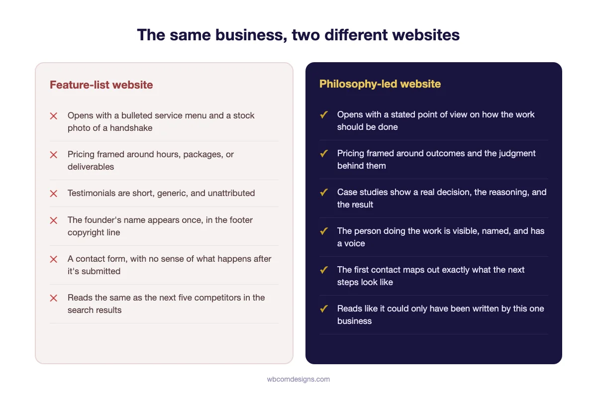
Neither version costs meaningfully more to build. The difference is almost entirely in what gets written and what gets left out, which is why this shift is available to a three-person advisory practice just as much as it is to an established firm with a marketing department.
What to Measure Instead of Traffic
A website built this way will rarely win on raw visitor count, and chasing that number is usually the wrong instinct for this audience in the first place. Affluent clients are not a volume market. A handful of the right visitors converting at a high rate will outperform ten times the traffic converting at a fraction of a percent, and the metrics worth tracking reflect that.
This is also where a lot of agencies and in-house marketers get the scorecard wrong for this kind of client. A dashboard built for an e-commerce brand, session count, bounce rate, pages per visit, tells you almost nothing useful here. A single visitor who reads two pages, spends four minutes, and calls your office the next morning is a better outcome than five hundred visitors who scroll once and leave. Report on the right handful of numbers to the business owner, not the ones a generic analytics template happens to surface by default.
Watch the ratio of form submissions to scheduled calls, not form submissions alone. A vague contact form generates submissions from people who are not serious, then wastes a partner’s time qualifying them. A specific, well-written page around that form filters earlier, so the submissions that do arrive convert to calls at a noticeably higher rate.
Watch how long visitors spend on the one documented case or disagreement page, if you track it. A page that genuinely demonstrates judgment tends to hold attention far longer than a standard case study grid, because it reads more like a story than a list.
And ask every new client, directly, what made them choose you over the other options they considered. This is the cheapest research a small business will ever do, and it is the fastest way to find out whether the philosophy and judgment you put on the site are the actual reasons people are hiring you, or whether you are still being chosen for a reason the site has not caught up to yet.
One more number worth tracking, if your sales process allows it: average deal size among clients who mention the website’s content during the sales conversation, compared to those who do not. The logic for watching this closely is straightforward, even before you have enough of your own data to confirm it: a visitor who arrives already convinced of your judgment has less reason to negotiate on price and less need to keep comparing you to other options. They are no longer shopping a commodity. They are evaluating the specific judgment they just read about, which is a different, less price-sensitive conversation.
Frequently Asked Questions
Does this mean I should remove my services page entirely?
No. Affluent buyers still need to confirm you offer what they need, and a services page is where that confirmation happens. The point is sequencing. The services page should not be the first thing a visitor sees or the thing carrying the weight of persuasion. It belongs one or two clicks deep, after the homepage has already made the case for why this specific business and not a competitor with an identical list.
Is this approach only relevant to finance, law, and luxury real estate?
Any business where the buyer is delegating a high-stakes decision they cannot easily verify themselves benefits from this shift, regardless of industry. A specialist surgeon, a bespoke furniture maker, a private chef, and a cybersecurity consultant serving enterprise clients all sit in the same category: the client is trusting judgment they cannot independently check, which makes philosophy and demonstrated judgment more persuasive than a spec sheet.
How long does it take to see a difference after making these changes?
Most businesses notice a shift in inquiry quality within the first few weeks, since the content change affects how quickly a hesitant visitor decides to reach out. The slower signal, actual client acquisition, takes longer to confirm because affluent sales cycles tend to run from several weeks to several months. Track inquiry quality early and revenue impact later, not the other way around.
What if I genuinely do not have a strong, specific philosophy yet?
Look at the decisions you have already made, not the ones you think you should make for marketing purposes. Every established business has already turned away a client, pushed back on a brief, or made a trade-off it would make again. That decision, described plainly, is the philosophy. The mistake is searching for a slogan instead of writing down something that already happened.
Should pricing be hidden on a site like this?
Hiding pricing entirely tends to read as evasion rather than exclusivity, and it does the opposite of what a trust-led site is trying to do. A better approach is explaining how pricing works, flat fee, retainer, percentage of assets, even without a final number, so the visitor understands the structure before they ever ask. Structure without a number builds trust. Silence does not.
Doesn’t stating a strong position risk sounding arrogant and turning people away?
It will turn people away, and that is the point rather than the risk. A position specific enough to be interesting will not be for everyone, and trying to write something every visitor agrees with is exactly how a site ends up sounding like every other site in the category. The businesses that get this wrong usually confuse arrogance, claiming to be the best, with specificity, describing exactly how they work. A specific position reads as confident. A superiority claim with no evidence behind it reads as arrogant. The difference is whether you can back the sentence with a real example.
Is this worth doing if our marketing budget is small?
This is, if anything, the approach best suited to a small budget. A full redesign costs real money and takes months. Rewriting a homepage’s opening sentence, publishing one honest case narrative, and fixing the copy around a contact form can be done in a single week by one person who already knows the business well, usually the owner or a partner. The constraint here is not budget. It is the willingness to write something specific enough that it could be wrong.
A feature list will always be easier to write than a philosophy. It requires no vulnerability and no real decision about what you believe. That is exactly why it is worth so little to the client reading it. The businesses winning affluent clients right now are not the ones with the longest list of capabilities. They are the ones willing to tell a stranger, in the first five seconds, something specific and slightly risky about how they work, and then prove it with one real story instead of ten generic ones.
Start with one page, not the whole site. The homepage opening line, or the one documented disagreement you have been putting off writing, whichever feels more uncomfortable is probably the one worth writing first, today, before the discomfort talks you out of it.
Need a hand turning your site’s existing judgment and track record into the pages that actually sell it? Wbcom Designs builds and redesigns WordPress sites for professional-services and client-facing businesses that need to earn trust fast.
Interesting Reads:
Related reading