28 min read
30 Design Styles Explained: History, Use Cases and How to Use Each

Two websites can sell the same product at the same price and still feel like they belong to different planets. One looks calm and expensive. The other looks loud and fun. The difference is the design style.
A design style is a shared visual language. It decides which fonts feel right, how colour behaves, whether corners are sharp or soft, and how much empty space a page is allowed to have. Pick one on purpose and every page on your site starts to feel related. Skip that decision and you get a patchwork of templates that never quite agree with each other.
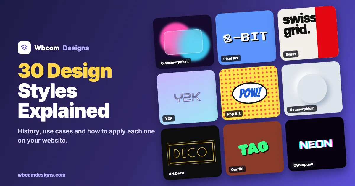
This guide walks through 30 design styles you will see on websites and in brand work in 2026. For each one you get where it came from, what it looks like, where it works, where it fails, and how to apply it to a real site. Every style also has a sample hero section we built in plain HTML and CSS, so you can see it doing an actual job instead of sitting on a mood board.
Why design style matters more than people think
Visitors judge a page in well under a second. A well-known study from Carleton University, later backed up by research at Google, found that people form a first impression of a website’s visual appeal in about 50 milliseconds, long before they read a single word. That snap judgement is mostly about style: colour, layout density, type and how much is happening on the screen.
Style also does quiet work for trust. A law firm in Memphis-style squiggles would feel wrong, even if the content were perfect. A skate brand in Swiss grids might feel cold. When style and audience line up, people relax and keep reading.
And it saves you time. Once you commit to a style, hundreds of small decisions are already made. Button shape, icon weight, photo treatment, even the tone of empty states. Your team stops arguing about pixels and starts shipping.
How we picked these 30
We started from the list that keeps doing the rounds in Instagram reels, then cleaned it up. Futuristic and Cyberpunk are close cousins, so they share one entry. Apple’s Liquid Glass is a newer branch of Glassmorphism, so those sit together too. That freed up room for styles that were missing and that people actually search for, such as Flat Design, Skeuomorphism, Material Design, Brutalism, Bauhaus, Art Deco, Memphis, Isometric, Bento Grid and Organic design.
The 30 styles are grouped into five families so the list is easier to scan.
Jump to a style:
- Minimal and structured: Minimalism, Swiss Design, Flat Design, Bauhaus, Bento Grid, Editorial
- Digital and interface: Skeuomorphism, Material Design, Glassmorphism and Liquid Glass, Neumorphism, Clay Style, Isometric, Aurora
- Retro and nostalgic: Retro, Art Deco, Victorian, Memphis, Pop Art, Y2K, Pixel Art
- Bold and expressive: Maximalism, Brutalism, Futuristic and Cyberpunk, Graffiti, Surreal Design
- Handmade and organic: Vector Art, Collage Art, Bohemian, Handwritten, Organic
All 30 design styles at a glance
| Style | Mood and best fit |
|---|---|
| Minimalism | Calm, premium. Best for portfolios, SaaS, luxury |
| Swiss Design | Ordered, confident. Best for agencies, culture, data |
| Flat Design | Clear, friendly. Best for apps, onboarding, icons |
| Bauhaus | Geometric, bold. Best for events, art, architecture |
| Bento Grid | Tidy, modern. Best for feature pages, dashboards |
| Editorial | Thoughtful, literary. Best for blogs, publishers, long reads |
| Skeuomorphism | Tactile, familiar. Best for audio tools, games, kids |
| Material Design | Systematic, practical. Best for web apps, Android, admin UI |
| Glassmorphism and Liquid Glass | Light, layered. Best for fintech, music, overlays |
| Neumorphism | Soft, quiet. Best for smart home, small widgets |
| Clay Style | Playful, warm. Best for kids, education, onboarding |
| Isometric | Explanatory. Best for tech, logistics, how-it-works |
| Aurora | Dreamy, modern. Best for AI, startups, launches |
| Retro | Warm, nostalgic. Best for food, drinks, music |
| Art Deco | Glamorous. Best for hotels, bars, weddings |
| Victorian | Ornate, heritage. Best for whisky, barbers, books |
| Memphis | Loud, fun. Best for youth brands, events |
| Pop Art | Punchy, ironic. Best for sales, campaigns, media |
| Y2K | Shiny, optimistic. Best for fashion, music, Gen Z |
| Pixel Art | Nostalgic, nerdy. Best for games, dev tools, merch |
| Maximalism | Rich, abundant. Best for fashion, art, lifestyle |
| Brutalism | Blunt, honest. Best for studios, indie products |
| Futuristic and Cyberpunk | Electric, edgy. Best for gaming, crypto, tech events |
| Graffiti | Rebellious. Best for streetwear, music, sport |
| Surreal Design | Strange, memorable. Best for campaigns, creative studios |
| Vector Art | Clean, scalable. Best for product sites, explainers |
| Collage Art | Raw, layered. Best for culture, editorial, music |
| Bohemian | Earthy, relaxed. Best for lifestyle, yoga, decor |
| Handwritten | Personal, human. Best for small business, education |
| Organic | Natural, gentle. Best for wellness, skincare, eco |
Minimal and structured styles
These styles put order first. They rely on grids and restraint, and they age well because they do not lean on a passing effect.
1. Minimalism
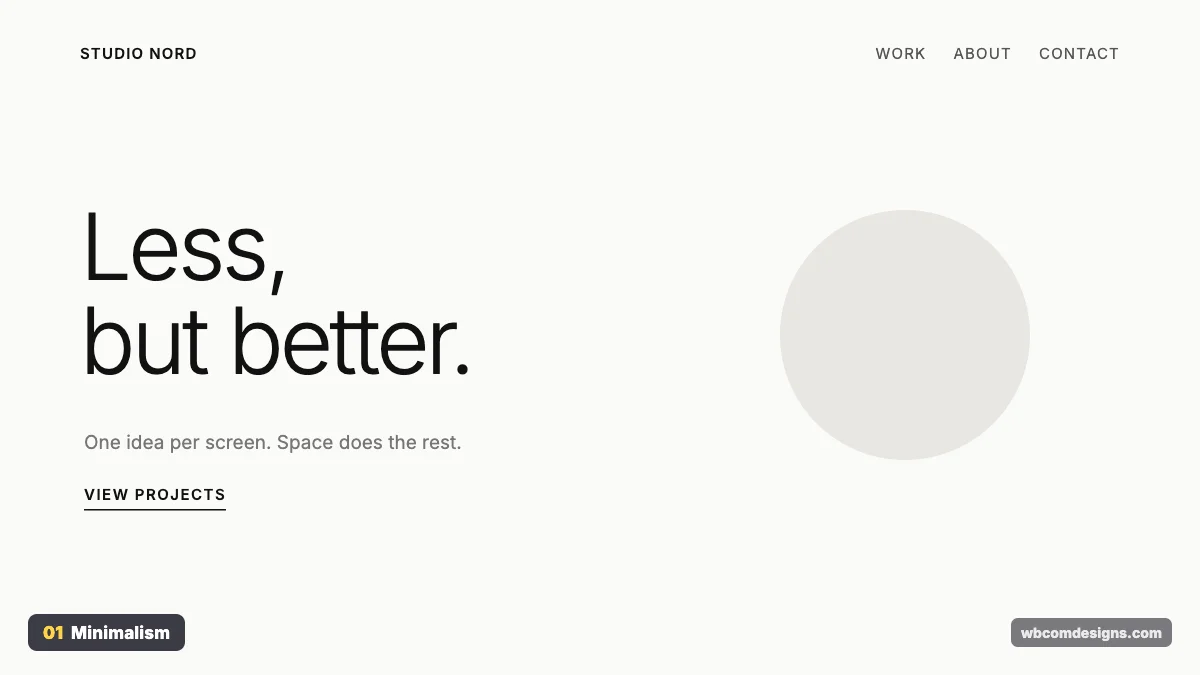
Where it came from. Minimalism grew out of 1960s art, when artists like Donald Judd and Agnes Martin stripped work down to simple forms. Industrial designer Dieter Rams gave it a motto that designers still quote: “Less, but better.” On the web, the Google homepage and Apple’s product pages turned it into the default look for premium brands.
What it looks like. Wide margins, one strong headline, a tiny palette and almost no decoration. The empty space is not wasted. It tells the eye exactly where to look.
Where it works. Portfolios, SaaS landing pages, luxury retail and any brand that wants to feel calm and sure of itself. It struggles on sites that have to show a lot at once, like news portals or big catalogues.
How to use it. Limit yourself to one typeface in two weights and two or three colours. Give every section generous padding, at least 80px on desktop. Cut any element you cannot explain. The hard part of minimalism is the editing, not the design.
2. Swiss Design
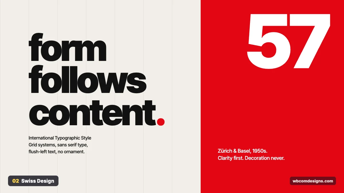
Where it came from. Also called the International Typographic Style, it took shape in Zürich and Basel in the 1950s through designers like Josef Müller-Brockmann, Armin Hofmann and Emil Ruder. Helvetica was released in 1957 and became its signature typeface. Müller-Brockmann’s book Grid Systems in Graphic Design is still on many designers’ desks.
What it looks like. A visible grid, sans serif type set flush left, big type sizes, asymmetric layouts and often a single strong accent colour such as red. No ornaments. Photography is treated as objective information.
Where it works. Design agencies, museums, conferences, data-heavy sites and anything where clarity is the selling point. It feels cold for brands that sell warmth, like kids’ products or wellness, unless you soften the palette.
How to use it. Build on a 12-column grid and let headlines break across lines on purpose. Pick a neo-grotesque font such as Inter, Helvetica Now, Suisse or Neue Haas Grotesk. Align everything to the left edge of a column. Resist the urge to centre things.
3. Flat Design
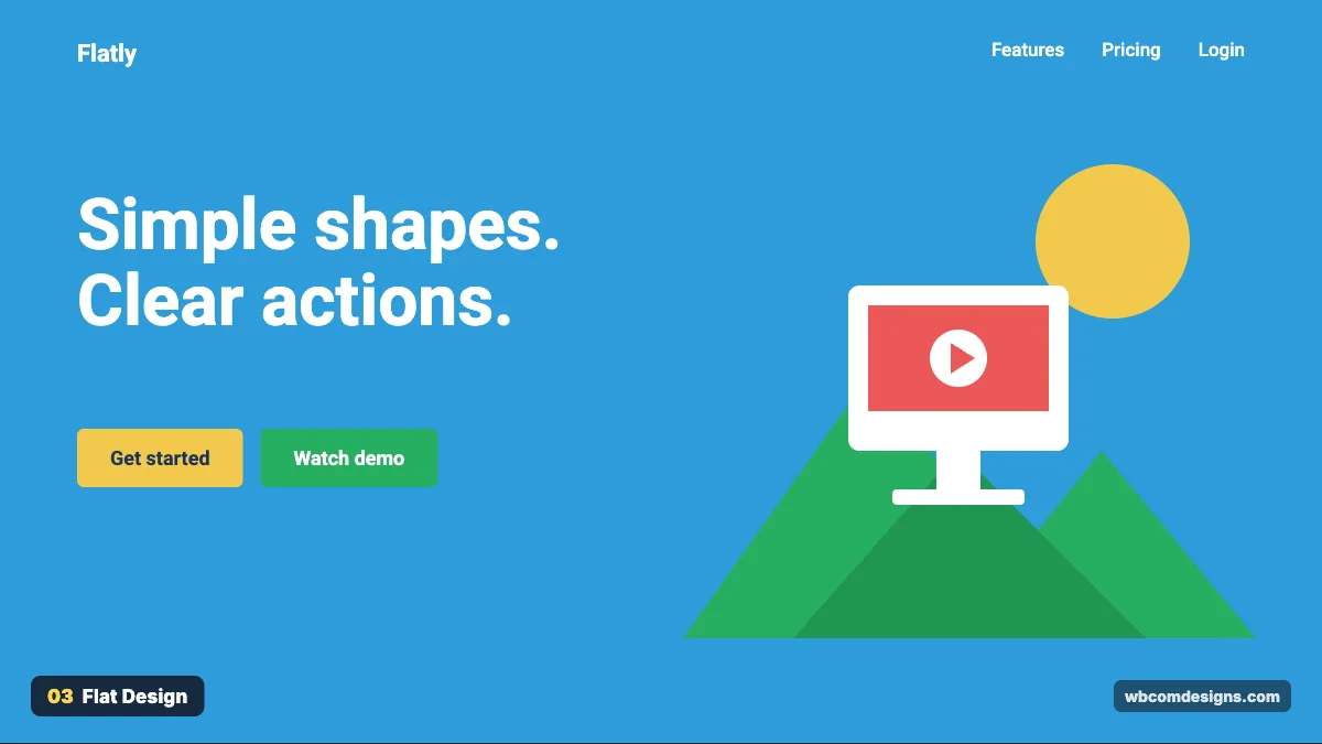
Where it came from. Microsoft pushed it first with the Metro design language on Zune and Windows Phone 7 around 2010. The big moment came in 2013, when Apple dropped its glossy, textured look for the flat iOS 7. Within two years most of the web had followed.
What it looks like. Solid colours, no gradients, no drop shadows, simple icons and clear buttons. Illustrations are built from basic shapes.
Where it works. Apps, onboarding flows, icon sets and sites for broad audiences who need to understand the interface quickly. Pure flat design can make it hard to tell what is clickable, which is why most teams now use “flat 2.0” with a hint of shadow on buttons.
How to use it. Choose a bright, limited palette and keep contrast high. Make interactive elements look different from static ones through colour or a subtle shadow. Use SVG icons from one family so the line weights match.
4. Bauhaus
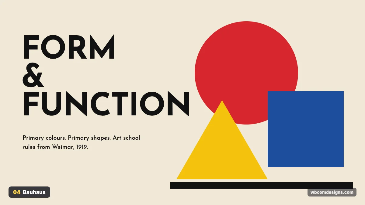
Where it came from. The Bauhaus school was founded by Walter Gropius in Weimar, Germany in 1919. It moved to Dessau in 1925 and closed in 1933 under pressure from the Nazi regime. In those 14 years it changed how the world thinks about design, by merging art with industrial production. Herbert Bayer, Wassily Kandinsky and László Moholy-Nagy all taught there.
What it looks like. Primary colours, circles, squares and triangles, heavy sans serif type and bold asymmetric compositions. Form follows function, but the function is allowed to look striking.
Where it works. Art and architecture sites, event posters, music festivals and brands that want a confident, intellectual feel. Skip it for content-heavy sites. Big shapes compete with long text, and readers lose their place.
How to use it. Use red, yellow and blue with black and an off-white background. Build hero images from CSS shapes or SVG rather than photos. Pair a geometric typeface like Josefin Sans or Futura with lots of negative space so the shapes can breathe.
5. Bento Grid
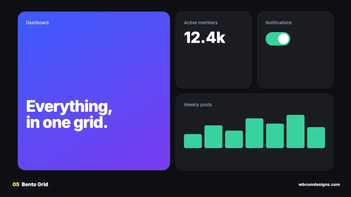
Where it came from. The name comes from the Japanese bento lunch box, where each dish sits in its own compartment. Windows Phone live tiles were an early version. Apple made it famous in the 2020s, using bento-style slides in its keynotes to summarise product features, and sites like Linear and Vercel brought it to the web.
What it looks like. A grid of rounded cards in different sizes, each holding one idea: a stat, a chart, a screenshot or a short line of copy.
Where it works. Feature overviews, product pages, dashboards and personal “about me” pages. It is a great way to show many small benefits without a boring bullet list. It breaks down for long-form content or step-by-step flows, where people need to read in order.
How to use it. CSS Grid does the heavy lifting. Use grid-template-columns with a few cells that span two columns or rows. Keep the corner radius and gap identical across all tiles. Give each tile exactly one message, and let one large tile anchor the layout.
6. Editorial
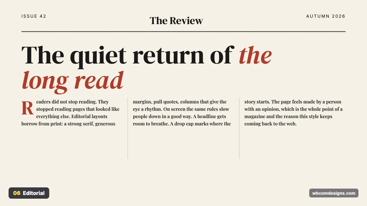
Where it came from. Magazine design. Alexey Brodovitch at Harper’s Bazaar in the 1930s to 1950s set the template: big type, dramatic white space, images and text treated as one composition. On the web, the New York Times feature “Snow Fall” in 2012 showed what long-form storytelling could look like online.
What it looks like. Elegant serif headlines, drop caps, pull quotes, multiple columns and thin rules separating sections. Pages feel like they were made by an editor, not a template.
Where it works. Blogs, publishers, newsletters, culture brands and case studies. It rewards good writing and exposes weak writing.
How to use it. Pair a display serif such as DM Serif Display or Playfair with a readable body font. Keep body text around 18 to 20px with a line length of 60 to 75 characters. Use pull quotes to break long articles, and add a drop cap with the CSS ::first-letter selector.
Digital and interface styles
These styles were born on screens. Most of them are about how interface elements look and feel, which makes them very relevant for apps and web products.
7. Skeuomorphism
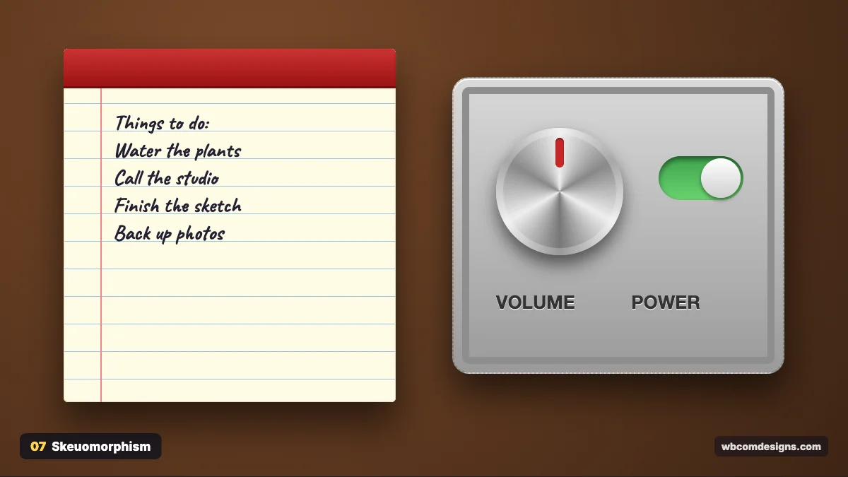
Where it came from. The word joins the Greek skeuos (tool or vessel) and morphē (shape). In software it peaked with early iPhone and Mac apps: a leather-stitched Calendar, a yellow legal pad for Notes, wooden shelves in iBooks and green felt in Game Center. The idea was to make new digital tools feel familiar by copying physical ones.
What it looks like. Real textures, realistic shadows, metal knobs, stitched leather and paper. Every control looks like you could pick it up.
Where it works. Music production tools, games, kids’ apps and any interface where a physical metaphor genuinely helps people understand it. A volume knob that looks like a knob needs no tutorial.
How to use it. Use layered gradients and multiple shadows to fake depth, and CSS conic gradients for brushed metal. Keep it to a few hero elements. A whole site in full skeuomorphism feels heavy and dated, but one realistic control can be delightful.
8. Material Design
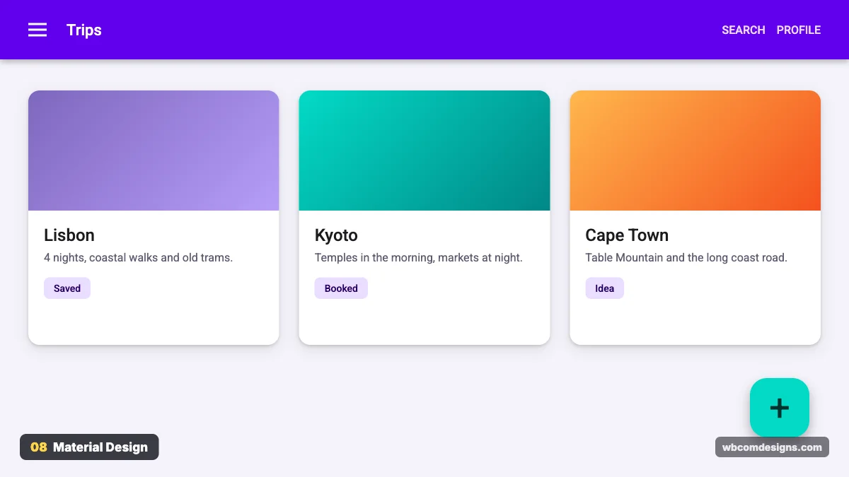
Where it came from. Google introduced Material Design at Google I/O in 2014 to unify its products. The metaphor was paper and ink: flat surfaces that sit at different heights and cast realistic shadows. Material You arrived with Android 12 in 2021 and added colour themes generated from the user’s wallpaper.
What it looks like. Cards with elevation shadows, a coloured top app bar, the round floating action button, Roboto type and meaningful motion when things change state.
Where it works. Web apps, admin dashboards, Android apps and any product that needs a proven, documented system instead of inventing one. Avoid it when you want a distinct brand look. Used straight out of the box, it makes any product feel like a Google app.
How to use it. Google’s official documentation at m3.material.io covers every component and colour rule in detail. Use elevation to show hierarchy, not decoration. Keep one primary action per screen and give it the most prominent button.
9. Glassmorphism and Liquid Glass
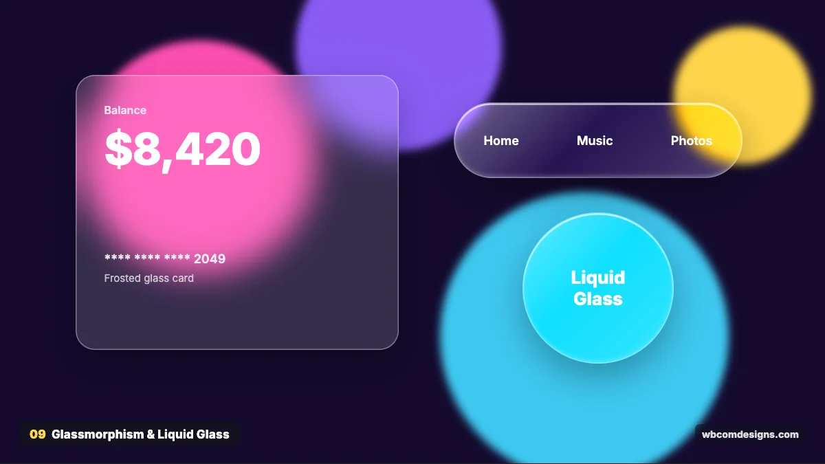
Where it came from. Windows Vista’s Aero theme in 2007 was the first mainstream frosted glass interface. Apple brought the look back with macOS Big Sur in 2020, and designer Michał Malewicz popularised the name glassmorphism the same year. In June 2025 Apple announced Liquid Glass, a more fluid version with light refraction and highlights that bend as elements move, across all its platforms.
What it looks like. Semi-transparent panels with a blurred background behind them and a thin light border, with colourful shapes glowing through. Liquid Glass adds glossy edges and stronger highlights.
Where it works. Fintech cards, music players, navigation bars, overlays and hero sections with bright backgrounds. It falls apart on plain white backgrounds, where there is nothing to blur.
How to use it. The key CSS property is backdrop-filter, for example backdrop-filter: blur(20px) with a background like rgba(255,255,255.15). Always check text contrast. Glass panels over busy images often fail accessibility checks, so test with the WebAIM contrast checker.
10. Neumorphism
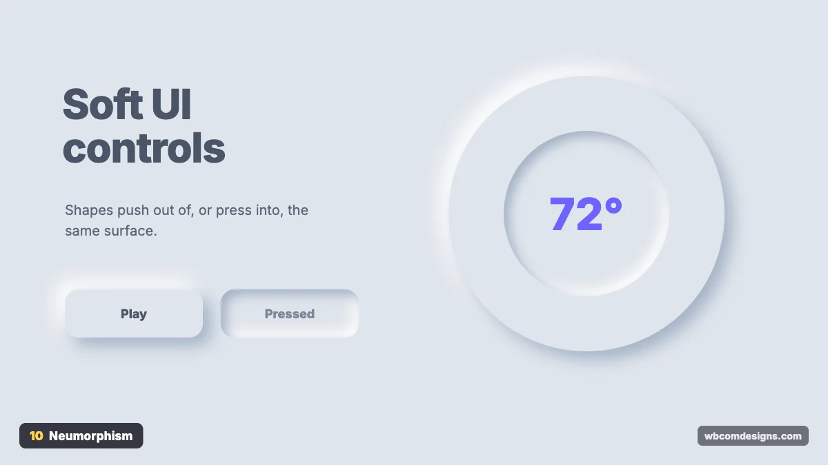
Where it came from. It went viral in late 2019 after designer Alexander Plyuto posted a soft banking app concept on Dribbble. The name blends “new” and “skeuomorphism”. Thousands of copies followed within weeks.
What it looks like. Elements look extruded from, or pressed into, the same surface. Every shape uses two shadows: a light one on the top left and a dark one on the bottom right. The background and the elements share one colour.
Where it works. Smart home controls, calculators, music widgets and small, focused interfaces. It is risky for whole websites because buttons have very low contrast and can be hard to spot.
How to use it. Use a mid-light background such as #E0E5EC and pair box-shadow values like 12px 12px 24px #a3b1c6, -12px -12px 24px #fff. Use inset shadows for pressed states. Add a coloured accent to text or icons on key buttons so people can find them.
11. Clay Style (Claymorphism)
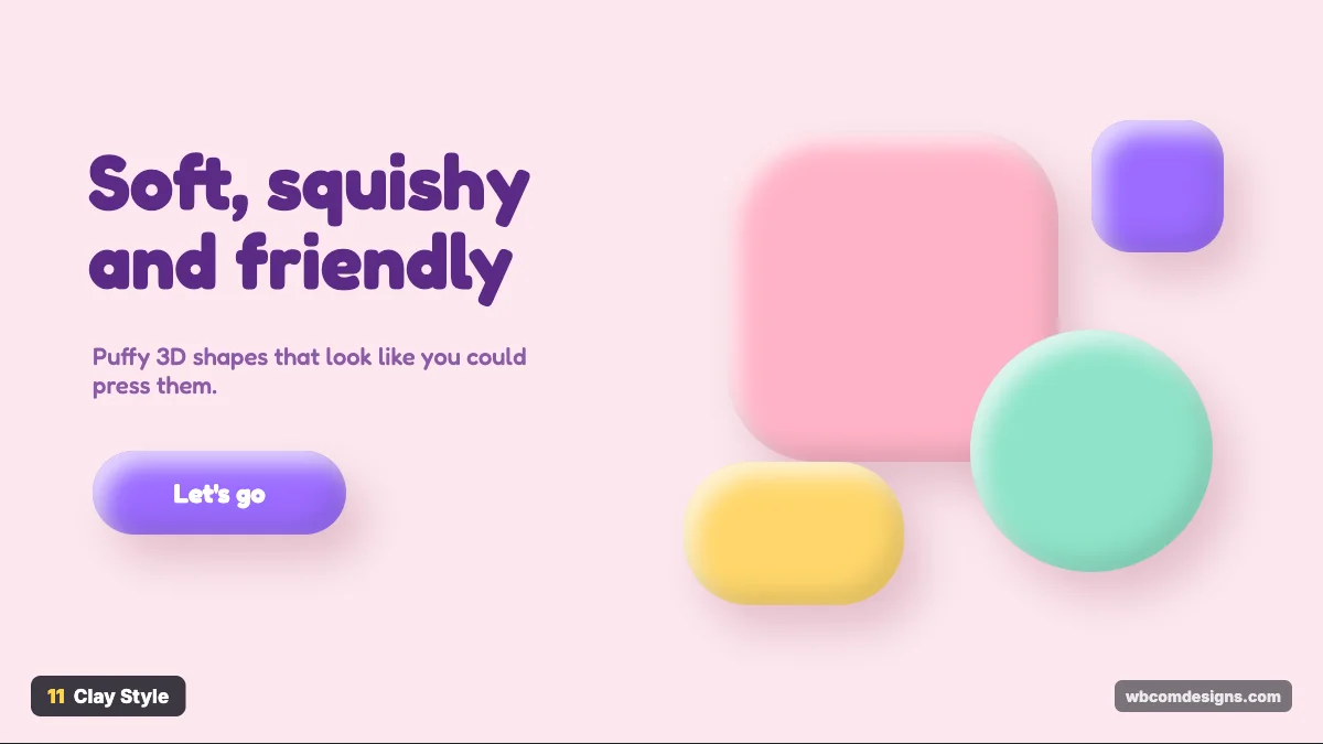
Where it came from. Claymorphism took off around 2021 and 2022, as 3D tools like Blender and Spline made soft 3D renders easy for any designer. It pairs well with the playful 3D illustrations many startups use.
What it looks like. Puffy, rounded shapes in pastel colours, with an inner highlight and an inner shadow so they look like soft clay. Corners are very round and fonts are friendly.
Where it works. Kids’ products, education apps, onboarding screens, games and brands that want to feel approachable. It looks wrong for finance or legal services, where playful shapes undercut trust.
How to use it. Combine an outer drop shadow with two inset shadows, one light and one dark. Use border radius of 30px or more. A rounded font like Fredoka or Nunito completes the look. Keep the palette pastel but make sure text on top still has enough contrast.
12. Isometric
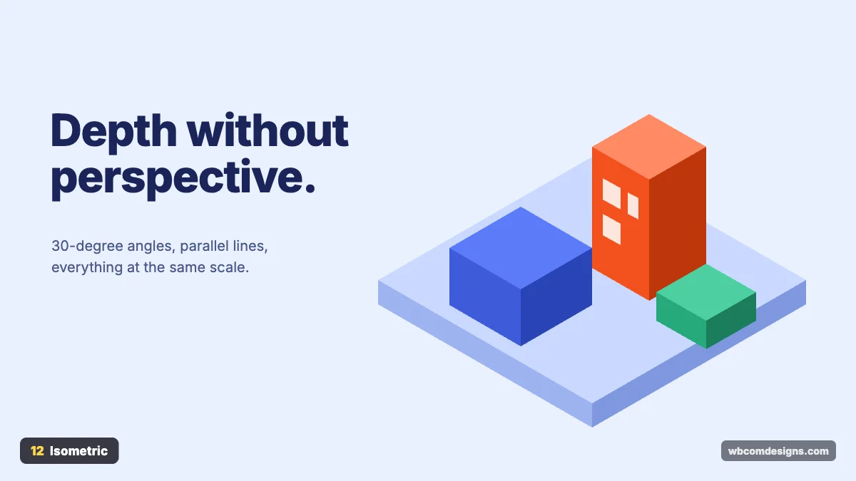
Where it came from. Isometric projection is a technical drawing method where the three axes sit 120 degrees apart, so objects show depth without perspective shrinking. Isometric-style games like SimCity 2000 in 1993 and Monument Valley in 2014 made it popular, and tech companies adopted it for illustrations explaining how their products work.
What it looks like. Buildings and devices drawn at 30-degree angles, all at the same scale, usually in clean flat colours.
Where it works. Explaining systems: cloud infrastructure, logistics, data flows, smart cities and “how it works” sections. Don’t use it for people or emotional stories. The fixed angle makes everything look like a diagram.
How to use it. Draw on an isometric grid in Figma or Illustrator, or build with CSS using transform: rotateX(60deg) rotateZ(-45deg). Use three tones of each colour for the top, left and right faces. Keep the lighting direction the same on every object.
13. Aurora
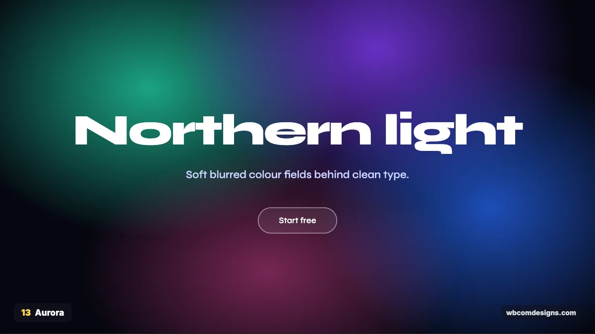
Where it came from. Gradient mesh backgrounds became a strong trend in the early 2020s. Stripe’s animated gradient homepage helped, and AI companies adopted the look heavily. The name comes from the northern lights, which these blurred colour fields resemble.
What it looks like. Large, soft blobs of colour blending into each other, usually on a dark background, with very clean white type on top.
Where it works. AI products, startup launches, product announcements and hero sections that need atmosphere without photos. Avoid it on text-heavy pages. Blurred colour behind paragraphs is tiring to read, and the look is now so common among AI startups that it rarely stands out.
How to use it. Layer a few radial gradients, or use blurred shapes behind content. Radial gradients render more smoothly than a heavy CSS blur filter and are lighter on performance. Keep the text simple. The background is already doing a lot.
Retro and nostalgic styles
Nostalgia sells because it feels safe. These styles borrow from a specific decade or era, and the best versions update the past instead of copying it.
14. Retro
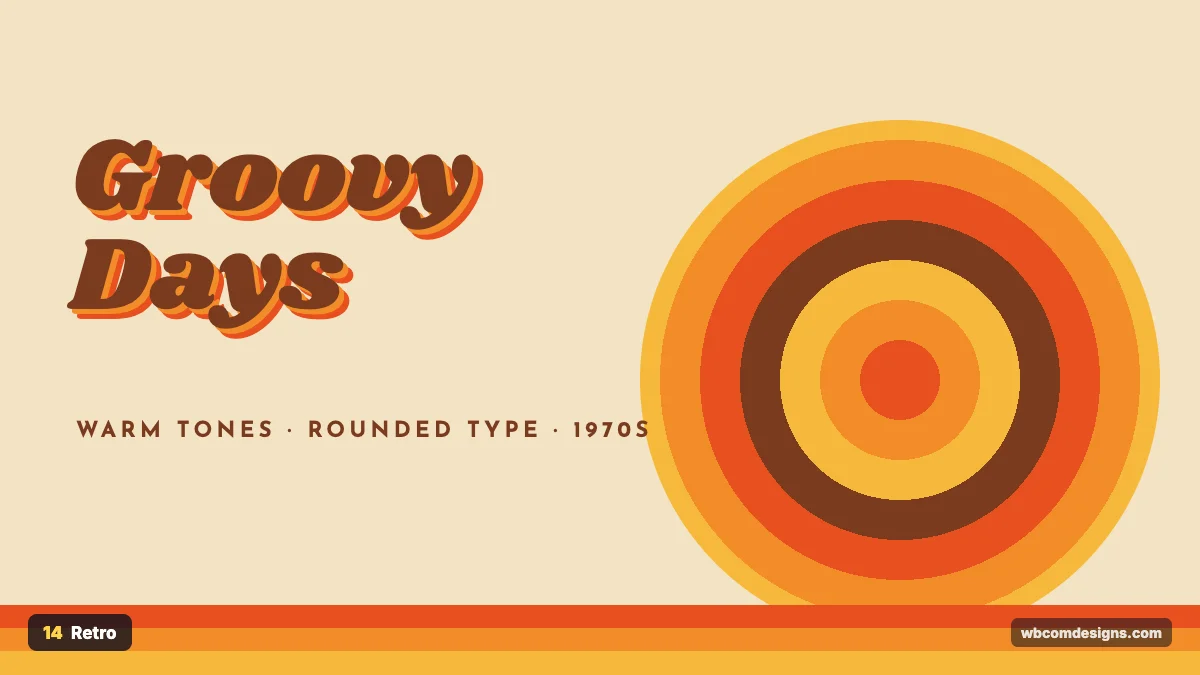
Where it came from. “Retro” can mean many decades, but in design today it usually points to the 1970s, with its warm oranges and browns and its love of Cooper Black type. Burger King’s 2021 rebrand, which brought back a logo inspired by its 1969 design, is one of the best-known recent examples.
What it looks like. Warm earthy palettes, rounded chunky type, sunbursts, stripes and slightly faded print textures.
Where it works. Food and drink, record labels, cafés, craft beer, vintage clothing and lifestyle brands with a sense of humour. It can feel like a costume on a bank or a SaaS tool, where people expect current and reliable.
How to use it. Pick a display font like Shrikhand or Cooper and pair it with a simple sans serif. Use stripes and circles built in CSS. A light grain texture overlay sells the age. Keep navigation and buttons modern so the site still works like a 2026 site.
15. Art Deco
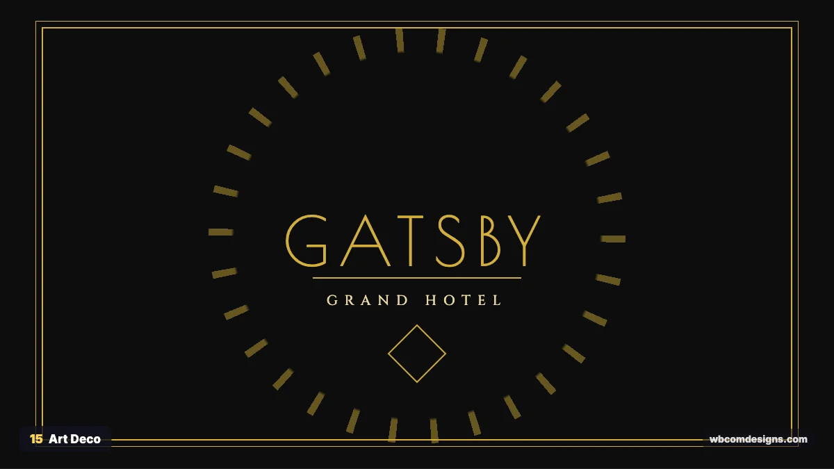
Where it came from. The name comes from the 1925 Exposition internationale des Arts décoratifs in Paris. The style defined the Jazz Age, from the Chrysler Building in New York to the great ocean liners. Baz Luhrmann’s The Great Gatsby in 2013 brought it back into fashion.
What it looks like. Black and gold, symmetrical layouts, fan and sunburst shapes, stepped frames and tall, elegant geometric type.
Where it works. Hotels, cocktail bars, weddings, theatres, perfume and jewellery. It feels wrong for budget brands or anything aimed at teenagers. Gold and symmetry promise luxury, so the product has to live up to it.
How to use it. Use a geometric display font like Poiret One or Limelight with wide letter spacing. Centre your layouts and frame them with double borders. Gold works best as an accent on deep black or navy, not as large blocks.
16. Victorian
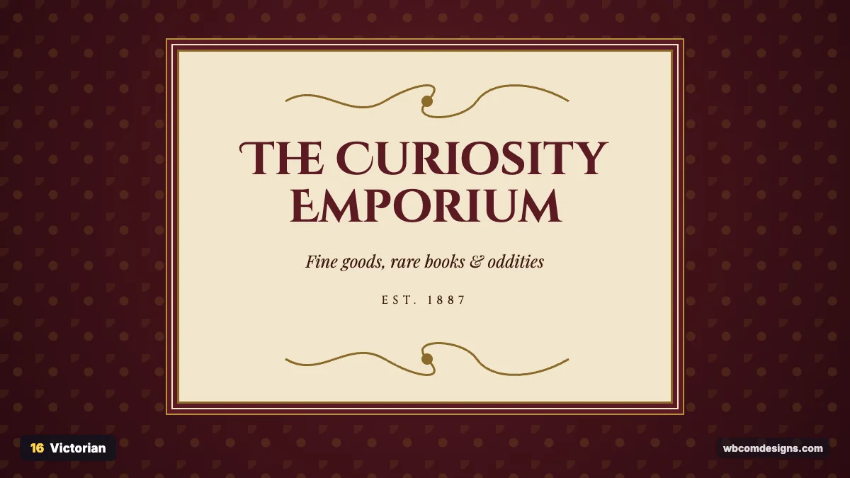
Where it came from. The Victorian era covers Queen Victoria’s reign from 1837 to 1901. Printing presses and new wood type made it possible to mix many decorative fonts on one poster, and chromolithography added colour. William Morris and the Arts and Crafts movement brought rich patterns into homes and books.
What it looks like. Ornate frames, flourishes, damask patterns, deep burgundy and green, cream paper, and decorative serif or blackletter type.
Where it works. Whisky and gin, barbershops, apothecary-style skincare, bookshops, tea rooms and heritage brands. Avoid it for tech or health brands. Ornament reads as old, and those audiences want to see something current.
How to use it. Keep the ornament in frames and dividers, and keep body text plain and readable. Fonts like Cinzel Decorative or Playfair work well for headings. SVG flourishes stay sharp at any size and weigh far less than scanned images.
17. Memphis
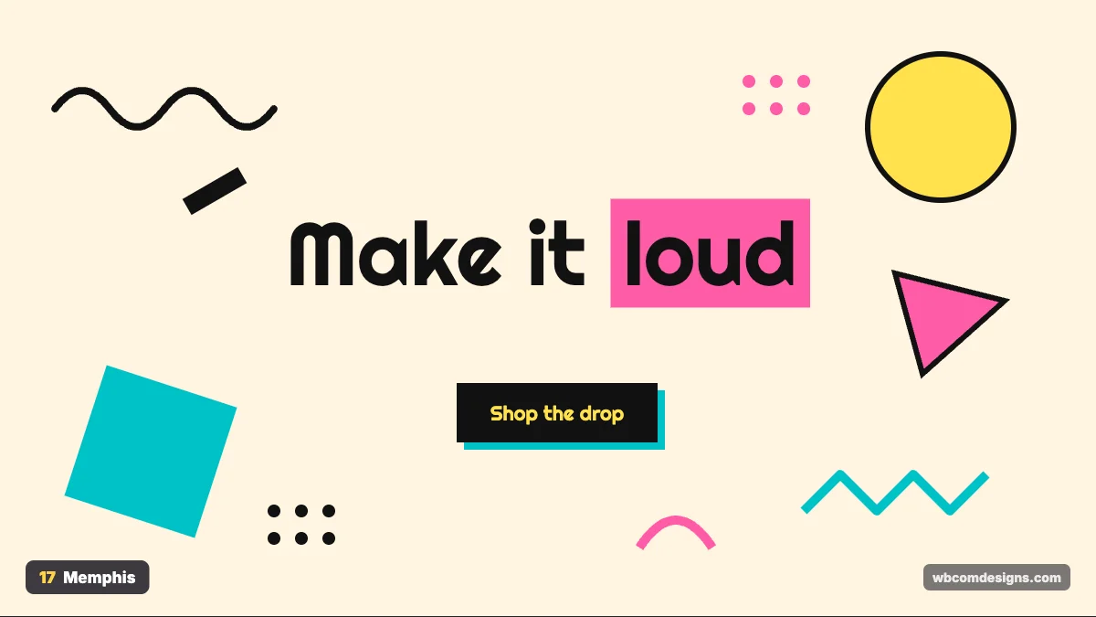
Where it came from. The Memphis Group was founded in Milan in 1981 by Ettore Sottsass. The name came from the Bob Dylan song “Stuck Inside of Mobile with the Memphis Blues Again”, which was playing at their first meeting. The group broke up in 1987, but its look shaped 1980s and 1990s pop culture.
What it looks like. Squiggles, zigzags, confetti shapes, dots and clashing bright colours on light backgrounds, often with thick black outlines.
Where it works. Youth brands, events, festivals, toy shops, creative agencies and social media graphics. It is hard to take seriously, so keep it away from healthcare and financial products.
How to use it. Scatter SVG shapes around the edges and keep the centre clear for content. Use one heavy display font. Hard offset shadows on buttons fit the style perfectly.
18. Pop Art
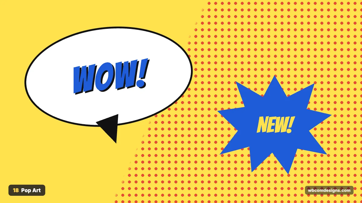
Where it came from. Pop Art began in Britain in the 1950s and exploded in the United States in the 1960s with Andy Warhol and Roy Lichtenstein. Lichtenstein’s comic-strip paintings, such as Whaam! from 1963, made Ben-Day dots and speech bubbles into fine art.
What it looks like. Halftone dots, comic speech bubbles, bold outlines, primary colours and exclamations like POW and WOW.
Where it works. Sale campaigns, product launches, media brands, comics and anything that needs to grab attention quickly.
How to use it. Make halftone patterns with a repeating CSS radial gradient. Use a comic font like Bangers for short words only. Keep it for campaigns and banners rather than whole sites, because it tires the eye fast.
19. Y2K
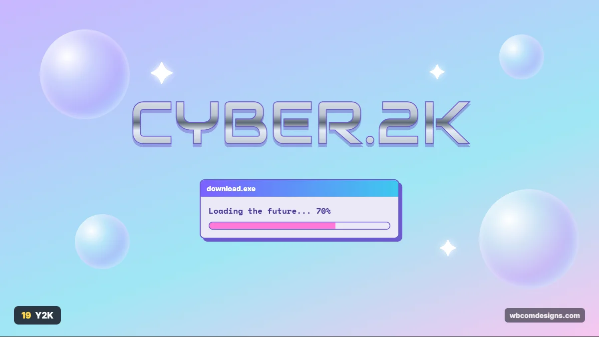
Where it came from. The late 1990s and early 2000s, when the new millennium felt exciting. Apple’s translucent iMac G3 in 1998, chrome logos, bubbly Windows XP and early internet culture all fed into it. Gen Z revived it in fashion and music around 2020.
What it looks like. Chrome and metallic type, iridescent bubbles, sparkles, lilac and cyan gradients, and old operating system windows.
Where it works. Fashion, music, beauty, nightlife and brands talking to people under 30. Outside fashion and music it can look like a joke, and it will date quickly once the revival fades.
How to use it. Fake chrome with a multi-stop linear gradient clipped to text using background-clip: text. Add a few bubbles and stars, not dozens. Fonts like Audiowide or Michroma give the techno feel.
20. Pixel Art
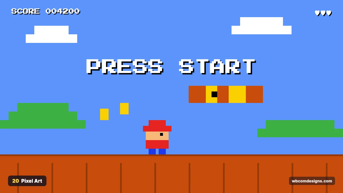
Where it came from. Early computers and consoles like the NES in the 1980s could show only a few colours at low resolution, so artists drew pixel by pixel. Indie games like Stardew Valley in 2016 and Celeste in 2018 proved the style still has a huge audience.
What it looks like. Visible square pixels, limited palettes, blocky fonts and game interface details like scores and hearts.
Where it works. Games, developer tools, tech merch, 404 pages and playful landing pages.
How to use it. When you scale pixel images, set image-rendering: pixelated so they stay crisp. Use a pixel font like Press Start 2P for headings only, because it is hard to read at length. Stick to a palette of 8 to 16 colours.
Bold and expressive styles
These styles want a reaction. They work when your brand has a strong personality, and they are hard to pull off for a cautious one.
21. Maximalism
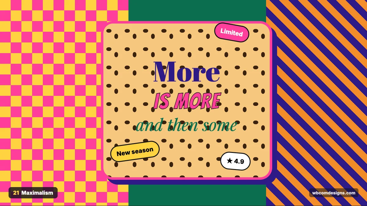
Where it came from. Maximalism is the answer to minimalism. Architect Robert Venturi summed it up in 1966 by twisting Mies van der Rohe’s “less is more” into “less is a bore”. In fashion, Gucci under Alessandro Michele from 2015 made clashing prints and excess look luxurious.
What it looks like. Layered patterns, several typefaces, bright clashing colours, stickers, textures and very full pages.
Where it works. Fashion, art, lifestyle, beauty and creative portfolios that want to show personality. Avoid it when visitors need to finish a task fast, such as booking or support pages, because every extra pattern slows the eye down.
How to use it. Controlled chaos still needs a hierarchy. Keep the main headline and the main button unmistakable, then let the rest go wild around them. Test on mobile early, where crowding gets worse.
22. Brutalism
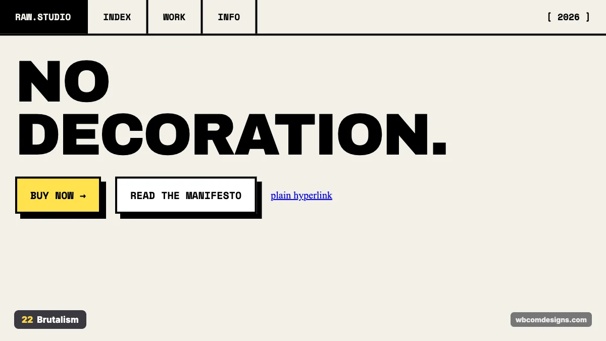
Where it came from. The name comes from Brutalist architecture and the French phrase béton brut, meaning raw concrete. Web brutalism picked up around 2014, when the site Brutalist Websites started collecting raw, unpolished designs. Neo-brutalism followed in the 2020s, with Gumroad’s redesign as a famous example.
What it looks like. Thick black borders, hard offset shadows, monospace or heavy grotesque type, default blue links and bright flat backgrounds. It looks unfinished on purpose.
Where it works. Design studios, indie products, developer tools, zines and brands that want to look honest and anti-corporate. Keep it off checkout and signup flows. Raw styling there can look broken, and people abandon forms that look broken.
How to use it. Use border: 3px solid #000 and box-shadow: 8px 8px 0 #000 on cards and buttons. Pair a heavy font like Archivo Black with a monospace. Good brutalism is still well organised underneath.
23. Futuristic and Cyberpunk
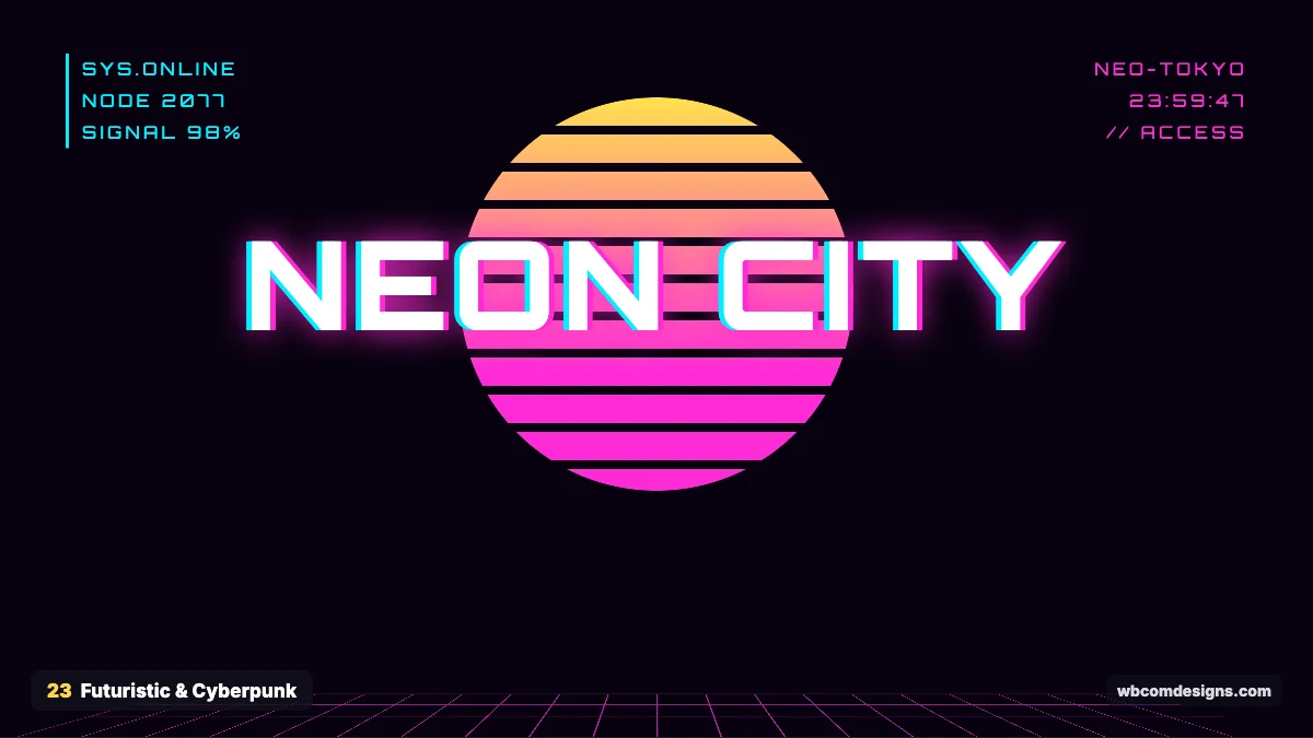
Where it came from. Ridley Scott’s Blade Runner (1982) and William Gibson’s novel Neuromancer (1984) defined the cyberpunk look: neon-lit cities and high tech next to decay. Tron (1982) gave us glowing grids. The synthwave music scene and the game Cyberpunk 2077 (2020) kept it alive.
What it looks like. Dark backgrounds, neon magenta and cyan, glowing grids, glitch effects, HUD-style labels and squared, techy type.
Where it works. Gaming, esports, crypto and Web3, tech events and electronic music. Dark neon screens are tiring for long reading and can feel aggressive for family or wellness brands.
How to use it. Make neon glow with stacked text-shadow values. A glitch look comes from offsetting copies of text in cyan and magenta. Fonts like Orbitron fit headings. Keep body copy in a normal sans serif so it stays readable.
24. Graffiti
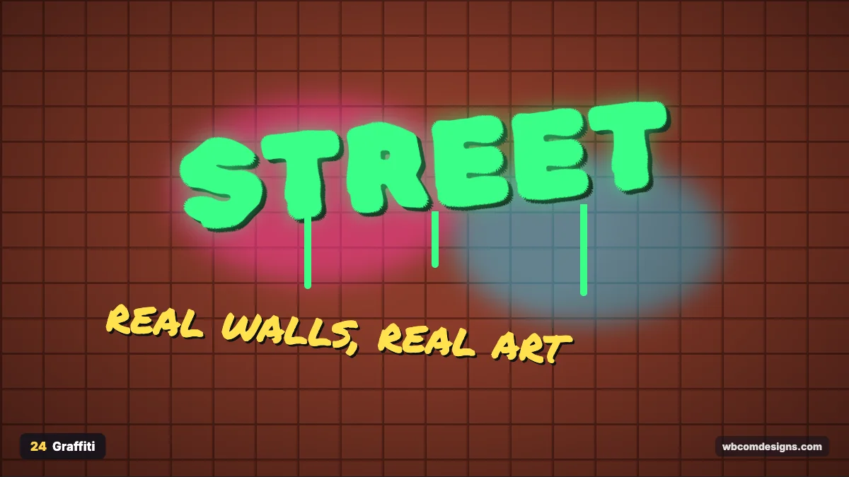
Where it came from. Modern graffiti grew on the subway trains and walls of New York in the late 1960s and 1970s. A 1971 New York Times story about the tagger TAKI 183 helped turn it into a movement, and it later fed into hip-hop culture.
What it looks like. Spray-paint lettering, drips, tags, brick and concrete textures and bright colours against dark, gritty backgrounds.
Where it works. Streetwear, music, skate and sports brands, youth programmes and urban events. Avoid it for corporate or medical brands, where it reads as vandalism rather than energy.
How to use it. Use graffiti fonts such as Rubik Spray Paint or Permanent Marker for display text only. Backgrounds can be photos of real walls, or a CSS brick pattern. Credit real artists if you use their work, and pay them if you can.
25. Surreal Design
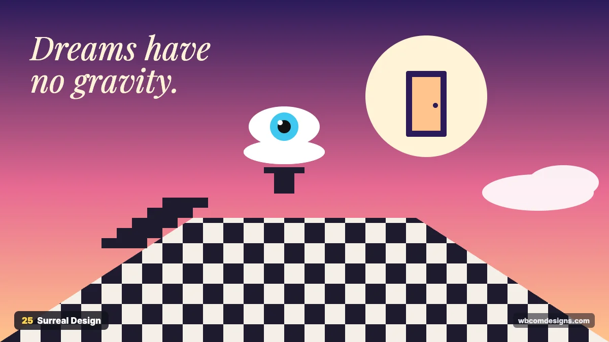
Where it came from. André Breton’s Surrealist Manifesto in 1924 launched the movement, and painters like Salvador Dalí and René Magritte made it famous. Digital tools and 3D software have made dreamlike scenes a big trend in campaigns and album art.
What it looks like. Impossible scenes: doors in the sky, floating eyes, stairs to nowhere, checkerboard floors and gradient sunsets.
Where it works. Ad campaigns, creative agencies, music, fashion editorials and any brand that wants to be remembered.
How to use it. Keep one surreal idea per image so the message stays clear. Combine it with simple, readable type. Surreal visuals work best in heroes and campaign pages, not in forms or checkout.
Handmade and organic styles
These styles feel human. They show the hand of the maker or borrow from nature, which helps brands look warm and approachable.
26. Vector Art
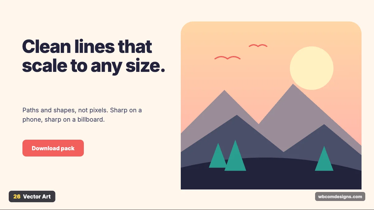
Where it came from. Vector graphics are built from mathematical paths instead of pixels, so they scale to any size without blurring. Adobe Illustrator launched in 1987, and SVG became a web standard in 2001. Flat vector illustration became the visual voice of tech companies in the late 2010s.
What it looks like. Clean shapes, smooth curves, flat or gently graded colour and simple scenes.
Where it works. Product sites, explainer sections, onboarding, blog headers and icons. The risk is blandness. Generic vector people with long limbs have been used so often that they now look like stock art.
How to use it. Export illustrations as SVG and optimise them with a tool like SVGO. SVGs are often a few kilobytes and stay sharp on retina screens. Keep a consistent palette and line weight across all illustrations so they look like one family.
27. Collage Art
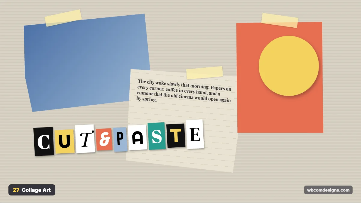
Where it came from. Pablo Picasso and Georges Braque glued paper into paintings around 1912. Dada artists like Hannah Höch pushed photomontage further, and punk graphics in the 1970s, such as Jamie Reid’s ransom-note lettering for the Sex Pistols, made cut-and-paste a rebel language.
What it looks like. Torn paper, tape, mixed photos, newspaper text and letters cut from different sources, all layered at slight angles.
Where it works. Music, culture magazines, fashion, art events and campaigns that want a raw, handmade feel. It is a poor fit for interfaces people use daily, such as dashboards, because the visual noise slows them down.
How to use it. Use CSS clip-path to make torn edges and small rotations so pieces feel placed by hand. Mix a few real photos with flat colour shapes. Keep the actual reading text clean and straight.
28. Bohemian
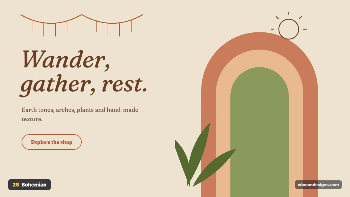
Where it came from. “Bohemian” described the artists and writers of 19th century Paris who lived outside social rules. The hippie movement of the 1960s and 1970s gave it its earthy look, and boho chic returned in 2000s fashion and later in Instagram interiors.
What it looks like. Terracotta, sand, sage and rust, arch shapes, plants, macramé, sun and moon line drawings and soft serif type.
Where it works. Yoga studios, home decor, handmade goods, travel, wellness retreats and lifestyle blogs. Avoid it for tech and B2B products. Earthy arches and macramé suggest slow living, not speed.
How to use it. Arches are easy with border-radius on the top corners. Pair a soft serif like Fraunces with warm photography. Add thin line illustrations rather than heavy graphics.
29. Handwritten
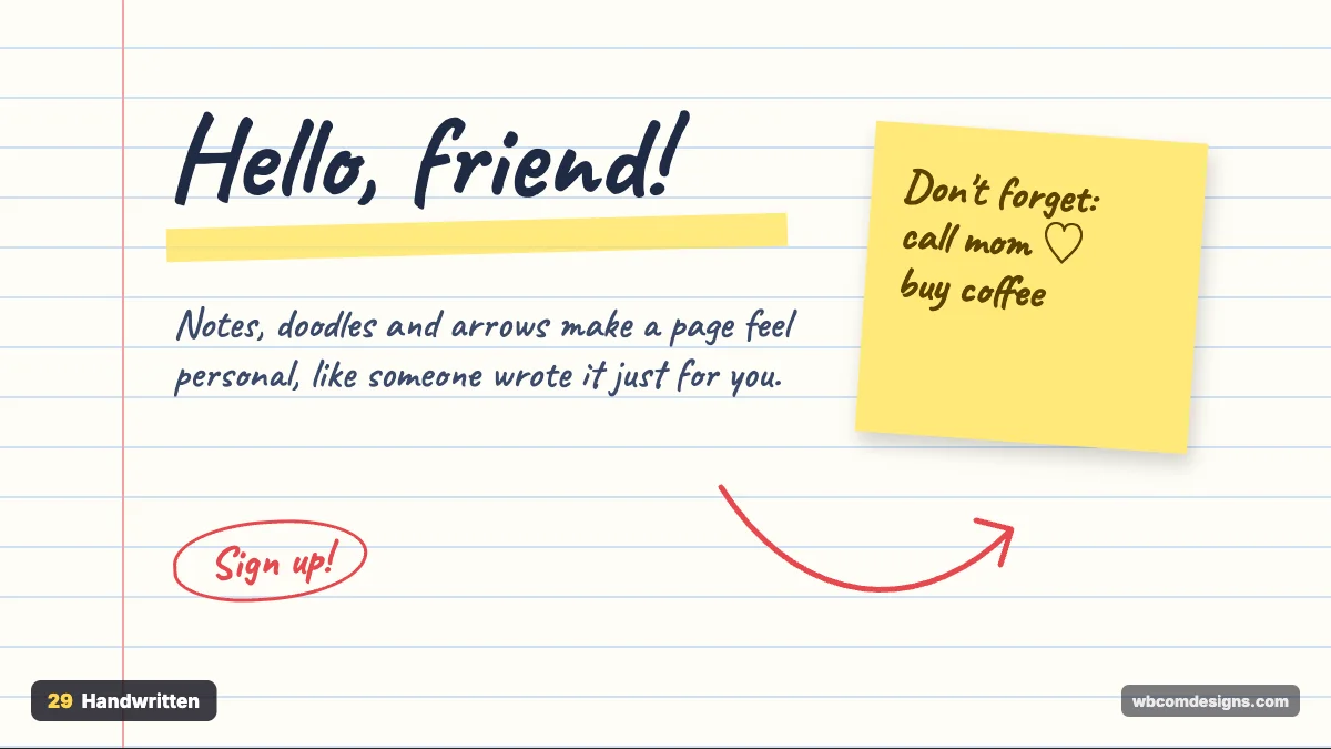
Where it came from. Hand lettering is as old as signs. On the web it grew with handwriting fonts on Google Fonts and brands like Innocent Drinks, whose scribbled, chatty packaging made the style feel friendly and honest.
What it looks like. Script headings, doodled arrows, sticky notes, highlighter marks and lined paper.
Where it works. Small businesses, education, personal blogs, kids’ brands, food and community sites. Never use handwriting fonts for body text or prices. They slow reading and look careless in serious places.
How to use it. Use a handwriting font like Caveat for headings and short notes only. Body text should stay in a clear sans serif. Hand-drawn SVG arrows that point at your call to action can lift clicks without looking salesy.
30. Organic
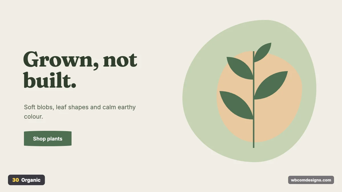
Where it came from. Art Nouveau around 1890 to 1910 drew on plants and flowing lines. Today’s version is linked to biophilic design, the idea that people feel better around natural forms. On the web, soft blob shapes became popular around 2019.
What it looks like. Irregular blobs, leaf shapes, earthy greens and sand tones, rounded buttons and calm photography.
Where it works. Wellness, skincare, food, sustainability brands, plant shops and health services. It can feel vague for products that need precision, like developer tools, where sharp grids build more trust.
How to use it. Make blobs with uneven border-radius values like 62% 38% 46% 54% / 55% 48% 52% 45%. Use a soft serif for headings. Leave lots of space, because organic shapes need room to look natural.
How to choose a design style for your website
Start with your audience, not your taste. A style you love can still be wrong for the people you serve. A retirement community would struggle with Cyberpunk, and a gaming clan would find Swiss Design dull.
Then look at what your site has to do. Content-heavy sites such as publishers, membership sites, course platforms and online communities need styles that keep text readable for long sessions: Minimalism, Editorial, Swiss or Material. Campaign pages and launches can afford louder styles like Pop Art or Memphis, because people only stay a few minutes.
Check your competitors too. If every company in your niche uses flat blue illustrations, a Bauhaus or Editorial approach will stand out immediately.
Finally, think about how long the style will last. Classic styles such as Minimalism and Editorial rarely look dated. Trend styles like Neumorphism or heavy glassmorphism can feel old in two or three years, so use them in accents you can swap out easily.
If you run a WordPress community or membership site, the theme sets most of this for you. Our BuddyX theme follows a clean, minimal base that you can push towards other styles with your own colours and a little custom CSS. Reign gives you more layout options when you want a stronger look out of the box.
Mixing styles without making a mess
Most good websites combine two styles. Picture a minimal layout with one glassmorphism hero, or an editorial blog with handwritten notes in the margins.
The rule that keeps it clean: one style sets the structure, the other adds accent. Structure means grid, spacing, body type and line length. Accent means colour and illustration, plus one or two signature components. When both styles fight for structure, the site feels confused.
Keep typography in check as well. Two typefaces is plenty for most sites. If you need a third, use it for a single purpose only, such as numbers or quotes.
For more on picking type that matches your style, see our guide to typography trends. To see how interface styles evolved from skeuomorphism to Material and Fluent, read modern UI design styles and where each fits. For what is shaping websites this year, our list of web design trends to watch picks up where this guide ends.
Frequently asked questions
What is the difference between a design style and a design trend?
A style is a complete visual language with its own history and rules, like Swiss Design or Art Deco. A trend is a popular technique at a given moment, like aurora gradients or bento grids. Trends sometimes grow into styles, and styles regularly come back as trends.
Which design style is best for a business website?
For most businesses, Minimalism or Swiss Design is the safest base, because they keep content clear and work on every device. Add personality through colour and photography rather than changing the whole structure.
Is glassmorphism bad for accessibility?
It can be. Text on semi-transparent panels over busy backgrounds often fails the WCAG contrast ratio of 4.5:1 for normal text. Raise the panel opacity or darken the background behind it, then test with a contrast checker.
Is skeuomorphism coming back?
Partly. Apple’s Liquid Glass brings depth and light back into interfaces, and many designers use realistic touches in small doses. A full return to leather and wood textures across whole apps is unlikely.
Can I use these styles on a WordPress site?
Yes. Most of these styles come down to fonts, colours, spacing and a few CSS properties. In a block theme you can set them in theme.json and Global Styles. In a classic theme, the Customizer plus a small custom CSS file goes a long way.
How many design styles should one website use?
One main style, and at most one accent style. More than that and visitors stop recognising your brand from page to page.
Pick the style your audience will trust and build it into your grid and type first. The fun can come later. A clear style choice made early is worth more than a hundred small fixes after launch.
Related reading