
27 min read
Not Getting High-Net-Worth Clients? Run This 5-Step Audit Before You Redesign Anything


A business owner notices inquiries have slowed down, opens the analytics dashboard, sees traffic is flat or falling, and reaches the same conclusion almost every time: the website needs a redesign. New homepage, new colors, new hero image, maybe a whole new platform. Six weeks and several thousand dollars later, the inquiries are exactly where they were before, because the website was never actually the problem that traffic chart made it look like.
Traffic is the symptom businesses can see. It is rarely the disease. A site that is not converting the visitors it already has will not convert more visitors either, and a redesign that does not address the real bottleneck just produces a better-looking version of the same leak, often at real expense and after real delay. This piece walks through a five-step audit, attention, relevance, credibility, differentiation, and follow-up, built specifically for small businesses trying to attract high-net-worth clients without blowing up a strategy that might already be closer to working than it looks.
None of the five steps requires a new website to run. Most of them can be completed in an afternoon with the analytics you already have open, a phone, and an honest half hour.
Worth being specific about the audience here. Everything below applies to small businesses in general, but it applies with extra force to businesses trying to attract affluent or high-net-worth clients specifically, because that audience has a narrower margin for error at every single one of the five checkpoints. A mainstream consumer business can survive a slightly generic page or a slow follow-up because volume covers for it. A business closing a handful of high-value relationships a year cannot. One lost inquiry in that model is not a rounding error. It is a meaningful fraction of the year’s new business.
In this post
- The redesign reflex, and why it usually fails
- The five-signal audit
- Why this framework matters more for high-net-worth acquisition
- Signal one: attention
- Signal two: relevance
- Signal three: credibility
- Signal four: differentiation
- Signal five: follow-up
- The data behind diagnosing before redesigning
- A worked example: running the audit on one business
- How to run this audit on your own site this week
- What not to change
- Frequently asked questions
The Redesign Reflex, and Why It Usually Fails
Eighty point eight percent of businesses that start a redesign do it because the existing site is not converting visitors into customers. That number tells you something important before a single design decision gets made: most redesigns are triggered by a symptom, falling conversions, rather than a diagnosis of why conversions are falling. Treating the symptom by changing the surface, new layout, new photography, new font, leaves the underlying cause untouched, which is why so many redesigns disappoint.
There is also a psychological reason the redesign reflex is so persistent, separate from whatever the data actually says. A redesign feels like doing something. It produces visible output, new pages to review, new colors to approve, a launch date to anticipate, in a situation that otherwise feels stuck and directionless. An audit, by comparison, can feel like delay. It asks a business owner to sit with the discomfort of not acting for a week or two while the real cause gets identified, and that discomfort is precisely why so many businesses skip straight to the visible fix instead.
The research on redesign outcomes backs this up directly. Site-wide conversions across the industry dropped by roughly 6.1 percent in a recent year, and even a redesign built on real user research produced a double-digit conversion drop in one documented case. Redesigns are not automatically an improvement. A cosmetic refresh with no strategy behind it is close to a coin flip.
The contrast is in what happens when a redesign is strategy-led rather than cosmetic. A redesign grounded in actual user research and a defined conversion goal delivers an average 41 percent return within six months, and a full strategy-led rebuild averages 68 percent return within nine months. Some strategically redesigned sites post conversion gains above 170 percent annually. The gap between those numbers and the ones above is not the redesign itself. It is whether anyone diagnosed the actual problem before reaching for a design tool.
That diagnosis is what the five-signal audit below is for. Run it first. If the audit turns up a genuine design or usability failure, forty-two percent of visitors say they would leave a site specifically because of poor functionality, then redesign that specific piece. If it turns up something else, and for most small businesses serving affluent clients it usually does, you will have saved the redesign budget for the moment it is actually needed.
The Five-Signal Audit
Every website interaction that leads to a client relationship passes through five checkpoints in order. A failure at any one of them stops the process, regardless of how well the later checkpoints perform. A beautifully designed, highly credible site that nobody sees fails at attention. A site with heavy, well-targeted traffic that takes three days to respond to an inquiry fails at follow-up. Both failures look identical on a traffic report. Neither gets fixed by a redesign.
Think of it less like a single dashboard metric and more like a chain. A chain’s strength is its weakest link, not its average link, and a business that spends its redesign budget reinforcing a link that was already holding fine gets nothing for the money beyond a better-looking chain that still snaps in the same place.
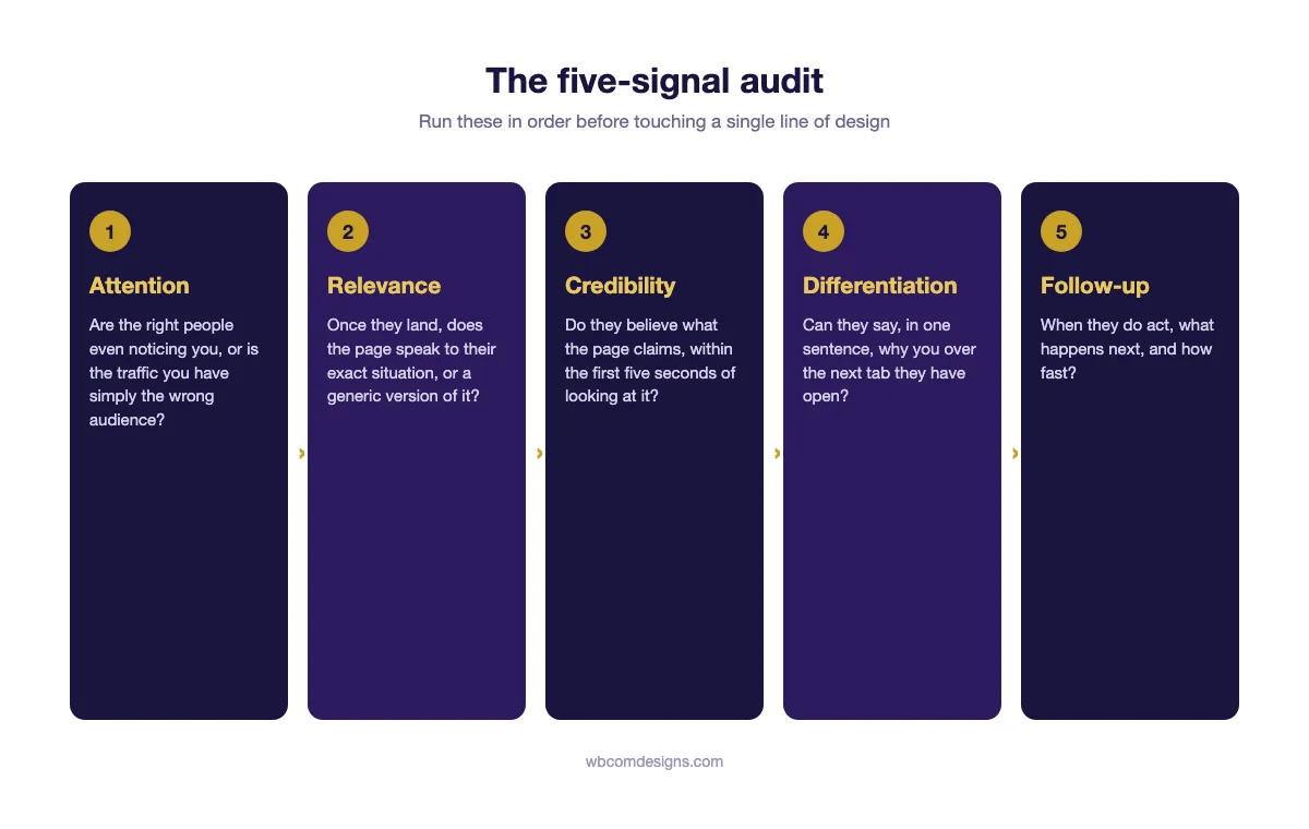
The order matters. Attention has to work before relevance can matter, relevance has to land before credibility gets evaluated, and so on down the chain. Auditing out of order, jumping straight to a credibility fix when the real problem is attention, wastes effort on a stage the visitor never reached in the first place.
Why This Framework Matters More for High-Net-Worth Acquisition
A mainstream retail business can run on volume economics. Thousands of visitors, a small single-digit conversion rate, a modest average order value, and the math still works because the numbers are large enough to smooth over individual failures. A business trying to win affluent clients does not get to rely on that kind of volume. The addressable audience is small by definition, the sales cycle is long, and a single relationship can represent a meaningful share of annual revenue. That changes what “good enough” looks like at every one of the five checkpoints.
Take attention first. A consumer brand with imprecise targeting can absorb a lot of wasted ad spend because the cost per acquisition is low and the volume is high. A wealth advisory practice targeting the wrong demographic is not just wasting a modest ad budget, it is spending the limited hours of a senior partner’s week responding to inquiries that were never going to close, time that has a real opportunity cost measured against the handful of real prospects who might have been reached instead with the same budget spent more narrowly.
Relevance and credibility compound the same way. An affluent buyer evaluating a six-figure or seven-figure decision is, almost by definition, more skeptical and better informed than an impulse buyer comparing two pairs of shoes. They have advisors of their own, they have been burned by a slick pitch before, and they read a generic page as a red flag rather than a neutral default. The bar a page has to clear to be believed is simply higher for this audience than it is for most consumer categories, which is exactly why the credibility research cited throughout this piece skews so heavily toward professional-services and luxury contexts rather than general e-commerce.
Follow-up carries the highest stakes of all five signals in this context, for a reason specific to how affluent buyers actually shop. They are rarely choosing between one option and nothing. They are almost always choosing between you and two or three other qualified firms they are evaluating in parallel, often in the same week. The firm that responds first does not just get to the prospect before anyone else. It gets to set the frame the rest of the comparison happens inside, while the slower competitors are reduced to comparing themselves against a relationship that has already started.
Signal One: Attention
Attention is not the same question as traffic volume, and conflating the two is where most audits go wrong from the first step. The question is not how many people are visiting. It is whether the people visiting are the ones who could plausibly become a client.
A spike in traffic with flat sales is usually a sign of exactly this mismatch. Bulk, low-cost traffic sources, broad social ads, content aimed at a general audience, SEO targeting keywords a wealthy prospect would never actually search, inflate the visitor count while doing nothing for the pipeline, because the visitors arriving were never going to buy. A business chasing more traffic under those conditions is optimizing the wrong variable entirely.
How to check it. Pull up your analytics and look past the top-line visitor count to where the traffic originates and how it behaves once it lands. A geographic mismatch, visitors from regions where you do not serve clients, is an obvious flag. So is a referral source known for low intent, a viral social post, a broad directory listing, paired with a bounce rate well above your site average. If a channel is sending volume but almost nobody from it ever reaches a contact page, that channel is not an attention problem to fix with more spend. It is evidence the targeting itself is wrong.
A scenario. A boutique financial planning firm targeting pre-retirees with investable assets above two million dollars had been running broad Facebook ads for a year, generating a steady stream of clicks and a respectable cost per click. Inquiries had not moved. A channel breakdown showed the ads were drawing heavily from a demographic in their twenties and thirties, curious about personal finance content but decades away from the firm’s actual client profile. The ad spend was working exactly as built. It was simply built to attract the wrong audience. Redirecting the same budget toward a narrower LinkedIn campaign targeting job titles and account sizes closer to the real client profile cut total traffic by roughly a third and increased qualified inquiries within the first month.
Notice what the fix was not. It was not a new homepage, a new logo, or a faster site. It was a decision about who to show the existing site to, made with a budget the firm already had. That is the general shape of nearly every attention fix: redirecting spend or effort toward a narrower audience, rather than producing more of either.
Signal Two: Relevance
Once the right visitor arrives, relevance determines whether the page speaks to their specific situation or to a generic version of it. This is where personalization research gets concrete. Sites with personalized content see an average conversion rate of nineteen percent, against 2.9 percent for sites without it, a difference of more than six times. Personalized calls to action perform 202 percent better than generic ones.
For a business serving affluent clients, relevance usually fails in one specific way: the page talks to everyone who might ever need this category of service, rather than to the specific person who is currently reading it. A wealth management homepage that opens with “we help individuals and families achieve their financial goals” is relevant to almost nobody, because it describes nearly every financial services business in existence. A page that opens by naming the exact situation a visitor is likely in, a recent liquidity event, an inherited portfolio that needs restructuring, a retirement horizon inside five years, speaks directly to someone who recognizes themselves in the first sentence.
The fix is not necessarily building ten separate landing pages for ten separate situations, though that can help once you know which situations actually drive your inquiries. Often the smaller, faster version of the fix is rewriting a single homepage’s opening section to name two or three of your most common client situations explicitly, instead of describing the service category in the abstract. A visitor scanning for themselves in that list either finds it in the first few seconds or decides, often without fully realizing it, that the page was not written with them in mind.
How to check it. Read your own homepage as if you were three different prospective clients with three different situations. If the page reads identically no matter which persona you imagine, it is written for a category rather than a person, and that is the fix, not a new layout.
A scenario. An estate planning attorney’s website had a single services page listing wills, trusts, probate, and power of attorney, written identically for every visitor regardless of what brought them to the site. Two very different visitors land on that page: a parent in their thirties setting up a first will after having a child, and a family dealing with a parent’s sudden incapacity who needs a power of attorney processed this week. Splitting the single generic page into two landing pages, one for proactive estate planning and one for urgent incapacity situations, each opening with language specific to that visitor’s actual circumstance, raised the contact-form completion rate on both pages without any change to the firm’s actual services or pricing.
Signal Three: Credibility
Credibility is the stage where a visitor decides whether to believe what the page is telling them, and it happens fast. Seventy-five percent of users judge a company’s credibility by design and content quality within five seconds, and eighty-two percent of buyers disqualify a service provider based on first impressions before any conversation takes place. We covered this signal in depth in a separate piece on why affluent clients trust judgment over a feature list, since credibility for this audience is less about polish and more about whether the site demonstrates a specific, provable point of view rather than a generic claim of expertise.
Within this audit specifically, the useful distinction is between a credibility problem and a design problem, because the two get confused constantly. A dated-looking site with specific, named, checkable claims will often out-convert a beautifully built site full of vague ones, because the visitor is evaluating believability, not aesthetics, even if they would describe their reaction as “the site looked unprofessional.” Fix the vagueness first. If credibility still reads weak once the claims are specific and real, that is the point where a genuine design issue, not just a missing fact, becomes the likely explanation.
For the purposes of this audit, the fast check is simpler than a full rewrite. Open your site on a phone and give yourself five seconds per page, homepage, about page, one service page. If nothing on the page in that window gives a skeptical visitor a specific, falsifiable reason to believe you, stock photography, vague claims of excellence, no named person behind the expertise, credibility is the signal failing, and it is very rarely fixed by a new color palette.
A scenario. A private tutoring and college-counseling service for affluent families had strong traffic and reasonable relevance, the landing pages were specific to each grade level, but inquiries consistently stalled after the first page view. The about page listed credentials in a bulleted format with no names attached, “Ivy League-educated counselors, fifteen years combined experience.” A skeptical parent reading that sentence has no way to verify it and no person to picture. Replacing it with two short, named counselor bios, each with a specific track record, one sentence about a real result for a real family, described without identifying the family, closed a measurable share of the gap between page views and booked consultations within a few weeks, with no other change to the site.
The underlying issue in that case was never the font or the layout of the about page. It was that the copy described a category of expertise rather than a specific, checkable instance of it. The same gap shows up constantly on sites that look perfectly modern and well built, which is why a design refresh so often leaves a credibility problem untouched.
Signal Four: Differentiation
A visitor who believes you are credible still has to answer one more question before acting: why this business instead of the other three tabs they probably also have open. Differentiation is where a feature list does the most damage, because a feature list, by definition, lists what every competitor in the category also offers.
Eighty-five percent of luxury customers say a brand’s reputation and authenticity matter more than the product or service itself, which means differentiation for this audience rarely comes from a capability a competitor lacks. It comes from a stated way of working that a competitor would not or could not claim. A boutique that only takes twelve clients at a time, an advisor who publishes their actual decision-making process instead of a generic philosophy statement, a firm that names the specific type of client situation it handles better than anyone else in the market.
How to check it. Pull up your three closest competitors’ homepages next to yours. Read only the opening section of each, with logos hidden if you can manage it. If you cannot tell which business wrote which paragraph, differentiation is the signal failing, and it has nothing to do with how any of the four sites look.
A scenario. A luxury property management company serving second-home owners had a homepage nearly identical in structure and claims to its two closest local competitors, full-service management, 24/7 support, trusted by homeowners. All three statements were true of all three companies. The differentiator that actually existed, and had simply never been written down, was that the company’s owner personally walked every property before onboarding a new client, a practice the larger competitors could not replicate at their scale. Making that single fact the opening line of the homepage, rather than burying it in a services list, gave prospective clients a concrete, specific reason to choose this company that a bigger competitor genuinely could not match.
The differentiator in that case had existed the entire time. It simply was not written anywhere a prospective client could find it before deciding to call a competitor instead. That is a more common version of a differentiation failure than businesses expect. The problem is rarely that nothing sets you apart. It is that whatever does set you apart is sitting in the owner’s head instead of on the page.
Signal Five: Follow-Up
This is the signal most small businesses lose the most ground on, and it has nothing to do with the website’s design at all. A lead who responds to a slow follow-up is not lost to a better-designed competitor. They are lost to whichever business picked up the phone first.
The research here is stark. A lead contacted within five minutes is roughly one hundred times more likely to connect and convert than one contacted thirty minutes later, and responding within the first minute produces a 391 percent lift in conversion compared to waiting even a few minutes longer. Seventy-eight percent of buyers choose the first business that responds to their inquiry, independent of who had the stronger offer. And yet the average local business takes 47 hours to respond to a web lead, while most prospects have moved on within the first hour of submitting the form.
The gap is not just speed. It is persistence. Eighty percent of sales require five or more follow-up touches to close, but most salespeople give up after one or two attempts, and forty-four percent never follow up with a lead at all. For a business serving affluent clients, where a single closed relationship can be worth years of revenue, that gap is often the single most expensive problem on this entire list, and it is also the cheapest one to fix.
How to check it. Submit your own contact form, from a personal device, at a normal business hour, and time how long it takes for a human response to arrive. Do it again at an inconvenient hour, a Friday evening, a Monday before anyone is in the office, since that is when a meaningful share of real inquiries actually land. If either test takes longer than you would be comfortable admitting to a client, this signal is the one to fix first, and it is usually a process change rather than a website change.
A scenario. A high-end interior design studio had excellent attention, relevance, credibility, and differentiation, every earlier signal in this audit checked out. Inquiries were arriving from well-matched prospects who clearly understood what the studio offered. Bookings, however, stayed flat for months. The studio’s intake process routed every form submission to a shared inbox that nobody checked more than once every two or three days, because the single most senior designer handled it personally between client meetings. Moving first response to a dedicated assistant with a same-day reply standard, with the senior designer only joining once a prospect was already qualified, turned a multi-day response gap into a same-day one, and booked consultations rose within the first month, with the website itself completely unchanged.
This is the scenario worth remembering above all the others in this piece, because it is the one most likely to apply to a reader who has already gotten a redesign quote in hand. A site that is doing everything right can still lose business at the very last step, the human one, that no amount of design work touches at all.
The Data Behind Diagnosing Before Redesigning
The pattern across all five signals is the same one, stated different ways by different researchers: the failure is rarely visible on the traffic report, and it is rarely fixed by the default instinct to redesign.
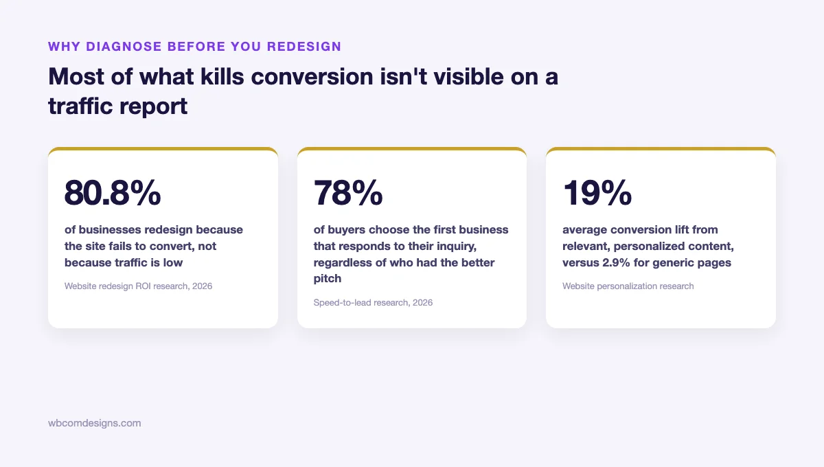
Put the numbers side by side and a sequence becomes visible. Eighty point eight percent of redesigns are triggered by a conversion problem, not a traffic problem, meaning the business already knows something downstream of the visit itself is broken. Seventy-eight percent of buyers choose on response speed alone, a factor that has nothing to do with the website’s design. And a 19 percent conversion rate against 2.9 percent for personalized versus generic content shows that even when a visitor does engage, how specifically the page speaks to them matters more than how polished it looks.
None of those three numbers are design metrics. All three sit upstream or downstream of the part of the funnel a redesign actually touches, which is why a redesign so often leaves the real number, inquiries that turn into clients, exactly where it started.
It is also worth noticing what none of this research says. None of it claims design does not matter, or that a visually dated site has no effect on a visitor’s judgment. It does, and the credibility signal above accounts for that directly. What the research actually shows is narrower and more useful: design is one of five places a funnel can break, not automatically the most likely one, and treating it as the default explanation skips the four checks that would tell you whether it is even the right one to start with.
A Worked Example: Running the Audit on One Business
It helps to see all five signals run against a single business rather than five separate ones, because in practice a real audit rarely stops at the first problem it finds.
A three-partner wealth advisory practice came into a review convinced they needed a full site rebuild. Inquiries had dropped by roughly a third over two quarters, and the partners had already gotten two redesign quotes. Running the five-signal audit instead of approving either quote turned up a different picture.
Attention checked out. Traffic was down slightly but the mix was healthy, mostly referral and a modest, well-targeted LinkedIn presence, with a bounce rate consistent with past performance. Relevance checked out too. The homepage spoke clearly to the firm’s actual niche, business owners approaching a liquidity event, and visitors from that segment were engaging with multiple pages per session. Credibility was reasonably strong, partner bios were specific and named, though thin on documented examples of actual judgment in practice, a minor flag worth a future fix but not the main problem. Differentiation was fine, the firm had a clearly stated position on concentrated stock positions that competitors in the area did not share.
Follow-up was where everything broke down. The firm’s contact form routed to a general inbox monitored by an assistant who triaged inquiries once a day, then forwarded qualified ones to whichever partner had availability, a process that averaged just under three days from submission to first human contact. Two of the firm’s most recent lost prospects, when asked directly why they went elsewhere, both mentioned hearing back faster from a competitor. The redesign under consideration would have touched every signal except the one that was actually broken.
The fix cost nothing beyond a changed internal process: a same-day response commitment, a dedicated partner rotation so no inquiry waited more than four business hours for at least an acknowledgment, and a short, specific message describing exactly what the next step would be. Inquiries converting to a first meeting rose within six weeks. The site itself was never touched.
The part of this example worth sitting with is how close the firm came to spending real money solving a problem that did not exist. Both redesign quotes they had gathered were competent, reasonably priced, and would likely have produced a perfectly good-looking site. Neither one would have touched the actual cause, because neither firm doing the quoting had any visibility into how the practice actually handled an inbound inquiry after it landed. That is not a knock on the design firms involved. It is simply outside what a redesign engagement is built to diagnose, which is exactly why the audit has to happen first, by someone looking at the whole funnel rather than just the part a designer can see.
How to Run This Audit on Your Own Site This Week
The whole audit, run honestly, takes most small businesses a single afternoon. The order below matches the order visitors actually experience the site, which is also the order worth auditing in, since a failure early in the sequence makes everything after it harder to evaluate accurately.
- Attention: pull your traffic sources for the last ninety days and flag any channel with high volume and low engagement. That mismatch, not the overall visitor count, is the number worth acting on.
- Relevance: read your top three landing pages as three different prospective clients. Note every sentence generic enough to belong on a competitor’s site.
- Credibility: give each key page a five-second test on a phone. Write down what a skeptical stranger would actually believe after that five seconds, not what you intended them to believe.
- Differentiation: compare your homepage’s opening section against your three closest competitors’ with logos hidden. If you cannot tell them apart, that is the finding.
- Follow-up: submit your own form twice, once during business hours and once outside them, and time the real response.
Whichever signal fails first in that sequence is very likely the one actually suppressing your results, and it is worth fixing that signal completely before moving further down the list, rather than attempting all five at once.
Write down what you find as you go, even informally. A date, the signal tested, and a one-line result. The value of this record shows up later, not during the audit itself: the next time inquiries dip, you will have a baseline to compare against instead of starting the entire diagnosis from zero, and you will be able to tell quickly whether a new problem looks like a repeat of an old one or something genuinely different.
What Not to Change
The audit above is as much about restraint as it is about diagnosis. A few things are worth protecting explicitly, because the instinct to “fix everything at once” after a slow quarter is strong, and it usually does more damage than the original problem.
This matters more than it sounds like it should, because a business in a slow quarter is also a business under pressure to be seen doing something decisive. Sweeping changes feel decisive. Narrow, evidence-based ones often do not, even when they are the ones more likely to actually work. Resisting that pressure is most of what separates a useful audit from an expensive redesign that solves nothing.
Do not change your URL structure or page slugs as part of a quick fix. Any search visibility you have built, even modest visibility, can take months to recover after a structural change, and almost none of the five signals above require touching a single URL.
Do not abandon a channel that is working just because the overall traffic number looks disappointing. A referral source sending a handful of highly qualified visitors a month is worth more than a social channel sending a thousand uninterested ones, even though the second number looks better on a dashboard.
And do not rewrite copy that is already passing its signal just because a redesign is underway elsewhere on the site. If your credibility section is doing its job, leave it alone while you fix follow-up. Teams that rewrite everything simultaneously lose the ability to tell which specific change actually moved the number, which means the next time something breaks, you are back to guessing instead of auditing.
Finally, do not change your pricing or packaging as a reaction to a slow quarter unless the audit specifically points there. Pricing changes are difficult to reverse cleanly, existing clients notice, and a price cut aimed at a traffic problem will not fix a traffic problem. It just makes the eventual fix more expensive, since you now have to restore pricing on top of solving whatever the audit actually turns up.
Frequently Asked Questions
How do I know if my problem really is design and not one of these five signals?
Run the audit first regardless. If all five signals check out, attention is well-targeted, relevance is specific, credibility holds up under a five-second test, differentiation is genuine, and follow-up is fast and persistent, and conversion is still weak, a design or usability issue becomes the most plausible remaining explanation. That is a legitimate reason to redesign. The audit’s value is ruling out the four cheaper explanations first, so the redesign budget goes toward an actual design problem rather than a process problem wearing a design-shaped disguise.
What if more than one signal fails at the same time?
It happens, and the fix is still sequential rather than simultaneous. Fix the earliest failing signal first, since problems downstream of it cannot be accurately measured until the upstream one is resolved. A business with both an attention problem and a follow-up problem will not learn much about its follow-up performance until the traffic reaching the site is actually the right traffic to begin with.
Is follow-up really more important than the quality of our pitch once we get someone on the phone?
For the purposes of getting someone on the phone at all, yes. A strong pitch delivered to a prospect who already committed to a competitor because they responded faster never gets the chance to work. Follow-up speed determines who is even still listening by the time the pitch happens. This is not an argument that pitch quality does not matter. It is an argument that speed is the gate the pitch has to get through first.
We are a small team. Can we realistically hit a five-minute response standard?
A literal five-minute standard is not realistic for every small team, and it does not need to be. The research shows a steep, continuous drop-off as response time increases, which means the goal is moving from your current time toward same-day or same-hour, not necessarily hitting the single fastest benchmark in the data. Even cutting an average response time from three days to four hours captures most of the available gain, without requiring round-the-clock staffing a small business cannot support.
How often should this audit be repeated?
Twice a year is a reasonable baseline for a stable business, with an extra pass any time inquiries noticeably shift, up or down, since a sudden change usually means one specific signal moved and is worth identifying before assuming the whole system needs attention. Treat a slow quarter as a prompt to audit, not a prompt to rebuild.
Do I need analytics software or a developer to run this, or can I do it myself?
Everything described in this audit can be done by one person with access to whatever analytics the site already has installed and a phone to test the contact form with. None of the five checks require a developer, a designer, or new software. The follow-up test specifically only requires a watch. That accessibility is deliberate. A diagnostic that requires hiring someone before you can even run it defeats the purpose of diagnosing before you spend.
What if the audit says our follow-up is fine but inquiries are still low?
Work back up the sequence rather than assuming the audit failed. A genuinely fast, persistent follow-up process with low inquiry volume usually points to attention or relevance further upstream, not enough of the right people are reaching the site, or credibility, the right people are reaching it but not believing what they see once they arrive. The five signals are a sequence precisely so that a clean result on one does not get mistaken for a clean result on all of them.
Can this audit replace hiring a marketing agency entirely?
For many small businesses, running this audit once is enough to identify and fix the actual problem without outside help, which is the point. For others, the audit surfaces a specific gap, consistently weak relevance copy, an attention channel that needs real media-buying expertise to fix, that is genuinely worth paying a specialist for. The audit’s job is not to replace every outside hire. It is to make sure any outside hire gets pointed at the signal that is actually broken, instead of being asked to redesign a site when the real gap was a three-day response time.
A redesign is a real decision with a real cost, and sometimes it is the right one. Most of the time, for a small business serving affluent clients, the actual leak is narrower and cheaper to fix than a full rebuild, sitting in one of five places: who is arriving, what they read, what they believe, why they choose you, and how fast you answer when they finally act. Find which one first. Fix that one completely. Only then decide whether anything about the site itself genuinely needs to change, and only with the specific evidence in hand to say exactly what needs to change and why.
Block an afternoon this week, not next quarter. The business that ran the five-signal audit before getting a redesign quote still has the site it started with, a sharper picture of where its actual leak was, and the budget it would have spent finding out the hard way, still sitting in the bank, available for whichever signal turns out to actually need it. That is a better position to be in than a freshly redesigned site and the same unanswered question about why clients were not showing up in the first place.
Want a second set of eyes on where your own funnel is actually leaking before you commit to a redesign? Wbcom Designs audits and rebuilds WordPress sites for professional-services businesses that need the diagnosis right before the design work starts.
Interesting Reads:
Related reading