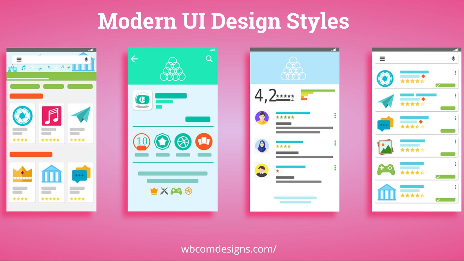
Modern UI Design Styles are making interfaces in software focus more on the style aspects. Designers are attempting to appease the user’s aesthetic and make their experience with a computerized device more pleasurable. Most of the function of UI design is found in graphical use, but it can also be found in non-visual venues.
At the base of it, UI design is not that different from any other kind of creative graphic work. It can be seen in book covers, title sequences, and posters. It is regarded as a balance of arranged design elements, such as colors, empty space, typography, and lines. These all work together to present visual information in a clear-cut manner. UI brings discipline to any design form organically, and it cannot be created in just one way.
Table of Contents
ToggleIs there a difference between UX and UI?
User experience (UX design) is inherently different from UI despite its many similarities. Where UX is more analytical in its function, UI focuses on the aesthetic of a design. We will be discussing UI design techniques and comparing their functions. But there are also UX design techniques that are helping designers and developers build better products.
The UX/UI design approach is a buzzword that companies use together, even in professional settings. Although the end result of applying them is the same, their function is not. Designers do understand the distinct differences of both words and can admit that UX is not UI. For many purposes, the two are used interchangeably and the design techniques we are about to talk about also serve both their interests. However, in this article, we will be focusing more on the use of UI in influencing digital design than UX.
Also Read: Principles Of Good User Interaction Design
A Designer’s Role
UI designers are essentially graphic designers. Their job is to cater to the aesthetic value of an application or software. Designers focus on how to make an application’s interface visually appealing and attractive. The theme of the application also needs to fall in line with the purpose it has, or the personality of the brand it represents. In a nutshell, all visual elements need to come together in unison without leaving any room for a design flaw.
People form 75% of their judgment on a website’s credibility purely on its aesthetics. Designers do not possess a checklist of criteria that will lead to a final UI design that appeases the audience. Initially, their job is to decide what the final application will look like. Once they have a blueprint in mind, they can then move on to color schemes and shapes, fonts, the width of lines, etc. The application’s interface and functionality are dependent completely on UI designers and their methodology.
Also Read: 20 Best WordPress Blog Themes
Different Kinds Of Modern Design Types
The user interface of a product or application can often conclude how successful it will be. Functionality is important to the users since an application that is difficult to use will not be well received. However, the technical superiority of the product or software will not matter if the users do not enjoy interacting with it. This is why the importance of a good webilistic design should not be underestimated.
A good designer can change the way a message is presented to users. Simply playing with shapes, letters, spaces, and colors can influence the decision-making process of millions of people, especially when marketing a new product. In today’s world of digital development, there are many directions that modern designers take.
What Is Skeuomorphism?
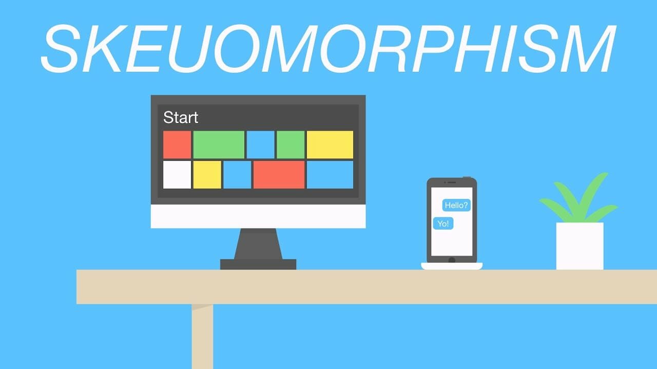
Skeuomorphism is a part of UI design, and its main purpose is an imitation of the physical world. The design style uses online tools to match real-life variants, such as synthesizers being made to look like keyboards. Skeuomorphism has since dominated the interface design industry ever since its initial conception. The issue with this kind of style is the usability aspect. Although it has given users the aesthetic pleasure of the elements used, the ‘knobs and buttons of the application are not helping the user experience at all.
The debate surrounding skeuomorphism is mostly regarding its necessity. There have been statements that entail that since skeuomorphism is all about natural-looking objects within an interface, it can make software look cluttered. According to the stats, 90 percent of information perceived by the brain happens to be visual. However, the mimicry of the objects in the design has become obsolete to a lot of users. At the same time, there are subsequent arguments that point out the issue of humanity and the digital world. Humans will not become accustomed to the digital world as much as the physical world, which is why skeuomorphism will continue to be relevant in the UI design technique.
Also Read: 10 Best Free Online Resources For Web Design
The Relevancy of Flat Design
Flat design is a type of UI technique that takes on completely opposite principles when compared with skeuomorphism. Designers have used this technique in many areas over the years, such as the Facebook app icon. However, the trend has been transitory in its impact. Although flat design can be used to create beautiful and elegant interfaces, it is not appropriate for all kinds of projects. For a successful flat design, the creators need to be mindful of the visuals as well as the message that is being communicated.
The absence of 3D effects that come with this technique means that there are fewer distinctive features between visual elements on a page. Most of these flat design icons are not clickable, which changes the way a user interacts with a certain application or webpage. The balancing element of the design comes when it is used sparingly. “Almost flat design” or “semi-flat design” is one such example of how simple visuals can add basic skeuomorphic qualities for better interaction. It has been estimated that 70% of online businesses fail to do so because of bad usability. Color variations, additional depth and dimension, and shadows increase visual variety along with usability. Apple’s iOS interface is a prime example of how this works.
Also Read: How To Create An Online Job Marketplace?
The Design War: Google vs Microsoft vs Apple
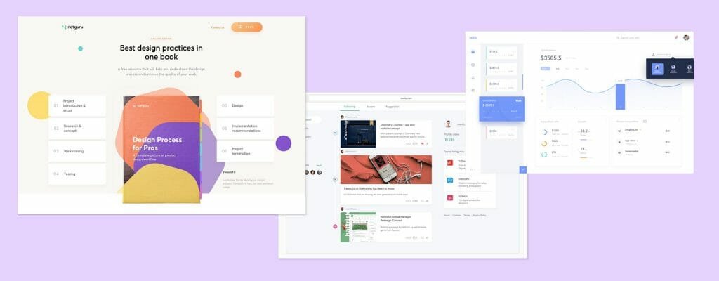
There has been an ongoing debate over Google, Apple, and Microsoft’s design techniques. Designers know that UI is influenced by a variety of trends each year, but with these three huge corporations taking their stance, this is the most talked-about design war in years. Where Google introduced the concept of material design, Microsoft came up with the fluent design system and Apple shifted towards flat design. The following are some ways in which they differ:
1. Google’s Material Design- Modern UI Design Styles
Stats have shown that 75% of all website traffic runs through Google. This is part of the reason why when Google introduced the material design technique in 2014, it instantly becomes astronomically popular. The implementation of this procedure has taken designers to assess different standards of UI design. Google’s product suits have used it all across their functions, such as Docs and Maps. Why did this work? Designers argued that since we have traditionally absorbed content through print, material design is a tactile experience of paper on the screen.
The consistent visual language that is being displayed gives Google its distinct look, and users have gradually become accustomed to the theme when navigating products. The thought-provoking stir that material design caused a shift in the way users to interact with the site, was considered to be a starting point to construct relevant design and intuitive navigation.
Also Read: How to Create an Online Niche Marketplace?
2. Microsoft’s Fluent Design- Modern UI Design Styles
The Fluent Design System was built on Microsoft Design Language 2 (MDL2), which is the same software that powers Windows 10. It was released to help user experiences break free of stationery shapes and static graphics. The visual experience that came with it was built to focus on animation, layers, and textures to give users a clearer sense of direction within the operating system.
Microsoft’s fluent design is a simple systematic emphasis on the fundamental aspects of design. It is used to optimize the process for designers to establish a level of clarity and coherence. The cognitive overload that designers have to deal with when creating a design is reduced so they can accomplish what they need. Rodney Edwards, who was part of the design team at Microsoft, talked about how the future of design is not about consumption but about solving problems in new environments. The aim of the system was to give users experiences and interactions that were closer to real-life platforms.
3. Apple’s Flat Design- Modern UI Design Styles
Flat design has been a popular trend in UI for many years now. It brings simplicity to an interface by removing unnecessary design elements. As it stays true to the digital essence of an interface, Apple moved its interface towards its direction with the release of the iOS 7. The redesign of Apple mobiles has flatter and more solid pigments, as well as simple icons. The concept behind this change was to improve the overall user experience. The design uses blurred lines to provide better context and leaves more empty space for onscreen elements. It also comes with a more modern typeface so that users do not face any difficulties.
Also Read: How to Create an Infographic in 5 Easy Steps
Conclusion On Modern UI Design Styles
The importance of UI design is based on the many techniques that designers can use to achieve it. The intuitive nature of the design, along with the affordability of its use has allowed it to remain popular today, in the digital sphere as well as the marketing world. An assessment of all the design techniques in UI, along with the influence of companies like Google and Microsoft, are all applicable today. Some of them may have an edge over others, such as flat design over skeuomorphism, but they all have the same end result.
Interesting Read:
10 Essential BuddyPress plugins For a Community Website
The Best Premium WordPress BuddyPress Themes
Useful Hacks And Customizations For Your BuddyPress Powered Website Via Reign Theme

