
9 min read
Boost Your Service Business With Better Website Design

A service business website has one job: turn a visitor who has a problem into a booked call, a quote request or an appointment. Most service sites fail at this not because they look dated but because they make the visitor work too hard to find the price, the proof and the next step. This guide walks through the design decisions that actually move enquiries for plumbers, consultants, clinics, agencies and anyone else selling time and expertise, with the specific WordPress settings and tools we use to get there.
Start with the one action you want
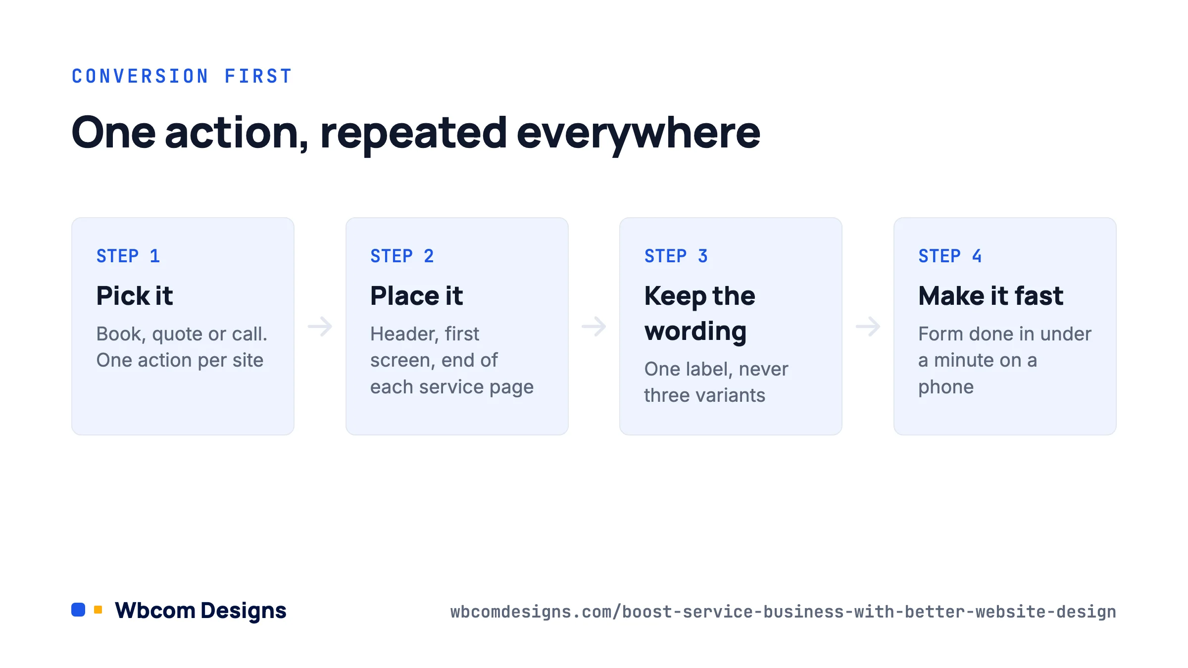
Before touching a template, decide the single thing a first-time visitor should do. For a dentist it is “book an appointment”. For a consultant it is “schedule a discovery call”. For a roofer it is “request a quote”. Everything else on the site supports that one action.
Once you know it, three rules follow. The action appears in the header on every page, in the first screen of the home page, and at the end of every service page. It uses the same wording everywhere (do not alternate between “Get in touch”, “Contact us” and “Book now”). And it goes to a form or booking widget that can be completed in under a minute on a phone.
We’ve audited plenty of service sites where the only way to enquire was an email address in the footer. Those sites get enquiries from the 5% of visitors who are already sold. The other 95% leave.
Build the home page around the visitor’s question
A visitor arriving from Google is asking “do these people solve my problem, can I trust them, and what happens next?” The home page should answer in that order, in the first two screens.
- Headline that names the service and the customer. “Emergency plumbing in Leeds, on site within 90 minutes” beats “Welcome to Smith & Sons”. Include the location if you serve one.
- One line of proof directly beneath it. A review count and rating, years in business, a recognisable client logo, or an accreditation. Pick the strongest single item.
- The primary button. Large, contrasting, with a verb. Next to it, the phone number as a tap-to-call link on mobile.
- Three to five services as cards, each linking to its own page. Not twelve. If you offer twelve, group them.
- Testimonials with names, photos and specifics. “Fixed our boiler on a Sunday, fair price” is worth ten generic five-star blurbs.
- How it works in three steps. Enquire, get a quote, work done. This removes the fear of the unknown that stops people from clicking.
- The button again at the bottom, with a short reassurance line: “No obligation. We reply within one working day.”
Give every service its own page
A single “Services” page listing everything you do is the most common mistake we see. It ranks for nothing specific and it forces the reader to scan for their problem. One page per service does three things: it ranks for that service plus your location, it lets you answer that customer’s exact objections, and it gives your ads a relevant landing page.
A service page template that works:
- H1 with the service and location.
- Two sentences on who it is for and what outcome they get.
- What is included, as a short list.
- Pricing, or at least a starting price or a range. Service businesses resist this, and it costs them. If your competitors hide prices and you show them, you win the comparison shopper by default.
- Two testimonials specific to this service.
- An FAQ block with four to six real questions your staff get asked, marked up with FAQ schema.
- The primary button.
On WordPress, build this once as a reusable block pattern or a template in your page builder, then duplicate it per service. If you run a lot of services, a custom post type with a shared template is cleaner than dozens of hand-built pages.
Make the site fast, because Google and customers both measure it
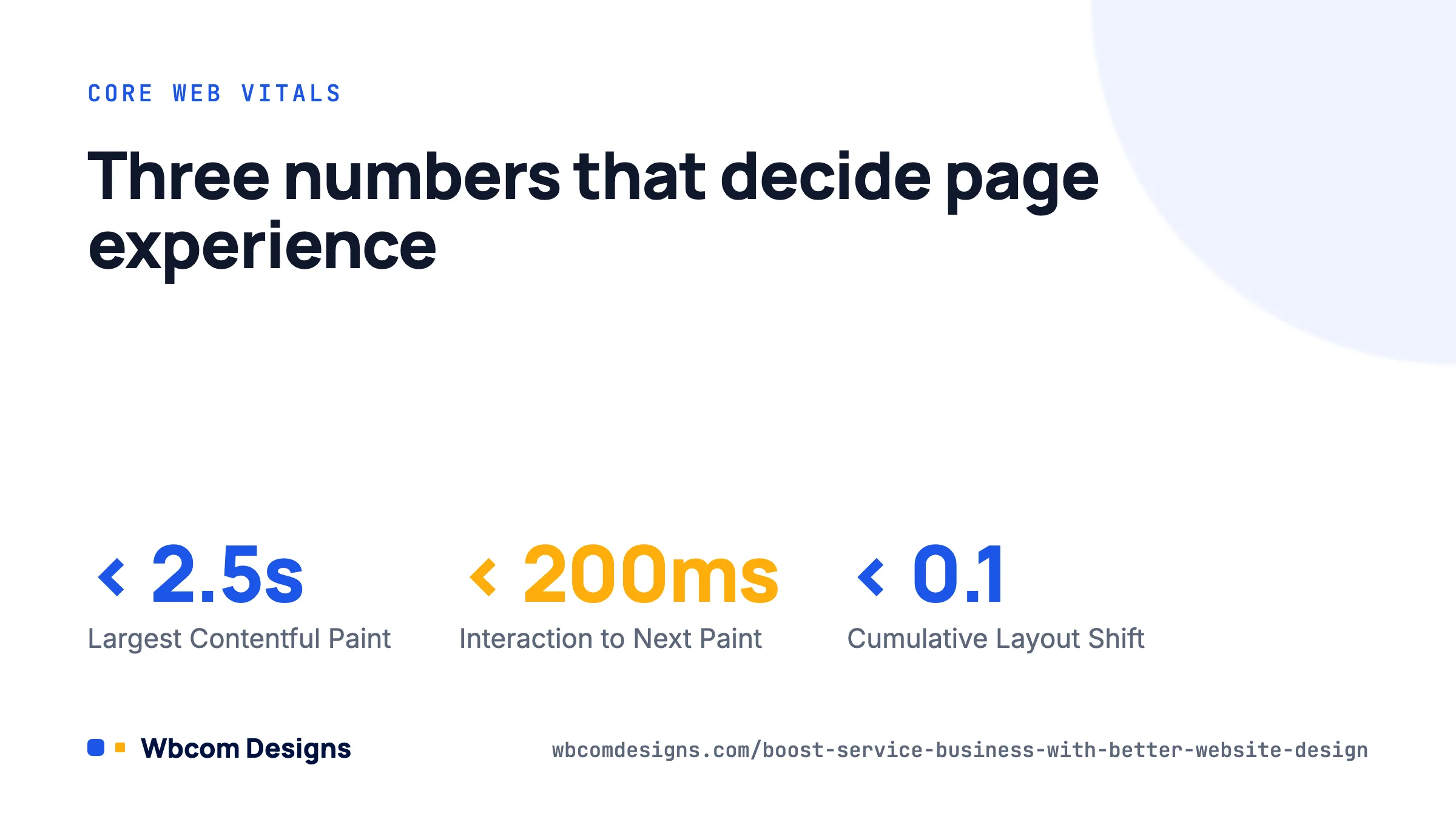
Google’s Core Web Vitals are the three numbers it uses to judge page experience: Largest Contentful Paint under 2.5 seconds, Interaction to Next Paint under 200 milliseconds (INP replaced First Input Delay as a Core Web Vital in March 2024), and Cumulative Layout Shift under 0.1. According to the HTTP Archive, only around half of sites pass all three on mobile, so passing is a real advantage in local results.
For a WordPress service site, this is the short list that gets most sites into the green:
- Hosting with server-side caching. Entry-level shared hosting is the usual cause of a slow LCP. A managed WordPress plan or a VPS with a caching layer is the single biggest upgrade.
- A lightweight theme. Heavy multipurpose themes load scripts for features you do not use. Pick a theme built for speed or a block theme.
- Image sizing. Upload images at the size they display, serve WebP or AVIF, and set the hero image to load eagerly with
fetchpriority="high"while everything below the fold lazy-loads. WordPress does the lazy-loading part automatically since 5.5; the hero override is the bit people miss. - Fewer third-party scripts. Chat widgets, heatmaps, three analytics tools and a Facebook pixel together can add a second to INP. Keep what you read, delete the rest.
- Reserve space for embeds. Booking widgets, maps and review carousels cause layout shift if the container has no fixed height. Set a min-height on the wrapper.
Check your real-user numbers in Google Search Console under Experience, then Core Web Vitals, and test individual pages in PageSpeed Insights. If you would rather hand this off, our WordPress performance optimisation service does exactly this work.
Design for the phone first
For most local service businesses, 60% to 80% of traffic is mobile, and a large share of that is someone with an urgent problem standing in their kitchen. Test every page on a real phone, not only the browser’s device emulator, and check:
- The phone number is a
tel:link and is visible without scrolling. - Buttons are at least 44 by 44 pixels and not crowded together.
- Forms use the right input types (
type="tel",type="email") so the correct keyboard appears. - Nothing important hides behind a hover effect, because there is no hover on touch.
- Sticky headers do not eat a third of the screen. A slim bar with the logo and one button is enough.
Local SEO: the part of the design that brings the visitors
Design choices affect whether the site shows up at all. Roughly 46% of Google searches have local intent, and for service businesses the map pack above the organic results takes most of the clicks. Three design-level things feed it:
- Consistent name, address and phone in the footer of every page, matching your Google Business Profile exactly, with LocalBusiness schema. Yoast and Rank Math both have a local SEO module that generates this; if you would rather not pay, a small JSON-LD snippet in the footer does the same.
- Location pages if you serve several areas, each with unique content about that area, not a find-and-replace of the town name.
- Reviews displayed on the site and a link that makes leaving a Google review a one-tap action. Completed, reviewed profiles are shown more often and clicked more often.
Connect the site to Search Console on day one and submit the sitemap. For the broader checklist, our WordPress SEO best practices guide covers the technical setup.
Forms and booking that do not lose the lead
The enquiry form is where design meets revenue. Keep it to the fields you need to reply: name, phone or email, and a message or a service dropdown. Every extra field costs you completions. Ask for the detailed information on the call.
Practical settings that matter:
- Send the notification to an inbox someone checks within the hour, and to a second address as backup. Use an SMTP plugin; default WordPress mail gets filtered or lost.
- Add a honeypot or Turnstile rather than a CAPTCHA puzzle. Puzzles cost more real leads than they stop spam.
- Redirect to a thank-you page that says what happens next and when. Track that page as your conversion in GA4 and Google Ads.
- If you take bookings, embed the booking tool on its own page and link to it from the primary button. Do not bury it in a modal that breaks on older phones.
If you sell packaged services with a price, you can go further and let customers buy directly. WooCommerce with an add-on such as Woo Sell Services turns a service into a purchasable product with a requirements form, a conversation thread and delivery tracking, which suits designers, consultants, tutors and agencies selling fixed-scope work.
Trust signals that actually work
Trust is not a badge strip. The elements that we see move conversion on service sites, roughly in order:
- Real photos of the team and the work. Stock photography of smiling people in headsets lowers trust; it signals you have something to hide.
- Specific testimonials tied to a named person, ideally with a photo or a link to the Google review.
- Transparent pricing or a clear explanation of how pricing works.
- Guarantees and what happens if something goes wrong.
- Accreditations, insurance, and memberships, shown where they are relevant (near the quote form, not in a random footer row).
- A physical address and a named person to contact.
A before-and-after example
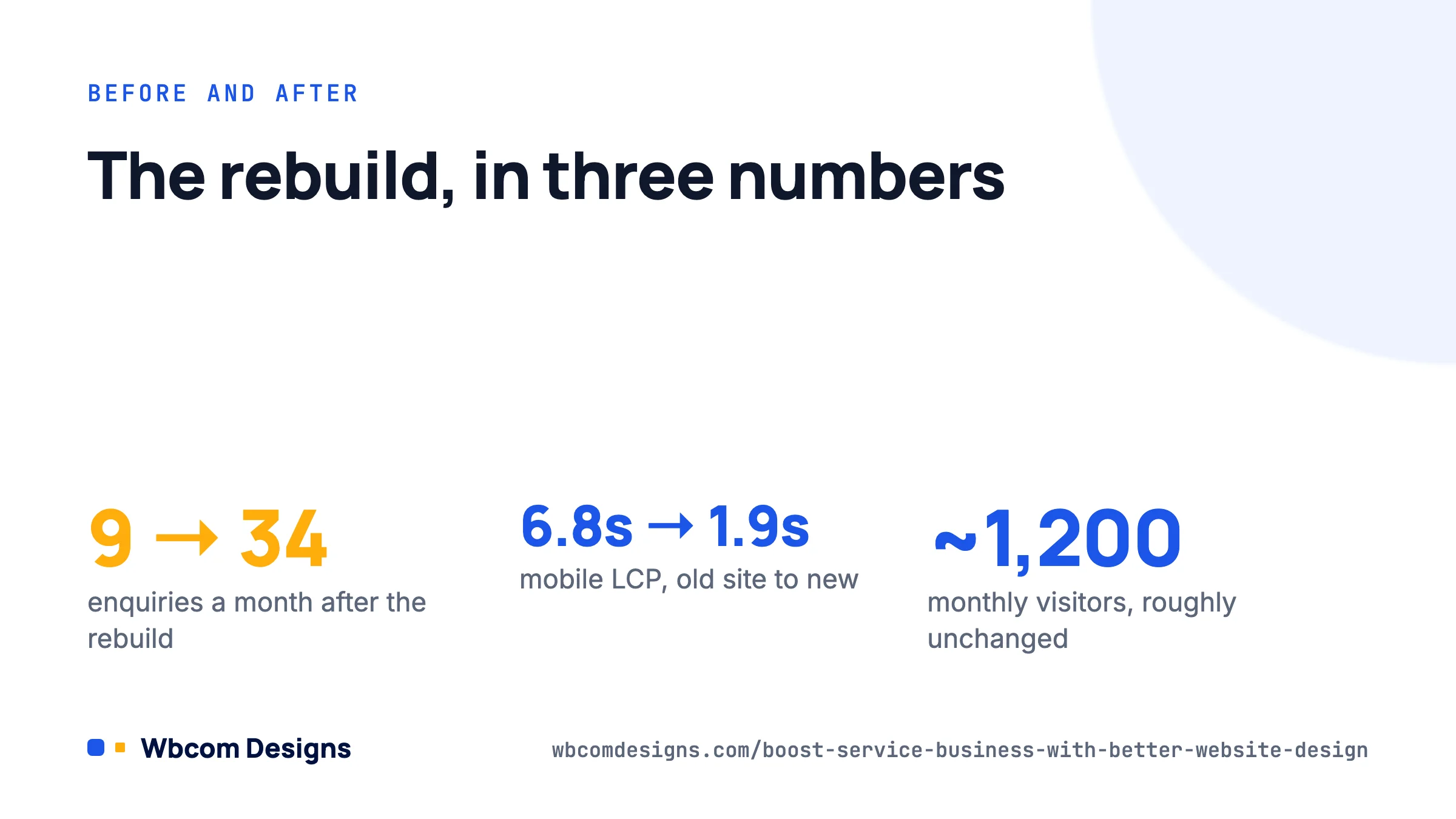
A regional electrical contractor came to us with a five-year-old site: a slider of stock photos, a single Services page, a contact form with nine fields, and a 6.8-second mobile LCP on shared hosting. Around 1,200 monthly visitors, 9 enquiries a month.
The rebuild did nothing exotic. One headline with the service and region, a tap-to-call number, seven service pages with starting prices and FAQs, a three-field form with Turnstile, real job photos, LocalBusiness schema, a lighter theme on managed hosting. Mobile LCP came down to 1.9 seconds. Three months later, similar traffic, 34 enquiries a month. The traffic did not change much; the site stopped leaking.
Frequently asked questions
Should I show prices on a service website?
Yes, at least a starting price or a typical range. Visitors who cannot find a price assume it is high and leave. If your pricing is truly bespoke, explain the factors and give an example project with its cost.
Do I need a blog?
Only if you will write genuinely useful answers to customer questions. Four strong articles answering “how much does X cost” and “how long does X take” beat forty thin posts. Unused blogs with a last post from three years ago hurt trust.
Page builder or block editor?
For a new site in 2026, the block editor with a good block theme is faster and lighter. Page builders still make sense if your team already knows one. Either way, keep the number of plugins low.
How often should the design be refreshed?
Content and photos every few months, structure when your services change, and a visual refresh every three to four years. Speed and forms should be checked quarterly, because plugin updates break both quietly.
Where to start
Do these four things this week, in order: put the phone number and a single clear button in the header, split your services into individual pages with a price indication on each, cut the enquiry form to three fields, and run your home page through PageSpeed Insights on mobile. Each one takes hours, not weeks, and together they fix the reasons most service sites underperform. If the PageSpeed result is red and you are on cheap shared hosting, move hosts before you redesign anything else.
Related reading