
8 min read
Bold New Font Styles Used in WordPress


Heavy, characterful display type is the fastest way to make a WordPress site look like it was designed this decade rather than built from a 2016 template. The catch is that bold fonts are easy to get wrong: too heavy in body copy, loaded from four different CDNs, or shipped with every weight when you use two. This guide covers the bold families that are working well on WordPress sites right now, how to add them properly on block and classic themes, and how to keep them fast and readable.
Why bold type is back
Two things happened. Variable fonts made it cheap to ship a full weight range in a single file, so designers stopped rationing heavy weights. And WordPress 6.5 (April 2024) added the Font Library to the Site Editor, which means any block theme can install and self-host a Google Font in about a minute without a plugin. Heavy grotesques and expressive serifs that used to need a developer are now a click away, and you can see the result across agency sites, SaaS landing pages and community platforms.
Bold type also solves a practical problem. Most WordPress sites are read on phones, and a 700 to 900 weight heading at 32px holds up on a small screen in bright light far better than a light 300 weight ever did. Used in headings and short labels, bold is as much about legibility as about style.
Bold font families worth considering

All of these are free, open licensed (SIL OFL or similar) and available through Google Fonts or directly from the foundry, which matters because the WordPress Font Library pulls from Google Fonts. Weights listed are the ones we actually find useful.
| Font | Style | Useful weights | Where it fits |
|---|---|---|---|
| Inter | Neutral grotesque, variable | 600, 700, 800 | Dashboards, SaaS, anything that also needs a body font |
| Space Grotesk | Quirky geometric grotesque | 600, 700 | Tech products, developer tools, portfolios |
| Bricolage Grotesque | Variable, with optical size and width axes | 700, 800 | Editorial sites, agencies that want personality |
| Syne | Wide, expressive display | 700, 800 | Creative studios, event sites, hero headings only |
| Unbounded | Extra-wide rounded display, variable | 700, 900 | Crypto, gaming, community landing pages |
| Archivo Black | Single heavy grotesque | 900 only | Posters, large numbers, punchy section titles |
| Anton | Condensed impact-style | 400 (visually heavy) | Sports, fitness, music, stacked headlines |
| Playfair Display | High-contrast serif | 700, 800, 900 | Magazines, luxury, long-form blogs |
| Fraunces | Soft “wonky” serif, variable | 700, 900 | Food, craft, lifestyle brands |
| DM Serif Display | Compact display serif | 400 (display weight) | Headings on otherwise sans-serif sites |
A pattern we use a lot: one bold display face for H1 and H2 (Syne, Bricolage or Playfair) and one neutral workhorse for everything else (Inter or the system stack). Two families, three weights total, and the site still feels designed.
Rules for using heavy weights without hurting readability
- Keep bold out of body copy. Body text at 16 to 18px should sit at 400 or 450. Reserve 600 and above for headings, buttons, labels and the occasional inline emphasis. Paragraphs set in 700 tire the eye within a few lines.
- Tighten letter-spacing on big headings. Most grotesques look loose at 48px and up. A
letter-spacing: -0.02emon H1 and H2 fixes it. Condensed faces like Anton usually need none. - Shorten line-height as size goes up. Headings at 900 weight want 1.05 to 1.15 line-height. Leaving the body value of 1.6 in place makes a two-line headline look like two separate headlines.
- Mind contrast. Heavy type in a mid-grey on white passes WCAG AA more easily than light type, but coloured bold headings over photography still need a 4.5:1 ratio (3:1 for text 24px and larger). Check it rather than guessing.
- Use real weights, not faux bold. If you load only the 400 file and apply
font-weight: 700, the browser synthesises a smeared version. Load the weight you use, or use a variable font that covers the range.
Adding a bold font on a block theme (Font Library)

On any block theme (Twenty Twenty-Four and later, or any theme with a theme.json), WordPress can install and self-host the font for you:
- Go to Appearance → Editor, then open Styles (the half-moon icon) and choose Typography.
- Click the Manage fonts icon next to the Fonts heading.
- Open the Install Fonts tab, search for the family (for example “Bricolage Grotesque”), tick the weights you need and click Install. Tick only the weights you will use. Installing all nine weights of a static family adds nine files to every page.
- Back in Typography, set Headings to the new family and Text to your body face. Under Headings you can also set the default weight, letter-spacing and line-height so every H2 on the site inherits it.
- Save. The font files now live in
wp-content/uploads/fonts/and are served from your own domain.
Because the files are local, there is no request to Google’s servers, which keeps you clear of the GDPR issue that German courts raised in 2022 over remotely loaded Google Fonts. It also removes a DNS lookup and TLS handshake from the critical path.
Defining fonts in theme.json for a child theme
If you maintain a theme or child theme, define the font once in theme.json so it ships with the theme and appears in the Font Library automatically. The theme handbook’s typography page documents the schema; a working example for a variable font looks like this:
{
  "version": 3,
  "settings": {
    "typography": {
      "fluid": true,
      "fontFamilies": [
        {
          "name": "Bricolage Grotesque",
          "slug": "bricolage",
          "fontFamily": "\"Bricolage Grotesque\", system-ui, sans-serif",
          "fontFace": [
            {
              "fontFamily": "Bricolage Grotesque",
              "fontWeight": "400 800",
              "fontStyle": "normal",
              "fontDisplay": "swap",
              "src": [ "file:./assets/fonts/bricolage-grotesque-variable.woff2" ]
            }
          ]
        }
      ]
    }
  },
  "styles": {
    "elements": {
      "heading": {
        "typography": {
          "fontFamily": "var(--wp--preset--font-family--bricolage)",
          "fontWeight": "800",
          "lineHeight": "1.1",
          "letterSpacing": "-0.02em"
        }
      }
    }
  }
}
The fontWeight: "400 800" range tells the browser one file covers every weight between those values, which is the whole point of a variable font. Drop the .woff2 into assets/fonts/ inside the theme. WordPress generates the @font-face rule and a --wp--preset--font-family--bricolage custom property you can use anywhere in CSS.
Adding a bold font on a classic theme
Classic themes (most community themes, including older BuddyPress setups) do not get the Font Library. You have three options, in order of preference:
- Use the theme’s own typography settings. Our BuddyX and Reign themes expose heading and body font, weight and size controls in the Customizer, and BuddyX 5.x moved to a token-based typography system so the choice applies to BuddyPress components as well as posts. Most well-maintained classic themes have something similar.
- Self-host with your own
@font-face. Download the woff2 from the foundry or Google Fonts, put it in your child theme, and enqueue a small stylesheet:
@font-face {
  font-family: "Syne";
  src: url("fonts/syne-variable.woff2") format("woff2");
  font-weight: 400 800;
  font-display: swap;
}

h1, h2.site-title {
  font-family: "Syne", system-ui, sans-serif;
  font-weight: 800;
  line-height: 1.1;
  letter-spacing: -0.02em;
}
add_action( 'wp_enqueue_scripts', function () {
wp_enqueue_style(
'child-fonts',
get_stylesheet_directory_uri() . '/fonts.css',
array(),
'1.0.0'
);
} );- Use a local-hosting plugin. OMGF (Optimize My Google Fonts) intercepts Google Fonts requests from the theme or page builder and rewrites them to local copies. It is the right answer when a page builder is already loading Google Fonts and you cannot change that.
Avoid the fourth option, pasting a <link href="https://fonts.googleapis.com/..."> tag into a header script box. It works, but it is slower, it leaks visitor IPs to Google, and it is the first thing a performance audit will flag.
Keeping bold fonts fast
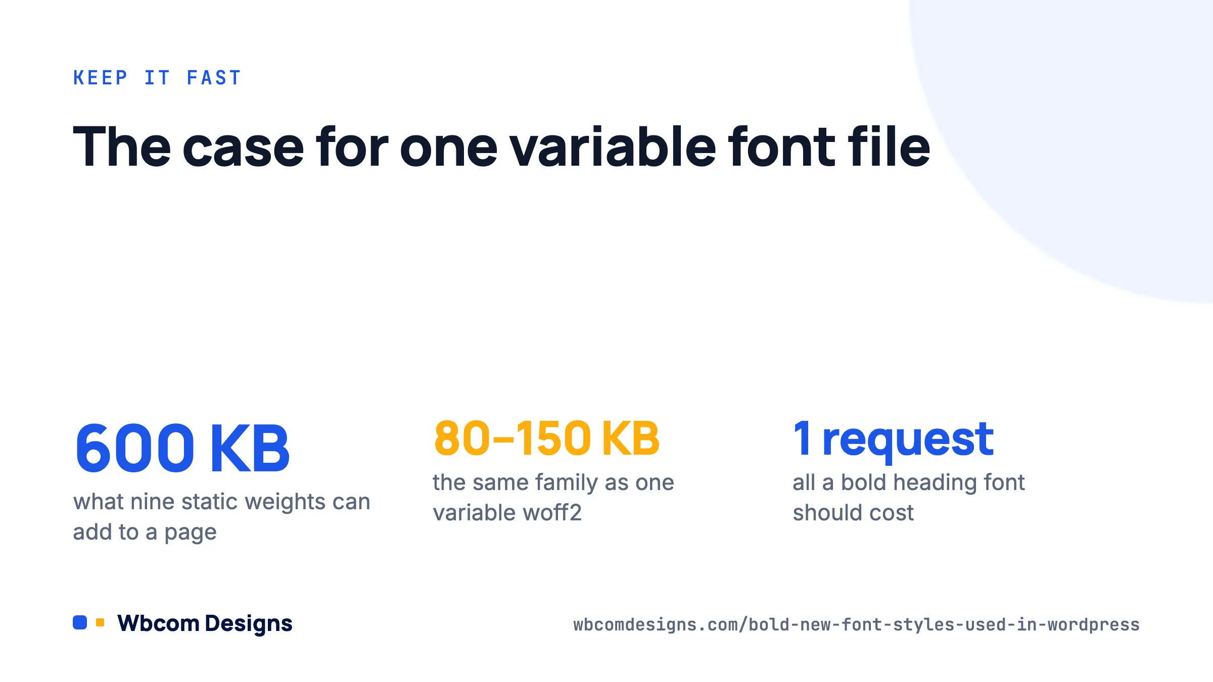
Display fonts are heavy. A static family with nine weights can add 600 KB to a page; the same family as one variable woff2 is usually 80 to 150 KB. Beyond choosing variable files:
- Preload the heading font. Add
<link rel="preload" as="font" type="font/woff2" crossorigin>for the one file used above the fold, viawp_heador the theme’s resource hints. Do not preload everything; that defeats the purpose. - Use
font-display: swapso text renders in the fallback immediately. The Font Library sets this for you; set it yourself in custom@font-facerules. - Pick a fallback with similar metrics. For wide faces like Syne or Unbounded,
Arial Blackorsystem-uiat the same weight reduces layout shift when the web font arrives. Thesize-adjustdescriptor lets you tune the fallback further if CLS is still a problem. - Subset. If the site is English only, the Latin subset is enough. Google Fonts serves subsets automatically; for self-hosted files use the foundry’s subset download or a tool like glyphhanger.
- Check the numbers. Run the page through PageSpeed Insights before and after. A well-implemented bold heading font should add one request and under 100 KB.
Pairings that work on WordPress sites
Some combinations we have shipped and would ship again:
- Syne 800 headings + Inter 400 body. Creative agency or portfolio. Wide, loud headings, calm text.
- Bricolage Grotesque 700 + IBM Plex Sans 400. Editorial or documentation site with character.
- Playfair Display 900 + Source Serif 400. Long-form blog or magazine. Use Playfair only for H1 and H2.
- Space Grotesk 700 + system-ui. Developer tool or SaaS. Zero body font cost.
- Unbounded 700 + Inter 400. Community or gaming platform. Unbounded for the logo, hero and section titles; Inter for every activity item and comment, where readability at 15px matters more than personality.
For community sites in particular, remember that members generate most of the text. A bold display face belongs on the hero and section headers. The activity feed, messages and profile fields should stay in a neutral face at regular weight. Our design tips for audience response go further into why hierarchy beats decoration.
Frequently asked questions
Does the Font Library work with classic themes?
No. It requires a block theme with a theme.json. On a classic theme use the theme’s Customizer settings, your own @font-face in a child theme, or a plugin such as OMGF.
Are variable fonts supported everywhere?
Every browser that has mattered since 2020 supports variable fonts, including Safari on iOS. You no longer need a static fallback set.
Is it OK to use Google Fonts at all given GDPR?
Self-hosting is the safe answer. The Font Library, OMGF and a manual @font-face all keep the files on your server, so no visitor data goes to Google. Loading fonts remotely from fonts.googleapis.com is what the 2022 Munich ruling objected to.
How many weights should I load?
Two or three. A typical set is 400 for body, 600 for buttons and labels, and 700 or 800 for headings. With a variable font the question goes away, as one file covers them all.
Where to start
Pick one bold display family from the table, pair it with Inter or the system stack, and install it through the Font Library if you are on a block theme or the Customizer if you are on BuddyX, Reign or another classic theme. Set headings to 700 or 800, tighten letter-spacing, drop line-height to around 1.1, and leave body text alone. Then run PageSpeed Insights to confirm you added one font request and nothing else. That is a modern-looking site in an afternoon, without a redesign.
Related reading