
5 min read
The Power User Curve: Your Top 1% Isn’t Flat Either


The 90-9-1 rule tells you something true and a little too tidy: 90% lurk, 9% contribute sometimes, 1% create most of the value. Neat. Actionable. Also incomplete in a way that matters once you actually sort the numbers inside that top 1%.
The 1% isn’t flat.
Rank your most active members by whatever you’re already tracking (posts, replies, points, logged-in days, doesn’t matter which) and you won’t find a plateau where everyone above the cutoff contributes roughly the same amount. You’ll find the same shape you found in the whole community, nested one level deeper: a small cluster miles ahead of everyone else in that group, then a long, slowly thinning tail down to the line you drew. It’s not a floor. It’s a cliff, then a slope.
The curve inside the curve
This isn’t a quirk of community platforms specifically. It’s the shape you get almost anywhere a population’s output depends on skill and time and how obsessed people already are, and none of that gets handed out evenly. Wikipedia’s edit history has always looked like this: a small number of editors account for a wildly disproportionate share of total edits, and within that small number, a smaller number still account for a disproportionate share of that. Open-source commit logs look like this. Stack Overflow’s top answerers look like this. The pattern has a name, a power-law or Pareto distribution depending on which field you learned it from, and the honest caveat is that real-world data rarely fits the pure mathematical version cleanly. What holds up across all of it, loosely enough to trust and precisely enough to act on, is the shape: steep at the top, long at the bottom, no flat middle where things suddenly even out.
That’s the part worth sitting with. There’s no level where the curve resolves into fairness. Not at the whole-community scale, not inside the top 1%, and, if you kept slicing, probably not inside the top 0.1% either. It’s turtles the whole way down.
Small communities feel this differently than large ones. With 40 members total, your “top 1%” is technically one person, which makes the whole framing feel absurd. It isn’t. The curve is still there; you just don’t have enough people yet for it to resolve into a smooth shape instead of a lumpy one. Give it time and members, and the same pattern shows up, just with more resolution.
Why “smooth it out” backfires
Once you see the shape, the instinct to sand it down gets tempting. A leaderboard with the same five names at the top every single week starts to look less like recognition and more like an advertisement for how little chance anyone else has. So teams do the reasonable-sounding thing: remove the leaderboard, cap visible reputation, stop calling out top contributors by name so nobody feels excluded.
This solves the wrong problem. The median member was never going to be the reason your community survives its second year. The outliers were. Smoothing the curve doesn’t make the average member more powerful. It just removes the signal that told the outliers their disproportionate effort was seen, and gives them one less reason to keep being disproportionate. You end up with a community that’s fairer to look at and quietly worse to be in, because the people doing the most work now have the least evidence anyone noticed.
What building for the curve actually looks like
The alternative isn’t “make the leaderboard bigger and hope.” It’s designing the ranking and recognition system to match the shape you actually have, instead of the flat one you wish you had.
A single global leaderboard has a structural problem once your community has any real history: the same handful of people occupy the top slots indefinitely, because they got there first and the gap compounds. Everyone below them isn’t competing for #1. They’re competing for #47, forever, against people who also aren’t going anywhere. WB Gamification’s cohort leagues solve this by re-sorting the field on a rolling basis: weekly Bronze-through-Diamond tiers, Duolingo-style, where you’re only measured against people currently near your own level. A power user still gets a real contest. They’re just contesting it against other power users instead of lapping the entire membership every week for a rank nobody below them can realistically challenge.
Recognition doesn’t have to be purely rank-based either. BuddyNext Pro’s member labels (Verified, Expert, Staff) give outliers a form of status that isn’t a zero-sum ladder position. Someone can be visibly, permanently marked as an expert contributor without that requiring someone else to be visibly ranked below them. It’s the same underlying move as an accruing reputation curve: status that builds from real participation instead of one static rank everyone gets compared against forever.
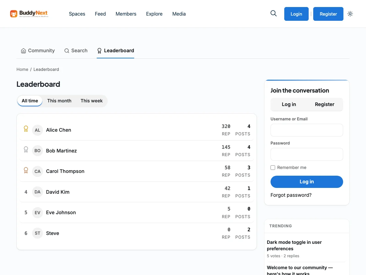
Both moves do the same thing in different ways. Instead of one axis where everyone is ranked against everyone forever, the curve gets more surface area to express itself against, a rotating cohort here, a status track there, so being at the top means something more specific than “outlasted everyone.”
The trap of measuring the wrong thing
There’s a second failure mode, quieter than the leaderboard one: measuring the curve on a metric that doesn’t actually matter, and optimizing for it anyway because it’s the easiest number to pull. Raw post count rewards whoever types fastest, not whoever helps most. Login streaks reward whoever remembers to open the app, not whoever contributes when they do. If the metric behind your leaderboard or your recognition system is cheap to game and expensive to fake genuinely, you’ll eventually train your real power users to do less of the thing you actually wanted and more of the thing you’re counting.
The fix isn’t more metrics. It’s picking the one that’s hardest to inflate without also doing the underlying work, and building the recognition system around that instead of around whatever your database already happened to be counting.
The curve isn’t the enemy
It’s tempting to read all of this as a complaint about inequality inside your own community. It isn’t one. A community with zero variance in contribution isn’t healthier. It’s usually smaller, or younger, or hasn’t found the thing yet that makes a handful of people obsessed with it. The curve showing up at all is a decent sign that something real is happening.
The mistake isn’t having a power-law curve. It’s designing every system, the leaderboard, the recognition, the feature roadmap, as if you didn’t. Build for the median and the top of the curve quietly disengages, because nothing in the product acknowledges what they’re actually doing. Build only for the top of the curve and everyone else feels like an audience instead of a member. The actual job is holding both at once: give the outliers a reason to keep being outliers, without making that the only shape a contribution is allowed to take.
Go look at your own numbers before you take any of this on faith. Sort your top 1% by whatever metric you’ve got, and see for yourself whether it’s a plateau or a cliff. It’s almost certainly a cliff. What you do next is the only part that’s actually a choice.
Related reading