15 min read
Best Websites for Design Inspiration: 23 Sites Worth Using

Last updated: August 2026
The best websites for design inspiration are Awwwards, Recent (formerly Godly), Siteinspire, Mobbin, Refero, Dribbble, Behance, Figma Community, Lapa Ninja, Typewolf and Coolors. Each one solves a different problem: award galleries for ambitious brand sites, UI libraries for real product screens, community platforms for process and source files, and specialist tools for type and colour.
Knowing the names is the easy part. Most designers bookmark twenty inspiration sites and never open them again. What matters is knowing which site to open for which problem, and building a habit that feeds your work instead of replacing it.
We have spent years using and re-checking these sources for client work at Wbcom Designs. Every site below was checked live in August 2026, and two of the entries from earlier versions of this guide have changed names or owners since, so read the notes. Here are the 23 that have changed how we approach design, grouped by what you need them for.
What Are the Best Web Design Inspiration Websites?
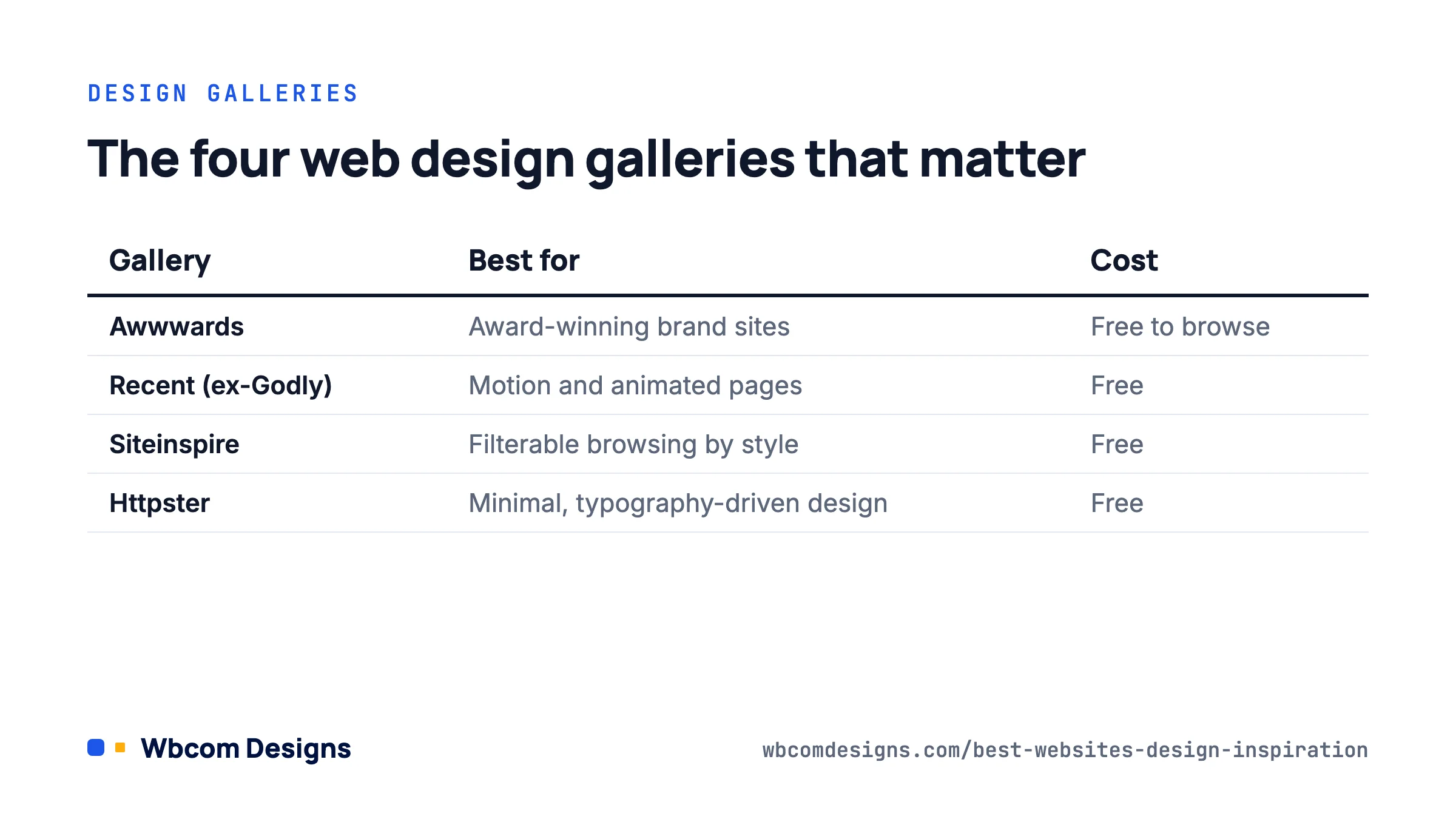
The best web design inspiration websites are galleries that curate and score real sites on design quality, usability and creativity. The top four are Awwwards, Recent, Siteinspire and Httpster. Each approaches curation differently, and knowing the difference helps you find what you need faster.
Awwwards is the most recognised web design gallery in the world. Every nominated site is scored on design, usability, creativity and content by a jury, and Site of the Day remains the award agencies put at the top of their pitch decks. Browsing is free. The Basic membership is $6.70 a month billed annually and the Professional tier is $13.80 a month, both mostly useful if you plan to submit work or want discounts on Awwwards courses.
The real value of Awwwards is not the winners list. It is the scoring. You can see individual jury scores, which teaches you what working professionals value and why. The downside is that Awwwards skews toward high-budget, animation-heavy brand experiences that have little to do with most client projects.
Recent is the gallery formerly known as Godly. The godly.website domain now redirects to recent.design, and the format is the same: a hand-picked collection of websites with animated thumbnails that preview motion and interaction before you click through. It is free. Motion is the biggest differentiator in web design right now, and Recent lets you judge it without loading every site. The curation is tighter than Awwwards, with fewer filler entries.
Siteinspire is a long-running gallery with the best filtering in the category. You can filter by style, type, subject and platform. Need clean portfolio sites built on Squarespace? Three clicks. Editorial layouts for a media client? Done. It is free, and the taxonomy alone teaches you how to categorise design approaches.
Httpster focuses on clean, typography-driven, minimal websites. It is free and curates the kind of design that earns attention through restraint rather than spectacle. When a client brief says “premium but quiet”, this is where we start.
Web Design Gallery Comparison
| Website | Best For | Size | Cost | Unique Feature |
|---|---|---|---|---|
| Awwwards | Award-winning, ambitious brand sites | Thousands | Free (Basic $6.70/mo annual) | Jury scoring system |
| Recent (ex-Godly) | Animated landing pages, motion design | 1,000+ | Free | Animated thumbnail previews |
| Siteinspire | Filterable browsing by style and platform | Thousands | Free | Advanced filtering system |
| Httpster | Clean, typography-focused minimal design | Hundreds | Free | Minimal design curation |
What Are the Best UI/UX Design Inspiration Sites?
The best UI/UX design inspiration sites are Mobbin, Refero, ScreensDesign and Collect UI. Unlike web design galleries that showcase marketing sites, these platforms catalogue real, shipped product interfaces. They show you how actual apps and SaaS products solve design problems in production.
The distinction matters. The design problems in a SaaS dashboard are different from those in a brand campaign page. If you are curious how other industries handle UX, our piece on what WordPress developers can learn from the iGaming industry’s UX innovation draws some unexpected parallels.
Mobbin is a library of real mobile and web app screens from products people use every day. Not concepts, not Dribbble shots. Search “onboarding flow” and see how fifty apps handle the same problem. The free plan is limited to a handful of apps. Paid access works out at $2.50 a week on the annual Pro plan, with Team and Enterprise tiers for shared collections.
Refero catalogues tens of thousands of web pages and iOS screens with manual tagging by component, flow type and design pattern. It has a free tier and a paid plan for the full archive. The tagging quality is what sets Refero apart from screenshot dumps: you can search for “empty state” or “pricing toggle” and get exactly that.
ScreensDesign is what Design Vault became. The designvault.io domain now redirects here, and the focus has narrowed to iOS apps, with full walkthroughs of onboarding flows, paywalls and subscription screens from successful apps. It is the best free resource we know for studying how apps convert, which is a design problem most galleries ignore.
Collect UI pulls the best UI shots from Dribbble and sorts them into categories such as login forms, 404 pages, user profiles and settings screens. It is free and updated daily. When you need to design one component and want twenty approaches side by side, nothing is faster.
UI/UX Inspiration Site Comparison
| Website | Best For | Library Size | Cost | Content Type |
|---|---|---|---|---|
| Mobbin | Mobile and web app UI patterns | Hundreds of apps | Free (Pro from $2.50/wk annual) | Real shipped product screens |
| Refero | Large tagged UI reference library | Tens of thousands of screens | Free tier + paid | Tagged web pages and iOS screens |
| ScreensDesign (ex-Design Vault) | iOS onboarding and paywall flows | Hundreds of apps | Free | Full app flow walkthroughs |
| Collect UI | Browsing by component type | Thousands | Free | Curated Dribbble designs by category |
How Do Dribbble, Behance, and Figma Community Compare?
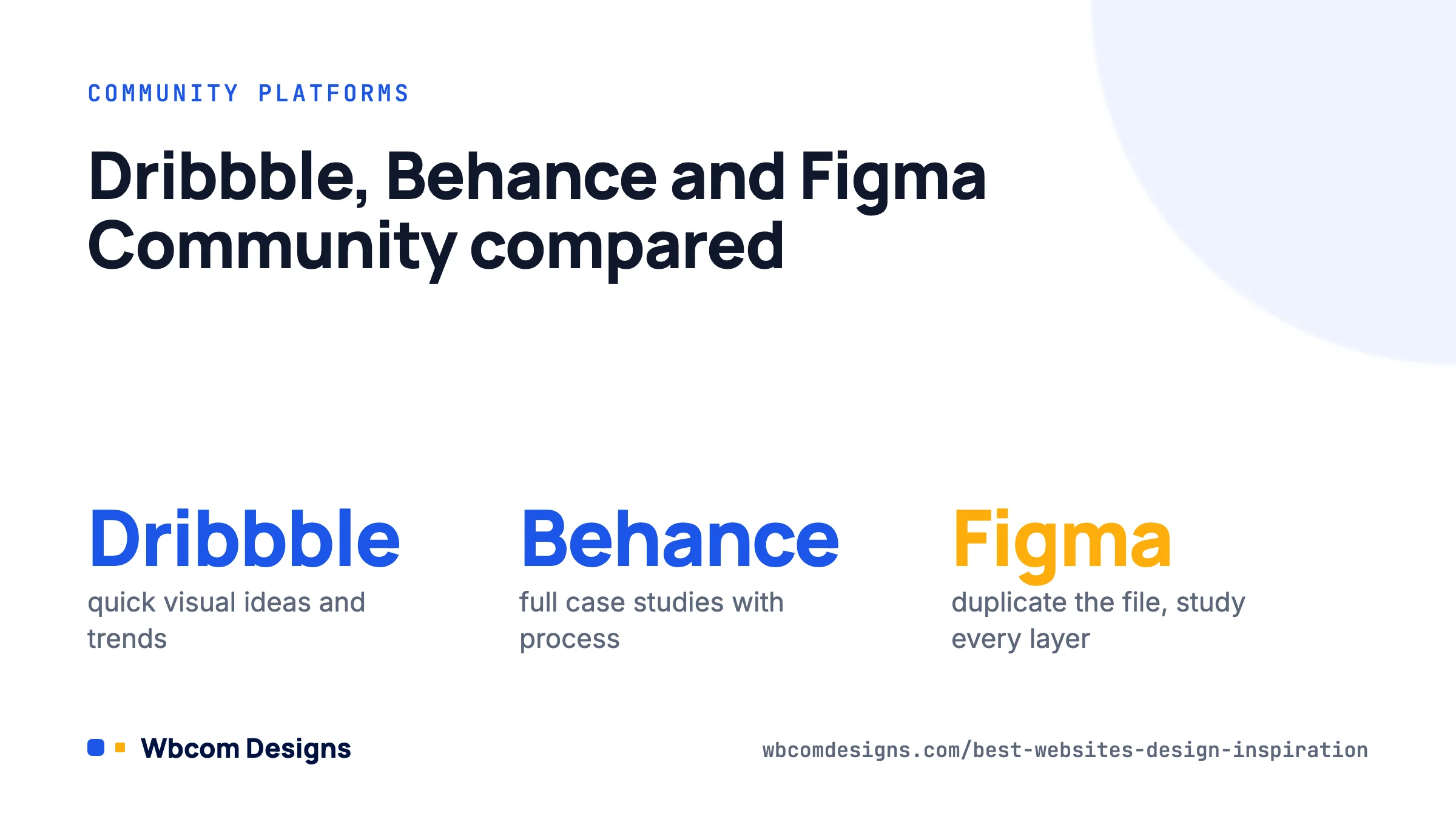
Dribbble is best for quick visual inspiration: colour, illustration, branding. Behance is best for in-depth project case studies that show process. Figma Community is best for interactive design files you can duplicate and explore layer by layer. They serve different purposes and you will probably use all three.
Dribbble is often called the Instagram of design. It rewards visual impact in a small frame, so the work that performs best is the most polished and eye-catching, not the most functional. Browsing is free. Paid plans now start at $4 a month (Lite) and $8 a month (Standard) billed yearly, and they are aimed at designers selling services rather than people looking for inspiration. Use Dribbble for surface-level visual ideas. Do not use it to learn how design works in production.
Behance is Adobe’s platform for project case studies. Designers walk through the brief, research, iterations, final product and sometimes the results. It is free. When you want to understand how a designer solved a problem rather than admire the output, Behance is where you go.
Figma Community is a library of prototypes, UI kits, design systems and templates you can duplicate into your own workspace. Instead of a screenshot, you open the actual file and see every layer, component and auto-layout setting. It is free and remains the single best learning tool for UI designers. Figma’s own AI features, including Make, have made the Community busier with generated starters, so filter by likes and duplicates to find the files worth studying.
Design Community Platform Comparison
| Platform | Best For | Cost | Content Depth | Learning Value |
|---|---|---|---|---|
| Dribbble | Visual shots, colour, branding | Free (paid from $4/mo) | Surface-level (screenshots) | Trend awareness |
| Behance | Full project case studies | Free | Deep (process + final) | Design thinking |
| Figma Community | Interactive design files | Free | Full source files | Hands-on learning |
What Are the Best Landing Page Inspiration Websites?
The best landing page inspiration websites are Lapa Ninja, One Page Love and Land-book. Landing pages have their own constraints: one page, one goal, and a visitor who decides in seconds whether to stay. These three sites curate examples that solve that specific problem. If your landing pages feed a wider conversion-focused marketing plan, studying them pays off quickly.
Lapa Ninja is a collection of more than 7,000 landing pages with full-page screenshots organised by category. It is free. The full-page approach lets you study the flow from hero to footer in one view, which is the only way to understand vertical rhythm on a landing page.
One Page Love is curated by Rob Hope and features only single-page websites. When everything has to live on one page, designers get inventive with scroll-based storytelling, section transitions and hierarchy. Browsing is free. Templates are paid.
Land-book is the most strictly curated landing page gallery. They reject far more than they accept, so every example is worth a look. It is free.
What Are the Best Typography and Color Inspiration Tools?
The best typography inspiration sites are Typewolf and FontPair. The best colour palette tools are Coolors and Color Hunt. Typography and colour are the two decisions that shape everything else. Get them wrong and the cleverest layout falls flat.
Typography Resources
Typewolf is the best resource for typography decisions on the web. It identifies the fonts used on real websites, publishes pairing guides and tracks type trends. What sets it apart is context: you see fonts in use, next to the fonts they are paired with. Articles are free. The paid guides go deeper into specific pairings and are worth it if you set type for a living.
FontPair curates hand-picked font pairings from Google Fonts, so every font is free to use immediately. Community-validated pairings remove the guesswork for projects with no font budget. It is free.
Color Palette Tools
Coolors is a palette generator where you press the spacebar to generate new palettes and lock the colours you like. It also has a contrast checker, image palette extraction and export to CSS variables. The free version covers most needs; the Pro plan adds unlimited saved palettes and removes ads for a few dollars a month.
Color Hunt takes a curation approach. Community members submit and vote on palettes, so the top results reflect current taste rather than random generation. It is free.
Typography and Color Tool Comparison
| Tool | Category | Best For | Cost | Unique Feature |
|---|---|---|---|---|
| Typewolf | Typography | Identifying fonts on real websites | Free (paid guides) | Fonts shown in real-world context |
| FontPair | Typography | Free Google Fonts pairings | Free | All fonts are free to use |
| Coolors | Color | Generating colour palettes quickly | Free (paid Pro) | Spacebar palette generation |
| Color Hunt | Color | Browsing curated trending palettes | Free | Community voting system |
What Are the Best WordPress Design Inspiration Sites?
The best WordPress design inspiration sites are WeLoveWP and the Awwwards WordPress filter. If you build with WordPress, you need sources that show what is achievable inside the platform’s constraints. A Webflow showcase does not translate directly. The same applies if you are planning to turn your WordPress blog into a mobile app: knowing what great WordPress design looks like is the starting point.
WeLoveWP is a gallery of more than 4,800 WordPress sites. You can see how WordPress design has evolved, which themes and builders produce certain results, and what is realistic within the ecosystem. It is free and handy for client presentations when you need to show what WordPress can do.
Awwwards WordPress filter shows only WordPress sites that have won or been nominated for awards. This is the proof point for when a client says WordPress cannot look premium. These sites compete with custom builds and win, all running on WordPress.
The gap between what people think WordPress looks like and what it can look like is enormous. These galleries close it. If you want to see what a block theme can do on a community or membership site, our BuddyX theme demos are a fair benchmark for that niche.
What AI Design Tools Can Generate Inspiration?
The most useful AI design inspiration tools right now are Framer’s AI features and Google Stitch (formerly Galileo AI). Both generate layouts or UI screens from text prompts and give you starting points you would not have reached on your own. For a wider look at how AI fits into a design and build process, see our AI workflow guide for web designers and developers.
Framer AI generates page layouts and wireframes from a description, then lets you refine them visually in the Framer editor. Framer has moved its AI features to a credit system: the Free plan includes 500 credits to try, the Basic plan is $10 a month, and Pro is $30 a month with larger credit allowances. For inspiration the value is the friction between what the AI suggests and what you know would be better. That friction is where new ideas come from.
Google Stitch generates UI designs for mobile and web from prompts and images, and exports to Figma or HTML. It is free to use with a Google account, subject to generation limits. The Figma export means the output is immediately editable rather than a screenshot you have to rebuild.
AI tools generate options. You still make the decisions. The value is the volume of starting points, not the quality of any one output.
How to Build a Daily Design Inspiration System
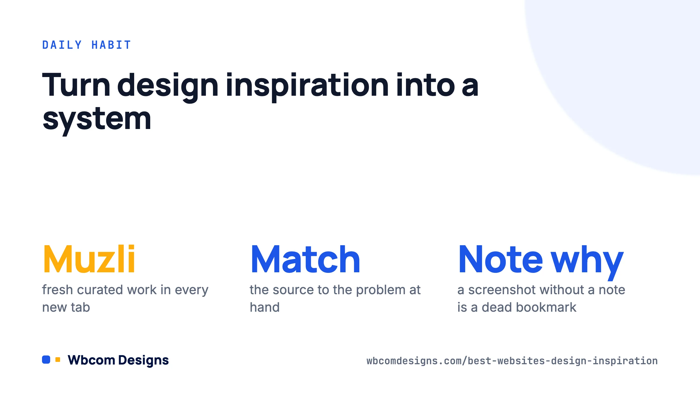
The most effective way to see good design every day is to install Muzli, a free browser extension that replaces your new tab page with a curated feed from Dribbble, Behance, design publications and trending sites. Every new tab shows fresh work without any deliberate effort.
Over weeks, thousands of references pass through your awareness. Your taste improves. Your reference library deepens. Your instincts sharpen. All from opening tabs. It is the highest-return design habit we know.
Beyond daily input, match the source to the problem. Building a landing page? Lapa Ninja and Land-book. Designing an app interface? Mobbin and Refero. Choosing fonts? Typewolf and FontPair. Picking colours? Coolors and Color Hunt. For deep learning, duplicate files from Figma Community and pull them apart. For client presentations, use WeLoveWP and the Awwwards WordPress filter.
Keep a reference board as you go. A private Figma file, a Raindrop collection or a folder of screenshots with one line on why you saved each one. The “why” is the part that compounds. A screenshot without a note is just another bookmark you will never open.
The designers who improve fastest consume design with intention. They do not scroll. They ask why a layout works, why a palette feels right, why an interaction is satisfying. That habit, more than any tool, separates designers who stay relevant from those who fall behind. Working in a team? Pair this habit with the collaboration tools for web designers we rely on so the references reach everyone.
Start with Muzli in your browser and one focused gallery for your current project type. Two changes. Give it a month.
Complete Design Inspiration Website Directory
| Website | Category | Best For | Cost |
|---|---|---|---|
| Awwwards | Web Design Gallery | Award-winning sites with jury scoring | Free (Basic $6.70/mo annual) |
| Recent (ex-Godly) | Web Design Gallery | Motion design previews | Free |
| Siteinspire | Web Design Gallery | Filterable design browsing | Free |
| Httpster | Web Design Gallery | Minimal, typography-focused design | Free |
| Mobbin | UI/UX | Real app UI screens | Free (Pro from $2.50/wk) |
| Refero | UI/UX | Tagged web and iOS screens | Free tier + paid |
| ScreensDesign (ex-Design Vault) | UI/UX | iOS onboarding and paywall flows | Free |
| Collect UI | UI/UX | Designs by component type | Free |
| Dribbble | Community | Visual shots, colour, branding | Free (paid from $4/mo) |
| Behance | Community | Project case studies | Free |
| Figma Community | Community | Interactive design files | Free |
| Lapa Ninja | Landing Pages | 7,000+ landing page screenshots | Free |
| One Page Love | Landing Pages | Single-page websites only | Free |
| Land-book | Landing Pages | Strictly curated landing pages | Free |
| Typewolf | Typography | Font identification and pairing | Free (paid guides) |
| FontPair | Typography | Free Google Fonts pairings | Free |
| Coolors | Color | Palette generation | Free (paid Pro) |
| Color Hunt | Color | Curated trending palettes | Free |
| WeLoveWP | WordPress | 4,800+ WordPress design gallery | Free |
| Awwwards WP Filter | WordPress | Award-winning WordPress sites | Free |
| Framer AI | AI Tools | AI-generated website layouts | Free (Basic $10/mo) |
| Google Stitch | AI Tools | AI UI designs with Figma export | Free with limits |
| Muzli | Daily Feed | New tab design inspiration feed | Free |
Frequently asked questions
What is the best website for web design inspiration?
Awwwards is the most recognised web design inspiration website. It scores nominated sites on design, usability, creativity and content. For a free alternative with animated previews, Recent (formerly Godly) is excellent. For filterable browsing by style and platform, Siteinspire is the best option.
What is the best free design inspiration website?
Recent, Siteinspire, Httpster, Behance, Figma Community, Collect UI, ScreensDesign, Lapa Ninja, Color Hunt and FontPair are all free with no paid tier required. Behance and Figma Community offer the most depth at no cost.
What is the difference between Dribbble and Behance?
Dribbble focuses on polished visual shots built for quick impact, like Instagram for designers. Behance hosts in-depth case studies that show the full process from brief to final product. Use Dribbble for colour and visual trends. Use Behance to understand design decisions.
Where can I find real app UI design inspiration?
Mobbin is the best resource for real app UI. It catalogues screens from shipped mobile and web apps, not concepts. Refero offers a large tagged library of web and iOS screens. ScreensDesign, which replaced Design Vault, walks through complete iOS onboarding and paywall flows.
What happened to Godly and Design Vault?
Both still exist under new names. Godly now lives at recent.design as Recent, with the same animated-thumbnail gallery. Design Vault redirects to ScreensDesign, which has refocused on iOS app flows. Old bookmarks redirect automatically.
What are the best landing page inspiration sites?
Lapa Ninja has the largest collection with more than 7,000 full-page screenshots. One Page Love specialises in single-page websites. Land-book is the most strictly curated, accepting only polished examples.
What are the best free font pairing tools?
FontPair curates hand-picked pairings from Google Fonts, so every font is free to use immediately. Typewolf identifies fonts on real websites and publishes pairing guides with context showing how the fonts perform in production.
Can AI tools generate design inspiration?
Yes. Framer AI generates layouts from text prompts, and Google Stitch creates UI designs that export to Figma. Both work best as starting points. The value is in the options you would not have thought of, refined with your own judgement.
How can I get daily design inspiration automatically?
Install Muzli, a free browser extension that replaces your new tab page with a curated feed from Dribbble, Behance, design publications and trending websites. Every new tab shows fresh work without any effort on your part.
Where to start
If you only add two things this week, make them Muzli for passive input and Figma Community for active learning. Then pick the one gallery that matches your current project: Lapa Ninja for a landing page, Mobbin for an app, Siteinspire for a marketing site, WeLoveWP if the build is on WordPress. Save what you find with a note on why. A month of that will do more for your eye than any course.
Interesting Reads
What WordPress Developers Can Learn from the iGaming Industry’s UX Innovation
3 Digital Marketing Tactics That Boost Conversions Fast
Related reading