
5 min read
The Retention Curve: Why Some Communities Flatten and Others Bleed Out


Plot the percentage of a signup cohort still active, week by week, and you get one of two shapes. Either the line keeps falling until it is basically zero, or it falls hard for a while and then goes flat, settling on some percentage that keeps showing up forever. Community people sometimes call the second shape a smile curve, because the line looks like it is turning back up even though nothing new happened. It just stopped falling. Everything else you measure about a community, growth, activation, referrals, is downstream of which of these two shapes you actually have.
Most people never check.
The reason is structural. Total member count is visible every day, right there on a dashboard, climbing as long as signups outpace the people who quietly stop showing up. A retention curve only reveals itself in retrospect, cohort by cohort, and only after you have waited long enough for the shape to settle. You cannot see it from this week’s numbers. You can only see it by going back ninety days and asking what happened to the people who joined then.
The number that lies
A community can grow every single month while every cohort inside it decays at the exact same constant rate. If 8% of active members stop showing up each month, and enough new signups arrive to outpace that loss, the total keeps climbing. The dashboard looks healthy. The retention curve, the one nobody is checking, never flattens. It just keeps producing a slightly larger number of people who are going to leave on the same schedule as everyone before them.
Growth does not fix that. It makes the leak more expensive to keep ignoring.
Picture two communities that both hit 5,000 members this year, growing at the same pace, on the same chart. One of them has a retention curve that flattens around month three at roughly 55% of each cohort still active. The other never flattens. Its curve is still sliding toward zero at month twelve, just slowly enough that new signups keep covering for it. From the outside, both dashboards look identical. One of them has a community. The other has a queue of people passing through on their way out.
Why a loop needs a floor
I have written about the growth loop a community needs to compound on its own: input becomes action becomes output that reaches someone new. That loop only compounds if the people it brings in stick around long enough to become inputs themselves. A loop running on top of a retention curve that never flattens is not a loop. It is a funnel with extra steps, still losing the same percentage of people every cycle, dressed up as a system.
The one AARRR stage that is not a moment
The AARRR funnel treats Retention as one of five stages, alongside Acquisition, Activation, Referral, and Revenue. The other four are mostly single events: someone signs up, someone takes one action, someone invites a friend, someone pays. Retention is the only one that is not a moment. It is a shape that only exists over time, and the shape is the entire point. You can pass every other stage and still be running a leaky bucket.
It only counts once someone has cleared activation in the first place. A retention curve built on raw signups instead of activated members is not measuring your community. It is measuring how fast people who were never really in it stop being on a list.
What actually flattens it
Nobody flattens a retention curve by asking members to try harder. The mechanisms that work are the ones that give someone a reason to come back without depending on them remembering to.
WB Gamification, a 100% free gamification plugin for WordPress, builds its streaks with grace days, so missing one day does not zero out weeks of continuity. That matters more than it sounds. A punishing streak teaches people that missing a day makes returning pointless. A forgiving one gives them a reason to come back even after a bad week.
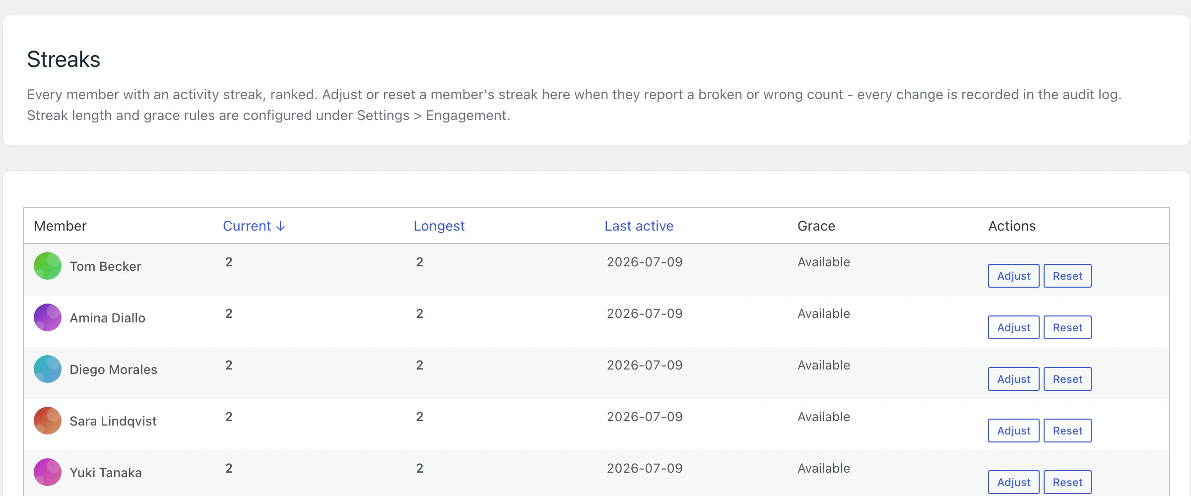
Cohort leagues do something similar from a different angle. Members get re-sorted into fresh weekly brackets, Bronze through Diamond, so someone who has been quietly outranked since March gets a new bracket every Monday instead of a leaderboard they gave up checking two months ago.
BuddyNext, the free Community OS for WordPress, backs this with its own branded email digests and onboarding reminder emails, for the same reason. A flattened curve is mostly not people choosing to stay. It is people being reminded there is something worth coming back to, at the exact moment they would otherwise have drifted.
None of this works past a point of diminishing returns. A digest that fires too often stops being a reminder and starts being the reason someone unsubscribes from all of it, which flattens nothing. The mechanisms that hold a curve up are the quiet ones a member barely notices is working on their behalf, not the loud ones fighting for attention against everything else in an inbox.
Decay is not the enemy
Some decay is real and has nothing to do with the product. People change jobs, change hobbies, finish what they came for. A cohort that drops from 100% to 60% in the first month is not necessarily broken. The actual question is not whether the line falls. It is whether it stops falling somewhere, and settles into a number you would be glad to keep forever.
Why nobody checks this
Acquisition is a number you can move today. Post something, run an invite push, watch the signups tick up by evening. Retention is a number you can only move for a cohort that joined ninety days ago, using decisions made back then, and you will not know if today’s decisions worked for another ninety days after that.
Sit with that for a minute: it is slow to reward you and nearly impossible to fake, which is exactly why most community owners spend their attention where the feedback is instant instead of where the leak actually is.
There is a second reason it gets skipped, and it is less flattering. Checking a retention curve honestly means admitting how much of your total member count is people who have already left in every way that matters, still counted, still inflating the number you show yourself every morning. It is easier to keep watching the number that is going up.
The actual check
Pick a cohort. Everyone who joined roughly ninety days ago. Look at what percentage was active in week one, then week four, then week twelve, then this week. If the line is still falling at the same rate it fell in week one, you do not have an onboarding problem you can patch with a better welcome email. You have a value problem, and no amount of acquisition spend fixes a value problem. It just buys you a bigger version of the same leak.
A community that is still shrinking in month six does not need a bigger front door. It needs something on the other side of it worth staying for.
Related reading