13 min read
Mobile-First Content for WordPress: Vertical, Swipeable, Fast

The Mobile Content Gap Most WordPress Sites Ignore
Here is an uncomfortable truth about most WordPress sites: they are not built for how people actually use the internet in 2026. Over 60 percent of all web traffic now comes from mobile devices, and for community and social sites, that number climbs above 75 percent. Yet the vast majority of WordPress themes and content formats are still designed with desktop screens in mind.
Responsive design solved the layout problem years ago. Your site probably looks fine on a phone. The columns stack, the text reflows, and the navigation collapses into a hamburger menu. But “looking fine” is not the same as being designed for mobile. There is a critical difference between content that adapts to a small screen and content that is built for it.
Think about the apps your visitors use before and after they visit your site. Instagram, TikTok, YouTube Shorts, Snapchat, WhatsApp Status. All of these deliver content in full-screen, vertical, gesture-driven formats. Users swipe, tap, and hold. Content fills every pixel of their screen. There are no sidebars, no footers, no wasted whitespace. The content is the experience.
Then they open your WordPress site. They see a scaled-down desktop layout with text paragraphs that require pinching to read comfortably, images that are too small to appreciate on a 6-inch screen, and a navigation structure that was designed for mouse clicks, not thumb taps. The content might be excellent, but the delivery creates friction. And friction kills engagement.
This is the mobile content gap: the disconnect between how mobile users expect to consume content and how most WordPress sites deliver it. Closing this gap does not require rebuilding your site from scratch. It requires adding a content layer that is genuinely mobile-first, one that uses the full screen, responds to touch gestures, and delivers media-rich experiences that feel native to the device.
Why Vertical Full-Screen Content Gets 2x the Attention
The shift to vertical full-screen content is not just an aesthetic preference. It is grounded in how people hold and use their phones, and the engagement data is overwhelming.
People hold their phones vertically 94 percent of the time. This is not a statistic that changes based on the content they are viewing. It is a physical behavior driven by how hands work. Holding a phone vertically is natural and comfortable. Rotating to landscape requires both hands and conscious effort. The content formats that win on mobile are the ones that work with this natural behavior, not against it.
When content fills the entire vertical screen, several things happen simultaneously:
- Distraction elimination: There is nothing else on the screen competing for attention. No sidebar ads, no navigation menus, no related post links, no footer. The viewer’s entire visual field is occupied by your content.
- Increased perceived value: Content that fills the screen feels more important and more intentional than content that shares space with other elements.
- Improved media impact: A photo displayed at full-screen resolution is dramatically more impactful than the same photo displayed at 300 by 200 pixels within a blog post layout. The image can breathe. Details become visible. Emotional resonance increases.
- Natural eye flow: On a vertical full-screen, the eye naturally scans from top to bottom in a single pass. There is no horizontal scanning, no column-jumping, and no decision about where to look next.
The engagement numbers confirm all of this. Vertical full-screen content formats consistently deliver 1.5 to 2.5 times higher completion rates compared to traditional responsive layouts. For video content specifically, vertical videos receive 58 percent more engagement than horizontal videos when viewed on mobile devices. This is part of a broader shift toward visual storytelling on WordPress that prioritizes immersive, image-first experiences over text-heavy posts.
Swipe, Tap, Hold: Gesture Navigation That Feels Natural
Touch gestures are the native language of mobile devices, and the best mobile content experiences speak that language fluently. WP Stories implements a gesture navigation system that mobile users already understand from the apps they use daily:

The WP Stories viewer supports intuitive gesture navigation: tap to advance, tap-and-hold to pause, and swipe to skip between stories, matching the interaction patterns users know from native mobile apps.
Tap to Advance
The most basic and frequent gesture. Users tap the right side of the screen to move to the next story segment, or the left side to go back. This is the same pattern used by Instagram Stories, Snapchat, and virtually every other story-format implementation. Your visitors do not need instructions. They already know how this works.
The beauty of tap navigation is its speed. A viewer can move through a 10-segment story in seconds if the content does not hold their interest, or they can linger on segments that resonate. The control stays with the viewer, which reduces the feeling of being trapped in a slow-paced presentation.
Tap and Hold to Pause
When a viewer finds a story segment they want to examine more closely, they press and hold the screen. The progress timer pauses, the auto-advance stops, and they can study the content for as long as they want. Releasing their finger resumes the timer. This gesture is particularly important for story segments that contain detailed images, longer text, or information worth absorbing at a slower pace.
The pause gesture also serves as an engagement signal. Segments where viewers frequently pause are clearly resonating, which gives you valuable data about what types of content your audience finds most interesting.
Swipe to Skip
A horizontal swipe moves between different users’ stories or between story groups. This is the fastest way to browse the stories feed, sampling content from different creators without tapping through every segment. Swipe left to move to the next story, swipe right to go back. The transition animation mimics the card-stack metaphor, with the current story sliding away as the next one slides in.
Swipe navigation is essential for communities with active story creators. When 20 members have posted stories, a viewer needs an efficient way to navigate between them. Tap-only navigation would require watching every segment of every story in sequence, which is impractical. Swiping lets viewers jump to the stories that interest them most.
Why Gesture Navigation Outperforms Buttons
Traditional web navigation uses buttons, links, and menu items that require precise taps on small targets. This works on desktop with a mouse cursor but creates friction on mobile. Fingers are imprecise. Small tap targets lead to mis-taps, frustration, and accidental navigation. Gesture-based interaction eliminates this problem entirely. The entire screen becomes the navigation surface.
Auto-Play and Progress Bars: Keeping Viewers Moving
Two features work together to create the rhythm that makes story content engaging: auto-play and progress bars.
Auto-Play: The Passive Viewing Experience
When a viewer opens a story, content begins advancing automatically. Each image segment displays for a set duration, typically five to seven seconds, before smoothly transitioning to the next segment. Video segments play for their full length. This creates a lean-back viewing experience where the viewer can simply watch without interacting.
Auto-play serves several important purposes:
- Reduces cognitive load: The viewer does not need to decide when to advance. The content flows at a pace that works for quick consumption.
- Creates momentum: Once a story starts playing, inertia keeps the viewer watching. Each segment transition is a micro-commitment to continue.
- Sets expectations: Auto-play signals that this is quick, consumable content, not a deep read.
- Increases completion rates: Stories with auto-play see completion rates 40 percent higher than those requiring manual advancement.
Progress Bars: Visual Pacing
At the top of the story viewer, a segmented progress bar shows the viewer exactly where they are in the story. Each segment of the bar represents one story slide, and the currently active segment fills from left to right in real-time, acting as a visible countdown timer.
The progress bar serves multiple functions simultaneously:
- Length indication: Before a viewer decides to commit to a story, they can glance at the bar and see how many segments it contains.
- Position awareness: Viewers always know where they are in the story. This prevents the “how much longer?” anxiety that leads to premature exits.
- Pacing feedback: The moving fill animation creates a subtle sense of urgency.
- Completion motivation: When the bar shows that a viewer is five out of six segments through, the urge to finish is strong.
Designing for Thumb-First Browsing
The concept of thumb-first design starts with a simple observation: most people use their phones with one hand, and the thumb is the primary finger that touches the screen. The thumb’s natural range of motion creates distinct zones on the screen:
- Easy zone (bottom third): The thumb reaches this area naturally without stretching. This is where your most important interactive elements should live.
- Stretch zone (middle third): Reachable but requires slight stretching. Good for secondary interactions.
- Hard zone (top quarter): Requires stretching or shifting the phone in hand. Avoid placing frequently-tapped elements here.
WP Stories is designed with these zones in mind. The primary navigation gestures (tap to advance, tap to go back) work across the entire screen surface, so thumb reach is not a constraint for basic navigation. The close button and progress bar are positioned at the top of the screen, where they are visible but do not interfere with the content area.
For story creators, the thumb-zone model has practical implications for content design:
- Place important text and visual elements in the center two-thirds of the screen, avoiding the very top and bottom edges where they might be obscured by device notches, status bars, or gesture areas.
- If a story segment includes a call-to-action link, position it in the lower-center area where the thumb can reach it naturally.
- Use text sizes of 16 pixels or larger for body text and 24 pixels or larger for headlines.
- Maintain generous spacing between interactive elements. Tap targets should be at least 44 by 44 pixels to accommodate finger imprecision.
Performance Optimization for Media-Heavy Content
Mobile-first content that uses full-screen images and videos can be performance-intensive, and performance on mobile directly correlates with engagement. A one-second delay in page load reduces conversions by seven percent. For media-heavy story content, performance optimization is not optional.
WP Stories handles several performance optimizations automatically:
Lazy Loading and Preloading
Only the current story segment and the next one in sequence are loaded into memory at any time. Previous segments are released, and future segments are loaded just-in-time as the viewer approaches them. This keeps memory usage constant regardless of story length.
The preloading system is intelligent. When a viewer opens a story, the first two segments load immediately. As the viewer watches segment one, segment three begins loading in the background. This pipeline ensures that transitions between segments feel instantaneous even on slower connections.
Responsive Image Sizing
Uploaded images are served at the appropriate resolution for the viewing device. A story viewed on a phone does not need a 4000-pixel-wide image. WP Stories uses WordPress’s built-in responsive image capabilities to serve the right size, reducing data transfer and improving load times.
Video Optimization
Video segments use adaptive streaming where supported, starting at a lower quality and increasing as the connection allows. Videos are muted by default with a tap-to-unmute option, which reduces initial data requirements and respects users who are in sound-sensitive environments.
Connection-Aware Behavior
On slow connections, WP Stories adjusts its behavior to maintain a smooth experience. Image quality may be reduced, video preloading may be limited, and transition animations may be simplified. The goal is always to keep content flowing without interruption.
Performance Benchmarks
For site owners concerned about the performance impact of adding stories, here are typical benchmarks:
- Initial story load: Under 1.5 seconds on a 4G connection
- Segment transition: Under 200 milliseconds (perceived as instant)
- Memory footprint: 15 to 30 MB per active story viewer session
- Page weight impact: Story indicators on the main page add approximately 50 to 100 KB, with full viewer assets loaded on demand
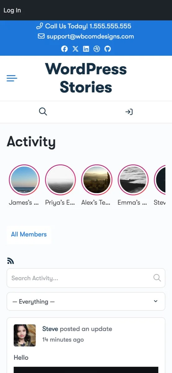
The mobile view shows WP Stories seamlessly integrated into the activity feed, demonstrating the optimized mobile layout with touch-friendly story indicators and responsive design.
Implementing Mobile-First Stories with WP Stories
Bringing genuinely mobile-first content to your WordPress site with WP Stories takes about 15 minutes. Here is the practical implementation path:
Step 1: Install and Configure
Download WP Stories from the WBCom Designs store and install it through your WordPress admin. Navigate to the settings panel and configure:
- Display style: Choose between circle, square, or list. For mobile-first sites, circle or square styles work best as they are designed for touch interaction.
- Story duration: Set how long each story segment displays during auto-play. Five seconds is a good default for image content.
- Expiration: Configure the 24-hour auto-expiration that keeps your stories feed fresh and current. Pairing auto-expiration with a deliberate ephemeral content strategy maximizes the engagement benefits of disappearing posts.
- Permissions: Decide which user roles can create stories. Start with admins and moderators, then expand as the feature gains adoption.
Step 2: Create Your First Mobile-Optimized Story
When creating story content, think mobile-first:
- Use vertical or square images that fill the mobile screen. Avoid landscape images that leave empty space above and below.
- Keep text overlays brief: one to two lines maximum. The message should be readable in under three seconds.
- Use high-contrast colors for text overlays so they remain legible on varied image backgrounds.
- If including a link or CTA, make it prominent and position it in the lower half of the frame where thumbs can reach it.
- Aim for three to seven segments per story. This is the sweet spot that feels substantial without overstaying its welcome.
Step 3: Test on Real Devices
Before rolling out stories to your community, test the experience on actual phones, not just browser developer tools. Check:
- Do story indicators appear correctly in the activity feed or designated placement area?
- Does the story viewer fill the screen properly, accounting for device notches and status bars?
- Do gestures work smoothly? Can you tap, hold, and swipe without issues?
- Is text readable without zooming?
- Do transitions feel smooth on mid-range devices, not just the latest flagship phone?
Step 4: Launch and Iterate
Announce the stories feature to your community. Post your first story as an introduction to the format. Encourage early adopters to create their own stories. Then watch the analytics:
- Which story segments get the longest pause times?
- Where do viewers drop off?
- What time of day sees the highest story engagement?
- How does mobile story engagement compare to desktop?
Use these insights to refine your content approach and posting schedule. Mobile-first stories are a format that rewards iteration.
Beyond Stories: Building a Mobile-First Content Culture
Adding WP Stories to your site is a concrete first step, but the broader goal is shifting your content mindset from desktop-first to mobile-first. This means:
- Audit your existing content through a mobile lens: Open your most popular pages on your phone and experience them as your visitors do. Where is the friction? Where does the layout break down?
- Design content for the thumb, not the mouse: Every interactive element should be easily reachable by a one-handed phone user. Every piece of text should be readable without zooming.
- Embrace vertical formats: Not just in stories, but in your regular content as well. Vertical images, portrait videos, and single-column layouts are optimizations for how people actually hold and use their devices.
- Prioritize speed: Mobile users are often on cellular connections with variable bandwidth. Every extra kilobyte of page weight is a potential drop-off point. Performance is a content strategy decision.
- Test on real devices regularly: Desktop browser simulations miss important details: touch responsiveness, scroll behavior, keyboard interactions, and real-world performance. Good documentation of your testing process helps maintain consistency across releases.
The Numbers That Matter
If you need to make the business case for mobile-first content on your WordPress site, these statistics provide the foundation:
- 60+ percent of web traffic is mobile (higher for social and community sites)
- Vertical content receives 58 percent more engagement than horizontal on mobile
- Full-screen formats deliver 1.5 to 2.5 times higher completion rates
- Story-format content has 70 to 85 percent completion rates versus 20 to 30 percent for text posts
- Mobile page speed improvements of one second can increase conversions by up to 27 percent
- 94 percent of phone usage time is in vertical orientation
- Touch-gesture navigation reduces interaction errors by 60 percent compared to small button targets
These are not projections or aspirational targets. They are documented outcomes from platforms and sites that have made the shift to mobile-first content delivery. Your WordPress site can achieve similar results.
Start Delivering Mobile-First Content Today
Your mobile visitors deserve better than a scaled-down desktop experience. They deserve content that fills their screen, responds to their gestures, loads quickly, and respects how they actually use their devices.
WP Stories brings vertical, swipeable, full-screen stories to your WordPress site with zero custom development. Auto-play keeps content flowing. Progress bars keep viewers oriented. Gesture navigation keeps interaction natural. And built-in performance optimization keeps everything fast, even on slower connections.
Get WP Stories and close the mobile content gap on your WordPress site. Your first mobile-first story is 15 minutes away.
Related reading