
19 min read
The Number That Lied to Me: What the BuddyNext Activation Funnel Actually Shows


For a long time I judged a community’s health by one number. Signups this month. Up is good, down is bad, simple as that.
It’s a comfortable number to watch because it only ever moves in the direction you want, mostly. And that’s exactly the problem with it. A signup is somebody creating an account. That’s it. It tells you a person clicked a button and typed a password. It tells you nothing about whether they came back, whether they said a word to anyone, whether anyone said a word back to them.
I’ve since pulled up communities with a beautiful, climbing signup line and a member base that was, underneath that line, quietly dying. New people arriving every week, and just as quietly leaving every week, and the chart never once told on itself. That’s not a hypothetical. That’s the normal state of a community run on vanity metrics, and it’s the same trap I wrote about in Goodhart’s Law: the moment a number becomes the target, it stops describing the thing you actually care about.
I remember the exact conversation that changed my mind on this. A site owner was proud of a signup graph that hadn’t dipped in four months. When we actually looked at who was posting, who was getting a reply, who was still around after week two, the picture underneath that graph was a lot thinner. New people were arriving at a steady clip and leaving at almost the same clip, and the top-line number had no way of showing that, because it was never built to. It only counts arrivals. It has no memory of departures.
So here’s the report I actually trust now, and I want to walk you through it the way I walked that conversation, because once you see the shape of it, you can’t really go back to just watching signups.
Four questions, asked in order
BuddyNext Pro calls it the Activation Funnel. You’ll find it under Engagement, then Insights, then a tab labeled Funnel. What it does is deceptively simple: it takes everyone who signed up in a window, usually the last 30 days, and asks four questions about them, in order.
Did they sign up. Did they make a first post. Did anyone react to that post. Did they follow another member for the first time.
That’s the whole list. No fifth metric, no vanity add-ons. And once you sit with it for a second, you notice these aren’t four random things. They’re four rungs on a ladder, and each one means something the last one didn’t.
Signing up proves nothing. It’s the lowest bar there is, a form submission. Posting proves a little more, somebody had enough curiosity or nerve to say something out loud in a room full of strangers. Getting a reaction back is the first moment the room says something back, and it’s not the new member doing the work anymore, it’s everyone else. And following someone for the first time is the moment a stranger becomes a person, the moment “a platform” turns into “a person I’m going to keep an eye on.”
By the time somebody clears all four, they haven’t just used your product. They’ve started a relationship with it.
Why it’s shaped like a funnel
Picture an actual funnel, the kitchen kind. Wide mouth at the top, narrow spout at the bottom. You pour a cup of something in, and less than a cup comes out the other end, because some of it clings to the sides on the way down.
That’s the whole visual. Everyone starts at the top, at signup, and that’s the widest point by definition, everyone who exists in the report cleared step one. Fewer clear step two. Fewer still clear step three. The report draws this as a shrinking bar chart, and here’s the part I actually like about how it’s built: the bars can’t lie to you by going the wrong direction. Each step is a subset of the step before it. Not a new count, a subset. So the number at step three can never be bigger than the number at step two, because nobody skips ahead. There’s no way to get credit for reacting-received if you were never even in the posted group to begin with.
That guarantee is what makes the drop-off numbers worth reading instead of just decorative. When the report says fourteen people made it to first post, that’s fourteen specific accounts, not a coincidence of two unrelated totals landing near each other.
Why it’s shaped like a cohort
Here’s where it gets uncomfortable if you’ve ever compared the wrong two groups of people.
A cohort, in this report, just means everyone who signed up in the same window, and only them. Not your whole membership. Not your power users from three years ago mixed in with somebody who joined this morning. Just this batch, checked only against itself.
Think about why that matters. Somebody who’s been a member for two years has had two years to post, get noticed, and follow people. Somebody who joined yesterday has had one day. If you lump them together and ask “what percent of our members have posted,” the old-timers carry the whole average and hide whatever’s actually happening to new people right now. You’d be measuring your history, not your present.
A cohort funnel refuses to let you do that. It’s the same discipline as a lab keeping a control group separate from the group you’re actually testing something on. This is what happened to the people who joined in this specific window, and nothing else gets mixed in.
What it actually looked like when I pulled it up
I ran this on a live test community rather than describe it in the abstract, because a report like this is easy to nod along to and hard to actually picture. Here’s the real screen.
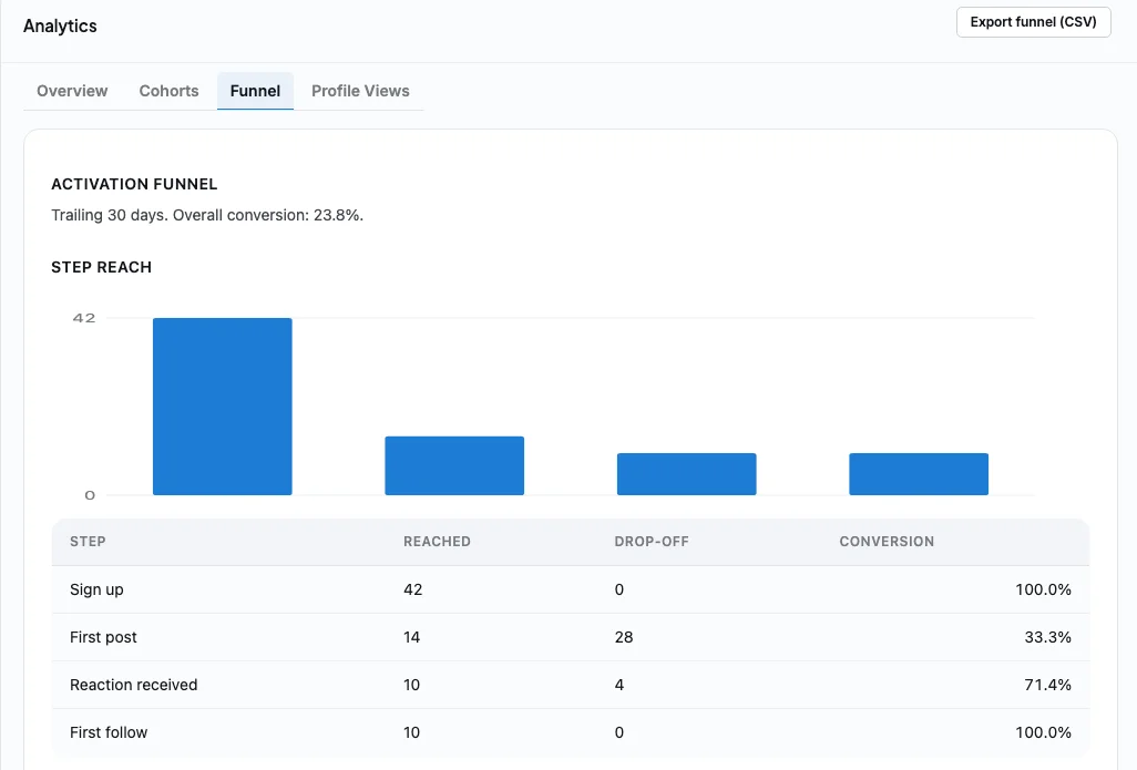
Forty-two people signed up in the trailing thirty days. Every single one of them, by definition, cleared step one. Fourteen went on to make a first post. That’s a 33% conversion, and it’s the steepest single drop in this whole funnel, two out of every three new signups never said a word.
Of those fourteen, ten got a reaction back. That’s 71%, which is a healthier number than I expected walking in, but read it the other way: four people worked up the nerve to post and heard nothing. And every single one of those ten who got noticed went on to follow somebody. Zero drop at that last step.
Add it up start to finish and you get 23.8% overall. Not even one in four signups became what I’d call an actual member. The report puts that number at the top so you don’t even have to do the division yourself, which I appreciate, because I used to do exactly this math by hand off separate exports and get it wrong half the time.
Look at the bar chart the report draws and you can see the kitchen funnel from earlier made literal. A tall bar at forty-two, a shorter one at fourteen, two shorter still after that. You don’t need the percentages to feel where the trouble is. Your eye finds the steepest drop before you’ve read a single number, and that’s exactly the point of drawing it this way instead of just listing four rows in a table. A shape you can feel is harder to explain away than a percentage you can rationalize.
The version of this that should actually worry you
The funnel above has its worst drop at the very first step, signup to first post. That’s common, and it’s usually a friction problem: something about your onboarding is putting a wall between “just signed up” and “said something.”
But there’s a worse shape, and it’s worth knowing what it looks like before it shows up on your own dashboard. Imagine a hundred people sign up. Sixty of them post. Only fifteen ever get a reaction.
Sit with that for a second, because it’s not the failure you’d expect. Sixty out of a hundred posting is genuinely good. Most of your onboarding is working. People are showing up, reading the room, and deciding to participate. The failure is what happens the moment after they hit publish: forty-five of those sixty people put themselves out there and got exactly nothing back.
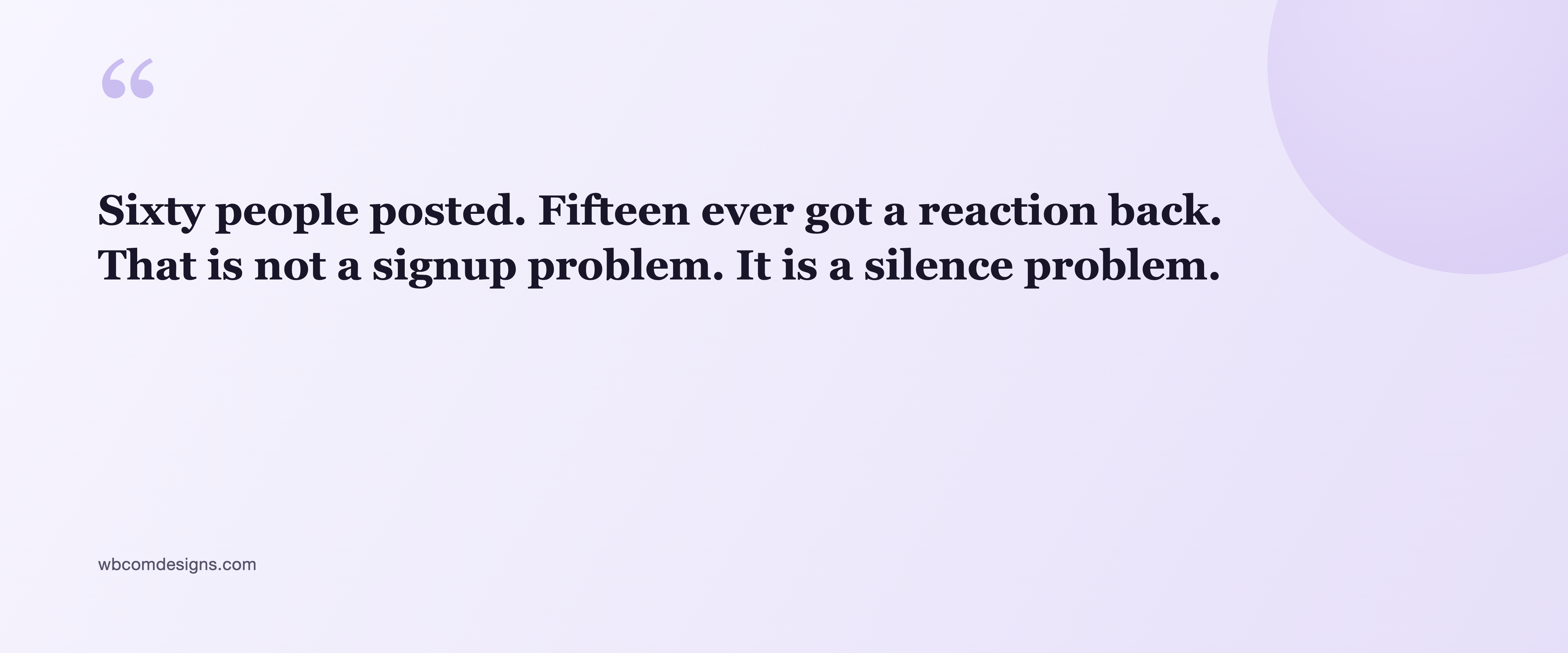
That’s the specific, quiet moment somebody decides your community isn’t worth their time. Not a bad signup form, not a confusing homepage. A stranger said hello to a room and the room didn’t say hello back. Nobody files a support ticket over that. They just stop opening the app.
Here’s what that can look like on the front end, not just as a number in a report. I created a fresh test account, posted a normal, friendly first message the way any new member would, and left it alone.
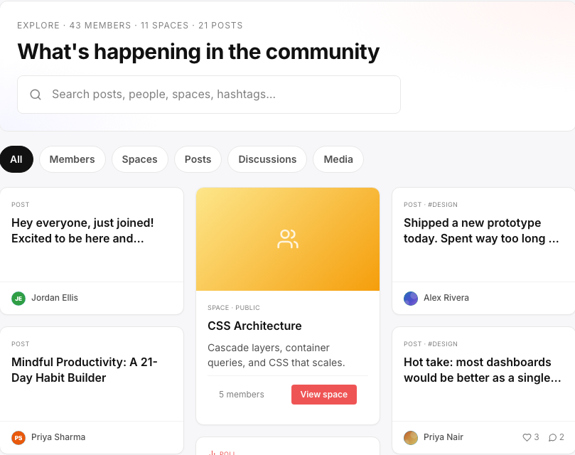
Look at the two cards next to each other. One has visible reactions and replies. The other, the new member’s post, has nothing under it at all, no count, because there’s nothing to count. That gap is invisible in a raw signup number and completely obvious the moment you look at an actual feed. This is the exact mechanism behind a piece I wrote called Liquidity: a community can be full of members and still feel empty if there aren’t enough people around to answer. The funnel is how you catch that happening to your newest arrivals before they quietly leave over it.
What the numbers are actually built from
I want to say a word about why I trust this report, because it would be easy to build a fake version of it that looks the same and means nothing.
The lazy version would run four separate counts in the same date range: how many signups, how many posts, how many reactions, how many follows, and just stack them like a bar chart. That’s not a funnel, that’s four unrelated totals standing next to each other pretending to be related. It can even produce nonsense, a step going up instead of down, if more reactions happened to land in that window than posts did.
What BuddyNext does instead is track the actual people. Step one resolves to a real list of member IDs, whoever signed up in the window. Step two doesn’t count posts in general, it checks which members from that exact list went on to post. Step three checks which of that narrower list got a reaction. Each step is a strict subset of the one before it, mathematically, not by convention. That’s why the drop-off number is something you can actually act on: twenty-eight people dropped off between signup and first post means twenty-eight specific accounts, sitting right there in your database if you wanted to look them up.
Why a pageview tool could never tell you this
It’s worth being honest about why this has to live inside the plugin itself and can’t just be bolted on from something like Google Analytics.
A pageview tool can tell you a browser loaded the signup page. Separately, it can tell you some pageviews happened on pages that look like posts. What it can’t do is tell you those were the same specific human being, connect that identity to a member account, and then check whether that exact account later received a reaction from another exact account. A reaction isn’t a pageview. It’s a relationship between two members, stored as a row in a database, and a traffic tracker was never built to see relationships, only visits.
That’s the whole reason this report is only possible from inside BuddyNext. It already knows, natively, who posted what, who reacted to it, and who followed whom. It’s reading its own data instead of trying to reconstruct a stranger’s identity out of anonymized traffic after the fact.
A couple of ways to misread this
A report is only as good as the caution you bring to reading it, so a few things I’ve learned to check before treating any single number as a fire alarm.
Small cohorts swing wildly. If only six people signed up in your window, one of them posting or not posting moves the percentage by double digits. Don’t panic over a bad month with a tiny cohort. Watch the trend across a few windows before you believe it.
The default window is a trailing thirty days, which means someone who joined twenty-nine days ago has had far less time to clear every step than someone who joined twenty-five days ago, and the report counts them the same. On a slower-paced community where posting isn’t a daily habit, this can make activation look worse than it really is simply because the clock hasn’t run out yet.
There’s also a difference between a report that’s honest and a report that’s complete, and this one is honest, not complete. It tells you where people stopped. It doesn’t tell you why, and I’ve learned not to assume I already know why just because I have a theory that sounds right. The best use of a bad number here is as the start of a conversation with your own members, not the end of one. Ask a few people who signed up and never posted what stopped them. The answer is sometimes something the report could never have hinted at.
And the reaction-received step depends on people other than the new member. If that’s consistently your worst drop, it might not be a new-member problem at all, it might be that your existing members aren’t active enough to notice anyone. Worth knowing this specific failure tends to get worse as a community grows, not better, because a bigger crowd makes everyone a little more likely to assume somebody else will answer. That’s the exact mechanism in the Ringelmann effect, and it’s a good reason not to assume growth alone will fix a quiet room.
What I’d actually change at each step
None of this is useful unless it tells you where to spend an afternoon.
If the cliff is between signup and first post, treat it as friction, not disinterest. They already walked in the door. Shorten the distance between finishing signup and seeing something they could post into. A “say hello” space with a low bar for what counts as a good post does more here than a longer onboarding flow ever will.
If the cliff is between first post and getting a reaction, this is the one I’d fix first, because it punishes the people who already did the hard part. Feature new members’ posts somewhere visible instead of letting them sink into a general feed next to everyone else’s. Give your existing members an actual nudge, even a soft one, to be the first reaction on a newcomer’s post. The goal is making sure the first thing a new poster experiences after hitting publish isn’t silence.
If the cliff is between reaction and first follow, and it’s rarer than the other two, people are being noticed without ever being pointed at a specific person worth following. Surface a follow suggestion right after someone’s first reaction lands, while they’re already back in the app checking a notification.

A prompt like this, placed at exactly the moment someone’s already engaged and looking around, is a small thing that closes a gap the funnel would otherwise just keep reporting on forever.
What I’d tell you if you only had five minutes
If you skimmed everything above and just want the version you can act on this afternoon, here it is.
Open the Funnel tab. Find your worst single drop, the biggest gap between two adjacent steps. Don’t try to fix all three gaps at once, pick the worst one and ignore the others for now. If it’s signup to first post, make posting easier and more obvious in the first five minutes someone’s on your site. If it’s first post to reaction, go find your quietest new members’ posts today and react to them yourself, then build a habit around it. If it’s reaction to first follow, add a suggestion right where people already are once they’ve been noticed.
Then wait a month. Look again. Did that specific gap shrink. That’s the only question that matters, and it’s a question a raw signup count was never able to answer for you.
The report next door
The Funnel answers one question, asked once. Did this batch of new members cross four lines. It never asks what happens after that, and it wasn’t built to.
That’s where Cohorts comes in, sitting one tab over. Where the funnel checks four fixed milestones a single time, Cohorts asks the same question over and over, week after week, for as long as you keep watching. Of everyone who signed up in a given week, what share came back the next week. And the week after that. And the one after that.
Here’s what it actually looks like.
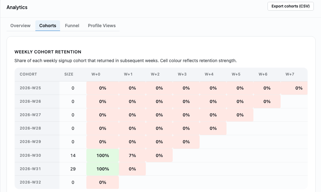
Read a row left to right. Each row is one week’s signups, one cohort. Fourteen people joined in the week labeled 2026-W30. The first column, W+0, is always 100 percent, because that’s just the week they joined, nobody’s had a chance to leave yet. The column after that, W+1, is the real question: of those fourteen, how many showed up doing anything at all one week later. In this case, one person did. Seven percent. Zero the week after that.
Sit with that for a second, because it’s a much colder number than anything the funnel showed. This same cohort’s activation funnel might have looked fine, people posted, people got reactions, but a week later almost all of them were already gone. Activation and retention are not the same question, and a community can pass the first one and fail the second one completely.
The color is doing the reading for you before you’ve looked at a single number. Pink is a warning, green is healthy, and your eye catches the shape of a row before you’ve added anything up. A row that turns pink fast tells you people show up once and vanish. A row that holds a warmer color further out tells you something is genuinely pulling people back, and that’s worth knowing exactly what it is so you can do more of it.
Why weeks, and not the funnel’s fixed thirty-day window? Because retention is a slower question than activation. Activation is about the first hour, or the first day. Retention is about whether someone’s still around a month from now, and you can’t see that shape in one snapshot. Only by watching the same group across several windows stacked on top of each other.
One is about whether someone became a member. The other is about whether they stayed one. You want the funnel first. Retention is the question that only matters once activation is already healthy.
Building the community with this in mind, not after
None of this is useful if you only ever look at it after the fact. The better use of these two reports is to let them point you at settings you already have and probably haven’t touched.
Take the worst drop we found earlier, signup to first post. There’s a real, concrete lever for that sitting under Members, then Registration and Login, and it’s worth opening that screen once before you ever look at a funnel number.
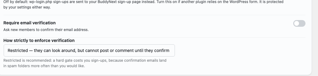
Requiring email verification and setting it to Restricted means a new member can look around but can’t post or comment until they confirm their address. That’s a hard gate, and BuddyNext’s own settings screen says so plainly right there: a hard gate costs you signups, because confirmation emails land in spam more often than anyone would like. If your funnel’s worst drop is exactly at first post, this is one of the first places I’d check. Not because verification is wrong to want, plenty of communities genuinely need it, but because it’s exactly the kind of setting that can quietly explain a number you were about to blame on something else entirely.
A little further down the same page is a second lever, smaller but just as direct.
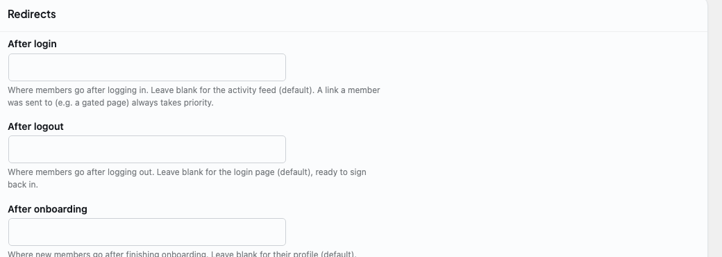
After onboarding controls where a brand new member lands the moment they finish your signup flow. Left blank, they land on their own profile, which is a perfectly reasonable default and also a dead end. Nobody posts from their own profile page. Point that redirect at your general space, or wherever your easiest first post lives, and you’ve shortened the exact distance the funnel is measuring, the gap between finishing signup and saying something.
This is the actual relationship between these two reports and the rest of BuddyNext worth understanding as you build a community, not after the fact. The Funnel and Cohorts tabs don’t have their own settings screen, and they aren’t supposed to. They’re a mirror, not a control panel. The controls live everywhere else in the admin, in Registration and Login, in how you’ve set up your Spaces, in what your onboarding flow actually asks people to do. Build the community with those in mind first, check the mirror after, and go change whichever setting the mirror is pointing at.
Which of this matters most depends on what you’re building
Not every community needs to watch this the same way, and it’s worth being honest about where it matters most.
If you’re running anything with a subscription or a paid tier attached, and BuddyNext Pro’s own monetization tools make that a real option, this report is closer to a revenue instrument than a nice-to-have. A member who never activates is a member who churns quietly at the end of their first billing cycle, and by the time that shows up in your subscription numbers, you’ve already lost the chance to do anything about it. The funnel catches it weeks earlier, while there’s still a member left to save.
If you’re running a support or help community, this pair of reports lives and dies by the reaction-received step specifically. A customer who posts a question and hears nothing back doesn’t file a complaint. They just open a support ticket somewhere else, or leave a review instead. Watch that one step closer than the other three if this is you.
If you’re running something more social, a hobby group, a fan community, a place that exists because people enjoy each other’s company rather than because anyone’s paying for it, the signup to first post step tends to matter most, because the entire value of the place is other people, and someone who never posts never actually meets anyone. Onboarding friction is your real enemy here, more than anything else on this list.
And if you’ve paired BuddyNext with Learnomy, running a course-adjacent community where members move through material together, watch Cohorts more than Funnel. A learner who’s active in week one and gone by week three isn’t a content problem. It’s very often a pacing problem, or a belonging problem, and retention is where that shows up first, long before a completion rate ever would.
Different shapes of community, same two reports, different step to watch first. The mistake is treating all four steps, and every cohort week, as equally urgent when they were never going to be.
The exports nobody asks for until they need them
There’s a CSV export sitting right next to this report, and for a long time I skipped past it because a screen full of numbers already felt like enough. I was wrong about that.
The value of the export isn’t the data, it’s the same data a month later, sitting next to this month’s. A screenshot tells you where things stand today. A folder of exports tells you a story, whether the signup-to-post gap you fixed in March actually stayed fixed through April, or whether it crept back the moment you stopped paying attention to it. Communities drift. A fix that worked once doesn’t automatically stay working, and the only way to know is to have last quarter’s numbers sitting on the same spreadsheet as this quarter’s.
If you manage more than one community, this is also the only honest way to compare them. Not by whose signup count is bigger, that comparison was never fair to begin with, but by whose activation percentage is healthier. That’s a comparison actually worth making, because it’s measuring the same thing in the same way for both of them.
A habit, not a checkup
The number itself is less useful than the discipline of checking it on a schedule. A single snapshot tells you where this month’s new members are stuck. Coming back next month tells you whether the thing you changed actually moved the needle.
Change one thing at a time. If you added a “post something” nudge to onboarding because that first step was the weak one, don’t also relaunch your homepage and rewrite your welcome email in the same week. You’ll have no idea which change did anything. Fix the worst step, wait a full window, look again.
And keep an eye on cohort size sitting right next to the percentage. A steady conversion rate while signups are climbing is a genuinely good sign, it means whatever you’re doing is holding up under more volume. A steady conversion rate while signups are flat is a different, quieter problem, and the funnel alone won’t have that conversation for you. You will.
Watch the number that tells you whether people stayed, not the one that only tells you they arrived.
Related reading