One of the biggest mistakes that eCommerce startups make is not considering the UI/UX of the platform they’re building. An ill-conceived UI/UX can make your customers want to leave the website before purchasing. While an ill-designed interface may not seem a big deal, it can be a killer. It’s the simplest UI/UX Mistakes eCommerce to avoid.
Online retailers can build a positive association with their brand by creating a user-friendly interface. A negative experience can drive a user away. By providing a good experience, eCommerce companies can attract customers. Here are some mistakes that eCommerce startups should avoid. Keep reading to understand what to include and what not to.
Table of Contents
ToggleCommon Mistakes People Make With UI/UX Design
If you’re trying to create a great-looking website, there are some common mistakes you might be making with your UI/UX design. Ignoring usability is one of the biggest mistakes you may make. While we can’t predict what the future holds, we can ensure that our designs will please our users.
Below listed are some common mistakes you might be making and how you can avoid them:
1. Complex Navigation- UI/UX Mistakes eCommerce

One of the most extensive UI/UX mistakes e-commerce websites make is that they include too many buttons. Too many buttons turn off customers, and too little information is available.
When creating a site, make sure that users browse and search for products easily. For best results, keep the number of clicks to a minimum. By keeping the navigation easy to understand, your customers will be more likely to purchase products from your website.
When designing an eCommerce website, you must keep in mind the needs of your users. The site’s layout should be easy to navigate and fast to load. It should also be mobile responsive and have a clear click path. The user should understand exactly what they are trying to do and where to go. If a user cannot navigate a site, they will abandon it without making a purchase.
A good eCommerce site should offer filters and sorting options for users to find the product they are looking for quickly. Adding too many buttons may not increase sales, but it will make navigation difficult and make it difficult for customers.
2. Poorly Designed Shopping Carts
Many eCommerce businesses fail to convert visitors into customers due to UI/UX mistakes. The shopping cart is a vital part of the eCommerce experience, and it is a crucial point to get right. The design of the checkout process should be straightforward. It should include all shipping fees and any additional costs. Most studies claim that up to 80% of eCommerce websites fail. To avoid these pitfalls, you should take the time to make sure your website is free from these common errors.
To keep your website up to date and relevant, you should focus on UX design. Your customers have a high expectation for an easy and fast checkout process. A long and complicated checkout process will only discourage customers. UI/UX design should be easy to use and navigate. A shopping cart should also have a breadcrumb for easy navigation.
A navigation breadcrumb is an essential component of a successful eCommerce website. If the user cannot find the product they are looking for, they’ll abandon the cart. If your cart is not easy to use, you will be losing potential customers. It is where UX design mistakes come in handy.
3. Messy/Complex Layout

One of the most common UI/UX mistakes in eCommerce is duplicate categories, which confuses and discourages customers. The website’s layout should be simple and easy to navigate, and it must be visually appealing in all browsers. If a user cannot easily navigate your website, they may bounce. It may result in lost sales and damaged customer loyalty.
As a website owner, you should have a clear message about the purpose of your site and what you’re selling. Users should be able to understand the name and product of your business from the first few seconds of visiting it. 3D Mailbox, for example, does not convey a clear message and instead looks like a page devoted to email software. CyberDesign Clan is another example of a website that lacks a clear message and instead loads the actual homepage as soon as they click on it.
4. Overuse of Fancy Typography

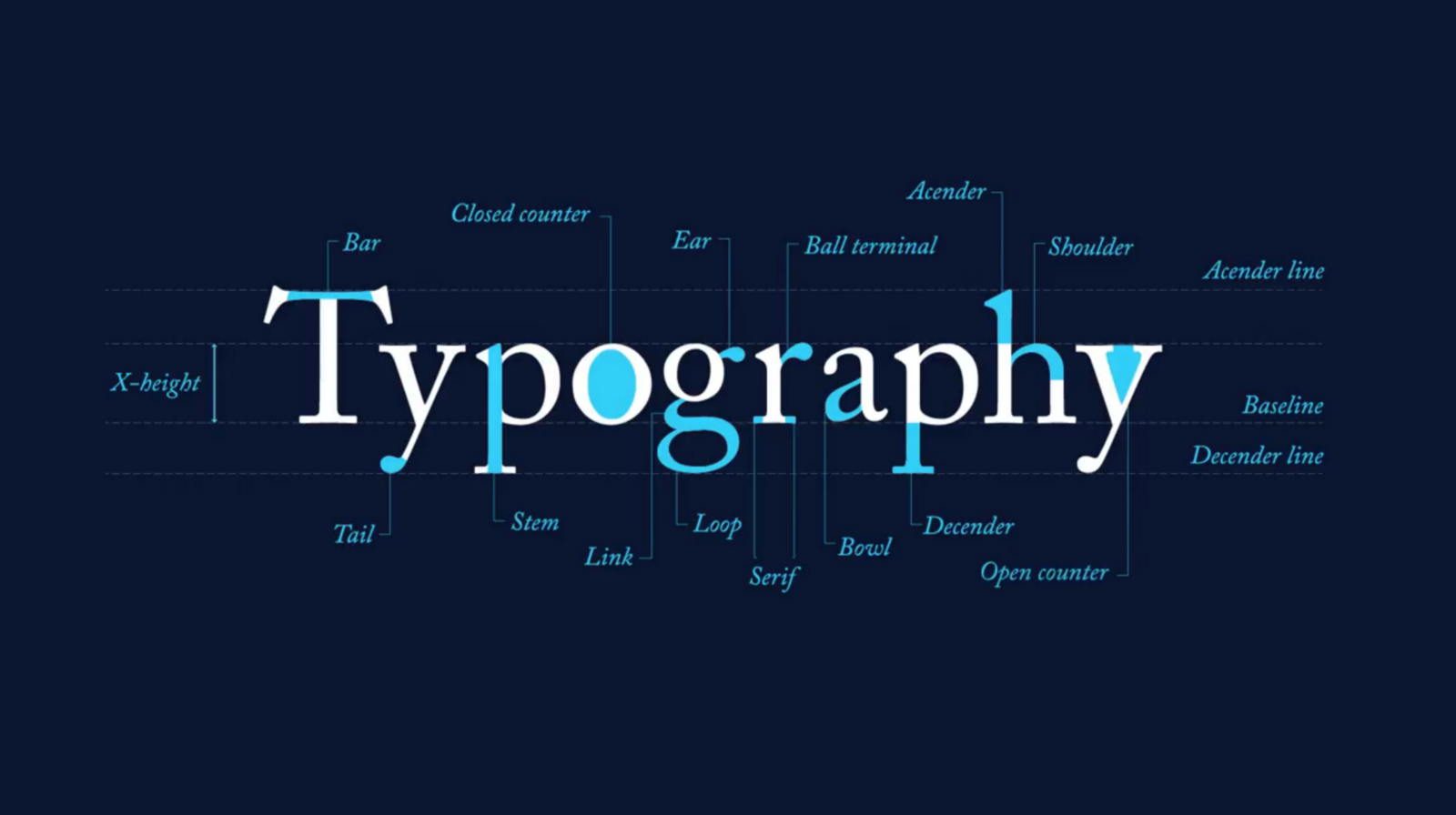
Using a complicated font or overuse of fancy typography can cause users to leave your site. While you want your website to look good, you must also be aware of the pitfalls of this design choice. It’s common for designers to make rookie mistakes when implementing UI/UX principles.
One of the most common UI/UX mistakes is the overuse of text and images. When a site is overloaded with information, it reduces user experience and decreases sales. A well-designed website will include a variety of fonts and style consistency, but not overdo it. In addition, the use of fancy typography can increase your bounce rate, resulting in a lower conversion rate.
Fancy typography makes it challenging to read and may turn off potential customers. It is a big problem for online businesses. A website with poor typography can cause users to lose interest and leave the site. Not to mention, typography mistakes can lead to a massive loss of business.
Also Read: How To Customize Typography
5. Hard-to-Find Key Details
Another common UI/UX mistake in eCommerce is requiring complicated passwords for consumers to access certain content. It is difficult for search engines to index your site if your submenus are too large. In addition, users may not want to enter complex passwords. In addition, these types of logins are not appropriate for a small microelectronics forum. If consumers have to enter a complex password to register on your forum, they won’t return. On the other hand, a solution related to medicine or finance might justify a complicated password.
6. Lengthy or Mandatory Sign-Ups
It would be best if you avoid the long or mandatory sign-up form option at all costs. It would help if you also considered implementing a heatmap on your site to understand user behavior.
Using a long, complex form with many fields can be problematic. It would help if you automatically highlighted areas with errors or made sure that the form scrolls to the appropriate field. If you’ve already entered an email address, don’t force the user to confirm it – unless it’s essential. It is one of the worst UI/UX mistakes in eCommerce, and it will cost you customers and revenue.
Also Read: 7 Web Design Factors That Affect Web Page Conversion Rates
7. An Unresponsive Site
One of the most common UI/UX mistakes in eCommerce sites is the use of heavy media elements. They should not be embedded into the website code and should be reduced to thumbnails. You should also avoid long forms because they are cluttered and may discourage customers from purchasing your products. It is a common mistake, but it can be avoided by simply making sure your text hierarchy is clear.
Using a mobile-friendly design, you can avoid making these common UI/UX mistakes. An eCommerce platform must be simple, uncluttered, and full of the details that customers typically look for. Your product images and descriptions should clearly describe the product and entice the customer to purchase. However, if your site’s design is not responsive or easy to use, it will drive customers away.
8. Feedback Option

Another UI/UX mistake is not incorporating user feedback. Users know what works and what doesn’t. They can provide you with ideas you didn’t think of yourself. It’s the best way to improve your site’s design and user experience. Incorporating user feedback is a great way to improve your UI/UX and make it more appealing to your customers.
Also Read: Avoid Blogging Mistakes While Creating A WordPress Blog
9. Focus On Single Page- UI/UX Mistakes eCommerce
Sometimes site builders focus on a single page instead of creating several. A website’s primary goal should simplify the purchase process and help customers find products quickly. A well-organized site will make the buying process easier for customers and minimize the risk of purchasing the wrong item. A user-friendly interface will encourage repeat customers, resulting in a loyal base.
Also Read: Ever Think Why Your Website Form Is Not Converting?
10. Not Doing Your UX Research
When designing your eCommerce site, the biggest mistake you can make is failing to do your UX research. In the present day, users are used to quick, seamless experiences. A poorly designed website can hurt your conversion rate, especially if it requires too many clicks to complete a task. To make your site easy to use, use clear, enlarging, and high-quality images.
A bad UI/UX design can cause a user to abandon your eCommerce site before completing the purchase. Make sure your eCommerce site offers comprehensive product information to avoid such a mistake. Unlike traditional retail stores, online shopping is not an interaction-based experience. Instead, it relies on detailed product descriptions to help users understand what they’re buying.
UI/UX research is one of the most important steps you can take when planning a successful eCommerce website. Without it, your customers may not even be able to find the products they’re looking for! You should also ensure that your UI/UX design includes filters and sorting options so that users can search the products they’re interested in.
Also Read: Wbcom Essential Templates with Other Themes
The Bottom Line of UI/UX Mistakes eCommerce
A good user interface and experience are more than simply using the correct colors and fonts or logically organizing your website. It’s about making it easy for people to complete a task online.
You must understand your users, their goals, and what they want from your site to create a fantastic user experience. A good UI will also grab your customers’ attention and help you upsell your products and services. It should be easy to navigate and well-designed. You can also build trust with your audience. You can avoid these common errors, and your website will grow.
Interesting Reads:


