The ultimate goal of any business website is to create a buzz about its products and services, thus ushering in a profitable business.
There are plenty of strategies you can employ to create a more effective, lead-generating website.
One such strategy focuses on optimizing form conversions.
Form conversation happens every time a visitor to your website successfully fills out a form and submits it on the website. You may call this a “micro-conversion” which can potentially generate “macro-conversion” in the long run.
Many believe shorter forms amount to higher conversions. But that doesn’t hold true in all cases. A close analysis will help you understand how to improve form conversion rates for your website.
7 Best Practices for better form conversion rates
No matter what lead capture strategy a B2B company opts for, a lead generation form is a must.
In fact, that’s the first step towards subtly persuading your leads to buy your service, thus converting engagement to business.
When placed in the website landing page, these forms act as gateways between the visitor and your site.
Studies show only 27% of form-generated leads stand qualified. The rest are wasted. However, an optimized form has the power to turn the tide in your favor.
Success lies in the details. The difference between a high-converting form and a lower one is found in those “trivial” factors we often take for granted.
Here are some research-backed tips and best practices to help you create optimized forms, thereby ensuring a high conversion rate.
1. Engagement level of your audience
As they say, first impressions matter the most.
The landing page is crucial when it comes to creating that “impression” and arousing curiosity among page visitors.
This is the best place for form placement. You need to ensure the form fits in perfectly with the key messaging of the landing page.
A carelessly crafted form may ruin the prospects of a well-designed and well-written landing page.
The burning question is — does the form engage your users?
Targeting just one engagement level would suffice, if done with care and consideration.
Let us look at the main engagement levels:
Uncertain prospects
Here, you need to put in more effort to convince those who aren’t yet sure. In order to explain your offers more elaborately, the landing page ought to be longest here and the forms should be placed much below. Basic fields such as full name and email ID should be enough at this stage.
Interested prospects
Yes, they’re interested. But not fully motivated to go ahead with form fillup. Keep the landing page a little longer and ensure the CTA not just informs but motivates too. Fewer fields are desirable here.
Prospects already sold
You can afford to keep the landing page short while ensuring more specific fields in your form. This way, the required details can be obtained from the prospects. Moreover, as they are already convinced, your CTA can now focus on information and not motivation.
2. Number of fields

The most common advice for successful form conversion rate is to create a form with a lesser number of fields.
However, instead of keeping it short, try keeping the form at the shortest length possible.
This means, the number of fields should depend on your target audience and their engagement level.
There’s no point overwhelming users with unnecessary fields or asking for too much information. They may not feel comfortable sharing too many confidential details.
If you can help it, don’t go beyond three fields for your form.
According to a study by Hubspot, when the number of fields is reduced from 4% to 3%, the form completion rate shoots up by 50%.
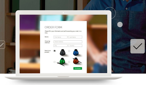
There are scores of form templates available on the internet. Whether the page contains registration forms or order forms, refer to these templates and get the much-needed guidance.
3. Call-to-action (CTA) headline
Besides the landing page CTA, the conversion form should have a distinct set of CTA headings, subheadings and buttons.
This determines whether visitors proceed to the next stage by making provisions for specific actions such as “Start your free trial” or “Register now”.
Most of the time, websites use verbs as their CTA headlines or button labels.
You must have encountered words such as “Submit”, “Sign up”, “Download” on a regular basis on any random site.
However, these verbs, when used in isolation, create vague meanings and may run the risk of coming across as “commands” to offending prospects.
To overcome this problem, use nouns to create CTAs that are in tune with your offers.
Moreover, CTA button colors play a crucial role here.
The trick is to select a color that’s in sync with the current design and layout but doesn’t shy away from inviting you to proceed further with well-defined and clearly-labeled CTA buttons.
Some case studies show how red stands out with its most impressive performance. Green and orange aren’t lagging too far behind.
As you can see, a simple fix here, a slight tweak there has the power to bring in huge gains.
4. Correct form position
Experts say conversion forms should be placed above the fold (the first half of the screen that you see without scrolling).
Moreover, the form layout should be able to stand out from amongst other page elements. A conversion form at the bottom of the page serves little to no purpose. Only a few discover it.
However, here’s a catch — What if your prospects aren’t inspired enough to fill in their information?
Will you try to engage and motivate them through an attractive landing page?
Or, will you be too eager to extract information from disinterested visitors?
A sound business mind will ensure the landing page packs enough punch with its eye-catching headings, subheadings and rich content.
Once your prospects are absolutely engrossed, they’ll want to find out more and scroll down where they’ll be greeted with smartly presented conversion forms.
So, the “above the fold” mantra works well for pre-sold prospects but in other cases, forms placed a little below serve the purpose.
5. Avoid phone numbers if you can
The phone number field is quite a controversial one as it compels even the most enthusiastic prospects to pause and reflect.
Most people are pretty wary of revealing this vital information and rightly so. They’re already dealing with multiple distractions in day-to-day life and the last thing they would want is a deluge of sales calls.
The form fields essentially depend on the type of forms. If you believe the phone number field has to be there, at least give the user a choice.
Once you change the phone number field from mandatory to optional, the form abandonment rate drastically drops from 39% to a mere 4%. Avail the services of click-to-call buttons to allow leads to access you.
6. Mobile responsiveness
Mobiles have emerged as the latest and most effective frontier in the B2B world.
A study by Boston Consulting Group reveals how mobiles are responsible for an impressive 40% rise in revenue of marketing leaders.
You can’t just ignore these facts and figures.
Create the conversion forms in a way that makes them adaptable to mobile devices.
Seek out some popular themes and plugins to enhance the look and feel of your landing page as well as the conversion forms on that page.
Ensure the layout doesn’t get distorted formobile users.
Additionally, the rows and columns should stack on a mobile screen by default.
Whether it’s a mobile screen or a computer screen, you would want the most important information to be filled first.
If it’s a longer form, ensure the mandatory fields are stacked higher up as compared to optional fields.
7. GDPR compliance/ Social proof
General Data Protection Regulation (GDPR) is a EU law that governs and regulates data privacy in the EU.
If you’re wondering how this is relevant for a US-based business, let us explain.
Whenever the conversion form accepts confidential data from an EU citizen, your business comes under the purview of the rules, regulations and penalties imposed by GDPR law.
Making your form GDPR compliant would be the right way to go.
If the form is in sync with Conversion Rate Optimization (CRO) best practices or the landing page is optimized using CRO software, half the job is done in terms of GDPR compliance.
Some of the key GDPR requirements are stated below:
- Pre-checked boxes are prohibited. Keep all checkboxes blank and avoid trouble
- Consent bundling is not allowed. Your form should pertain to a particular offer. Don’t jumble things up by sneaking in a different offer while requesting for newsletter subscription
Conclusion
As a marketer, you ought to be clear about how you want your form to look and feel like. Once that clarity is achieved, it’s a smooth ride from there.
Several tools are available in the market to help you create a smart form that optimizes the entire site for a higher conversion rate.
The strategies described above aim to show the way so that you get the maximum benefit out of your CRM.
Use this opportunity to generate interest among your target audience. Capture their attention by coming up with optimized forms.
Seize the prospects.
But first, create a space where they feel comfortable hitting the “submit” or “register” button without harboring fear that they’re being misled or their information is being misused in any way.
Interesting Reads:
When Does Managed WordPress Hosting Make Sense?


