
11 min read
The One Number That Actually Tells You If Your Community Is Working


Ask most people running an online community how it’s doing, and they’ll tell you the member count. Twelve thousand people, they’ll say, like the number settles the question.
It doesn’t.
I’ve watched communities with twelve thousand members where maybe forty people would notice if the whole thing vanished tomorrow. I’ve watched communities with four hundred members where half of them would show up in your inbox, annoyed, within the hour. One of those is working. The member count can’t tell you which.
Here’s where it gets uncomfortable: most of what community owners track isn’t measuring the community at all. It’s measuring the pile-up of people who once clicked “join.” A North Star Metric fixes that, and the definition is short enough to hold in your head. It’s the one repeatable moment of real value a member gets from being there, counted by how often it actually happens, not by how many people once signed up to find out.
In this pieceWhy the obvious numbers lie to you
Finding the moment that’s actually real
What this actually looks like on a real feed
The trap hiding inside a number that only goes up
The pushback you’ll get for tracking this
A quick test, if you want one
Where this actually lives inside BuddyNext
What this looks like depending on what you’re running
The metric you need changes as the community ages
Turning it into something you actually check
Why the obvious numbers lie to you
Product teams have used some version of a North Star Metric for years. Almost nobody applies it to a community correctly, because communities are especially good at generating numbers that go up for reasons that have nothing to do with success.
Think about a gym. A gym doesn’t succeed because it sold you a membership. It succeeds because you showed up and used the equipment. The membership is the vanity number. The workouts are the real one. Every community has this same split sitting in its dashboard, and almost every owner is staring at the wrong half of it.
Total members only ever goes up. People rarely formally leave a community, they just quietly stop coming back, which means the number that’s supposed to tell you how you’re doing keeps climbing right through the exact period when you’re losing. By the time it flattens, you’ve usually already lost the habit of checking anything else.
Total posts has the same problem wearing a different coat. Ten compulsive posters can produce a number that looks exactly like forty people having real conversations. Your dashboard can’t tell the difference between those two communities. You have to.
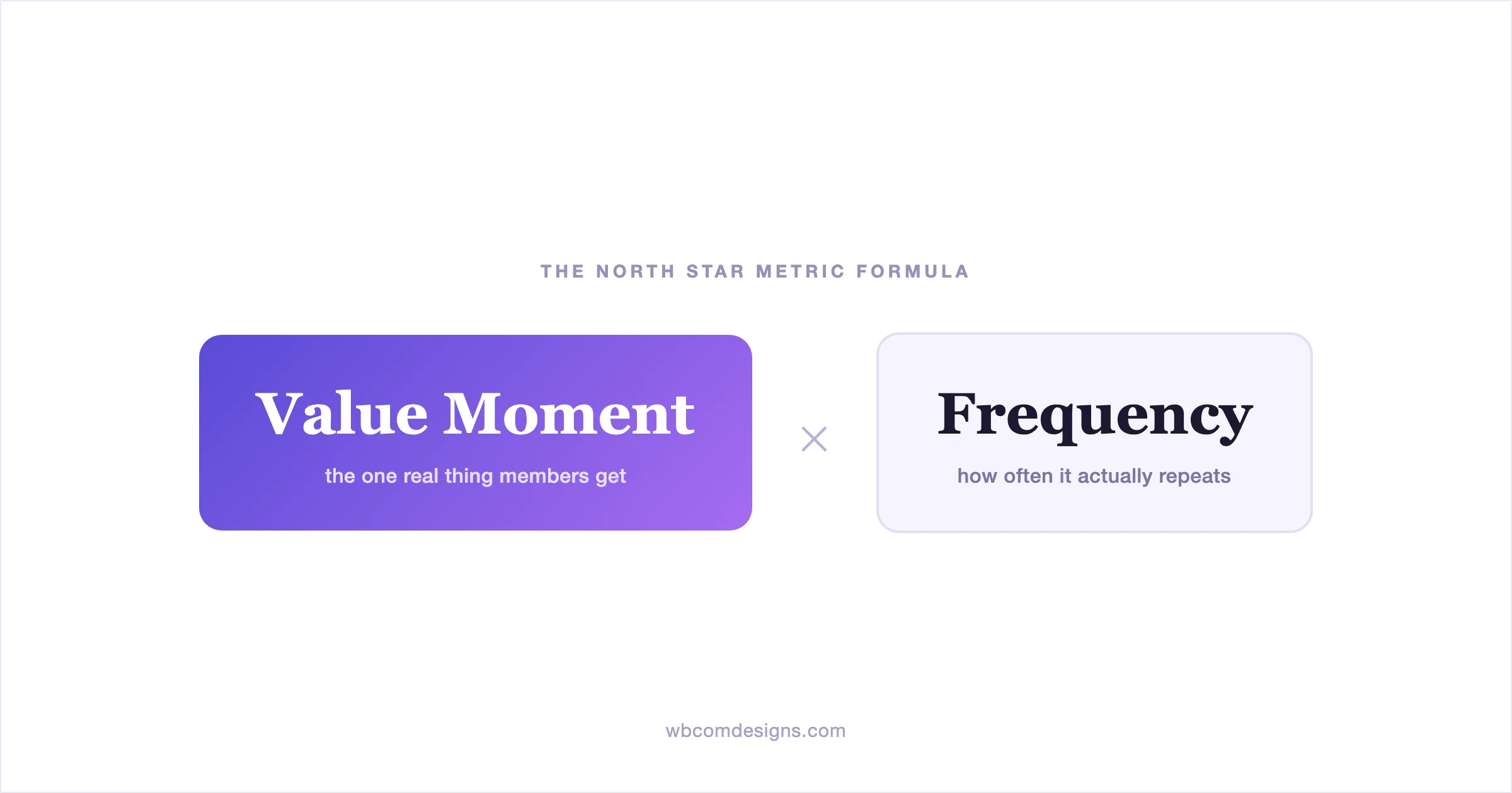
The actual formula is simple enough to say in one breath: your North Star Metric is the value moment, multiplied by how often it repeats. Sit with that for a second, because both halves matter and most owners only chase one of them. A value moment that happens once means nothing, you can get a total stranger to open your app exactly once. A moment that repeats but delivers nothing real is just habit wearing engagement’s clothes, doom-scrolling counts as frequency too. You need both at the same time, or the number is lying to you in a new way instead of the old one.
Finding the moment that’s actually real
This is the part people skip, because it’s genuinely harder than pulling a number off a dashboard. You have to answer an honest question first: what does someone get from being in your community that they couldn’t get from just reading your content?
For a lot of owners, the honest answer is nothing yet. That’s not a failure. That’s information. It tells you the community layer hasn’t earned its keep, and no metric is going to fix that for you before the community itself does.
When the value moment is real, it’s usually specific and a little unglamorous. It’s not “engaged with content.” It’s someone getting an answer to a question that had been stuck for three days. It’s finding another person who’s dealt with exactly this problem before. It’s posting something a little vulnerable and getting three kind replies instead of the silence they were braced for. None of those show up in a pageview.
Once you can name that moment in one honest sentence, the frequency question gets easy. Weekly is usually the right window for most communities. Daily is too twitchy to mean anything, and monthly is too slow to catch a problem before it’s already cost you the member.
What this actually looks like on a real feed
All of this stays abstract until you look at an actual feed, so here’s one. This is a real Space, not a mockup, from a live BuddyNext community.
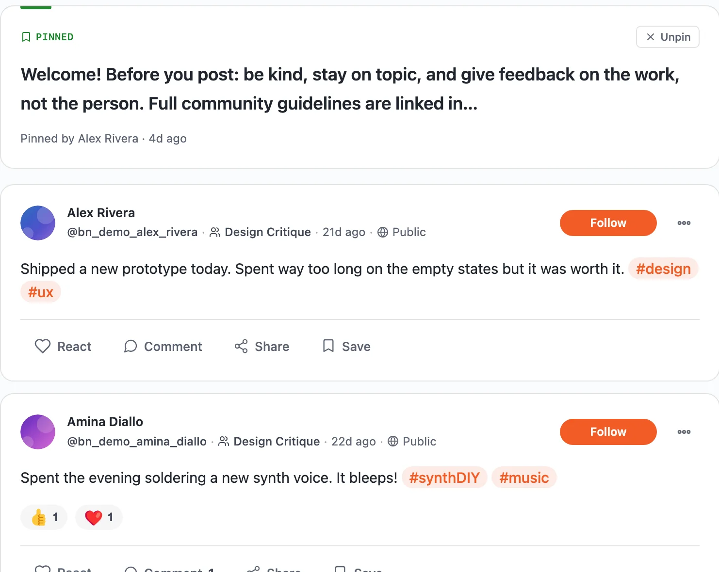
Look at it the way a founder glancing at a dashboard would. Posts are happening. Someone’s active. At a glance, it reads as healthy, and that’s exactly the trap. A feed like this can be entirely one-directional, people posting into it, nobody responding, and it would look identical to a feed where every post gets a real reply. You cannot tell the difference from post count alone. You have to open it and read what’s actually happening in the replies, which is precisely the work most dashboards let you skip.
Now here’s the member side of the same community.
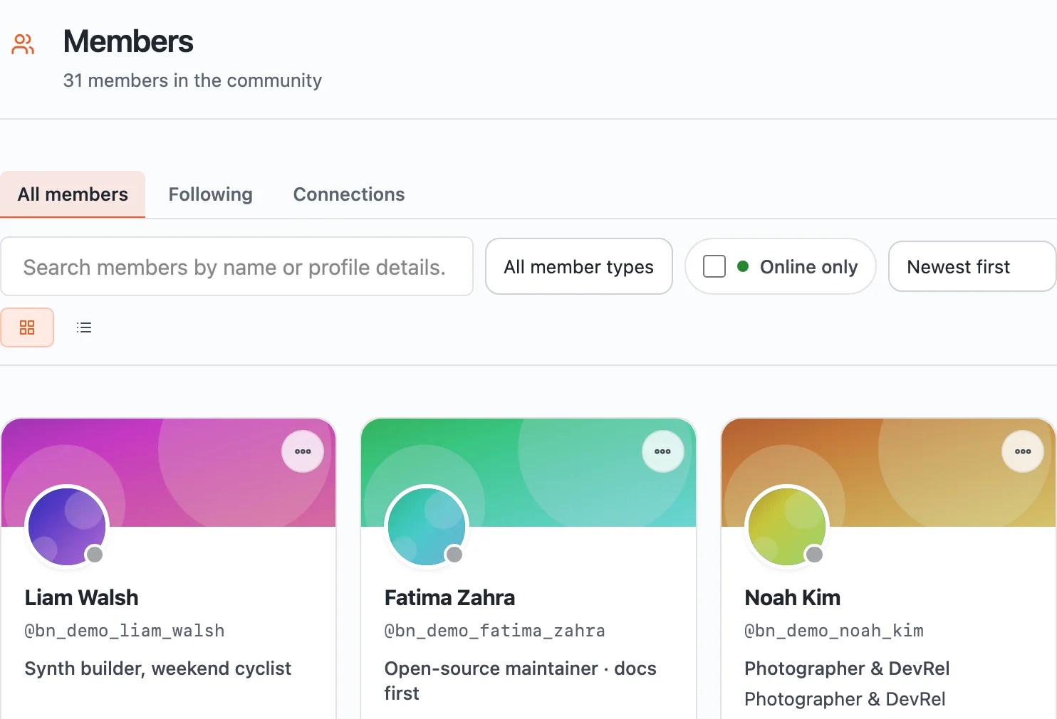
A member directory answers a different question than a feed does. It tells you who’s actually here, not just who’s ever signed up. The number at the top of this page is the vanity number. The names in this list who’ve posted or replied in the last week are the real one, and that number is almost always smaller, sometimes a lot smaller, than the one everyone quotes in the all-hands meeting.
This is the whole exercise in miniature. Two real screens, both technically “engagement,” and only one of them tells you anything true about whether the community is working.
The trap hiding inside a number that only goes up
Here’s the uncomfortable version of the point above: if your metric would look identical whether one hyperactive member or forty ordinary ones produced it, it isn’t measuring what you think it’s measuring.
That’s the trap. Not that vanity metrics are wrong exactly, they’re just answering a question nobody actually asked. “How many people have ever joined” and “is this thing working right now” are different questions, and most dashboards only bother answering the first one, because it’s the one that never goes down.
The pushback you’ll get for tracking this
Say this out loud in a meeting and you’ll get real resistance, and it’s worth naming it instead of pretending it won’t happen.
The first objection is usually “leadership wants the big number.” Total members is what goes on the slide, it’s simple, it’s always going up, and it makes everyone in the room feel good for four minutes. Nobody wants to be the person who replaces a number that’s always climbing with one that might actually be flat or falling. The honest answer is that the big number was never lying for your benefit, it was just lying quietly, and the meeting where you finally explain why growth stalled despite “healthy” numbers is a much worse meeting than the one where you introduce a smaller, truer number early.
The second objection is some version of “isn’t tracking who posted and who didn’t a little much.” It can feel that way if you frame it as surveillance. Reframe it as the same thing a teacher does when they notice which students haven’t spoken in three weeks. You’re not watching people, you’re watching whether the room is working, and the difference matters. Nobody needs a name-by-name dossier. You need a percentage.
The third is the most practical one: “we don’t have a dashboard for this.” That’s usually true on day one, and it’s not a reason to skip the exercise. A spreadsheet you update by hand every Friday for a month is a completely legitimate starting point. The habit matters more than the tooling, the tooling just makes the habit less annoying once you’re sure it’s worth keeping.
A quick test, if you want one
Try to finish this sentence about your own community: “A good week looks like ___.” Not vaguely. Specifically enough that you could check, this Friday, whether last week actually was one.
If you can’t finish it, that’s not a personal failing, most people can’t on the first try. It just means you’ve been running on member count and hope instead of on an actual signal, and now you know that, which is more than you had five minutes ago.
Where this actually lives inside BuddyNext
If you’re running the community on something like BuddyNext, the two screens above, the feed and the member directory, are things you already have without installing anything extra. They’re not a north star metric by themselves, they’re the raw material you build one from, the same way a spreadsheet full of numbers isn’t a chart until someone decides which two columns matter.
The free tier gives you exactly what’s shown above: real activity, real member data, browsable and searchable, but not pre-packaged into a single trend line. BuddyNext Pro adds an actual Insights tab, DAU, WAU, MAU, with week-over-week change tracked automatically instead of eyeballed from a member list. Neither replaces the exercise in the section above, the test still has to be answered in a sentence, but Pro turns the weekly check from a five-minute manual pull into something you can screenshot and put in a Monday update.
If you want to see exactly where each piece of this lives, screen by screen, free tier versus the fuller dashboard, the walkthrough on tracking this inside BuddyNext covers it in more detail than makes sense to repeat here.
What this looks like depending on what you’re running
Everything above is deliberately general, because the mechanics are the same everywhere. But the honest value moment itself changes shape depending on what kind of community you’re actually running, and it’s worth being specific rather than leaving you to guess.
A brand or customer community is earning its keep when a real problem gets solved without a support ticket, not when the engagement rate looks healthy. A course with a social layer is working when students are actually helping each other inside a cohort, not just individually finishing lessons in isolation. A fitness community is working when people are still showing up in week six, long after a challenge’s countdown hit zero, not when the 30-day leaderboard looks busy. A hobby community is working when a beginner’s embarrassing question gets a real answer, not when the showcase gallery is full of polished finished work.
Four different niches, four different honest value moments, and the exact same underlying trap in every single one: a number that looks healthy because it only ever goes up, sitting on top of a community that might already be quietly dying underneath it.
The metric you need changes as the community ages
One more honest complication, because pretending this stays static would be its own kind of lying. The right North Star Metric for a community two months old isn’t automatically the right one two years later, and holding onto the early one past its useful life is its own quiet failure mode.
Early on, the value moment is almost always about first contact. Did a brand-new member post something and get a reply before they had time to decide the place was dead. That’s the whole game in month one, because the entire community can evaporate before it exists if new people don’t get answered.
Once a community has real density, dozens of people who’d notice if it vanished, the question shifts. It’s less about whether newcomers get a reply and more about whether the conversations happening are still the kind that made people show up in the first place, or whether the community has quietly drifted into a smaller, louder core talking mostly to itself while everyone else reads in silence. That’s a different failure mode than the one you were watching for at the start, and it needs a different number.
Revisit the sentence from the quick test above every few months, not just once. If it hasn’t changed in a year, that’s either a sign your community found a stable shape early, which happens, or a sign nobody’s actually been checking whether it’s still true.
Turning it into something you actually check
A North Star Metric sitting in a slide deck nobody reopens isn’t a North Star Metric. It’s decoration. The whole point is that you look at it every week and let it change what you do next.
That means picking two or three inputs that actually move the number, instead of drowning in every stat your platform happens to generate. If your value moment is “got a reply within a day,” your inputs are something like new-member posts in week one. Average time to first reply. Moderators who showed up that week. Move those, and the real number moves with them. Everything else is noise you’re allowed to ignore.
Most owners have access to exactly the data they need already, sitting in a feed and a member list, and just aren’t looking at it as a north star. They’re looking at it as a curiosity, once, and then never again.
The community owners I’ve watched actually turn things around weren’t the ones with the biggest number in the top corner. They were the ones who could tell you, in one sentence, what a good week looks like, and who actually checked whether last week was one.
That sentence is worth more than any dashboard you’ll ever build.
Looking for a self-hosted LMS with zero platform fees? Explore Learnomy, our standalone WordPress academy engine with direct Stripe/PayPal checkouts, Ed25519-signed certificates, and LearnDash importers.
Read Article → Explore Learnomy →Related reading