16 min read
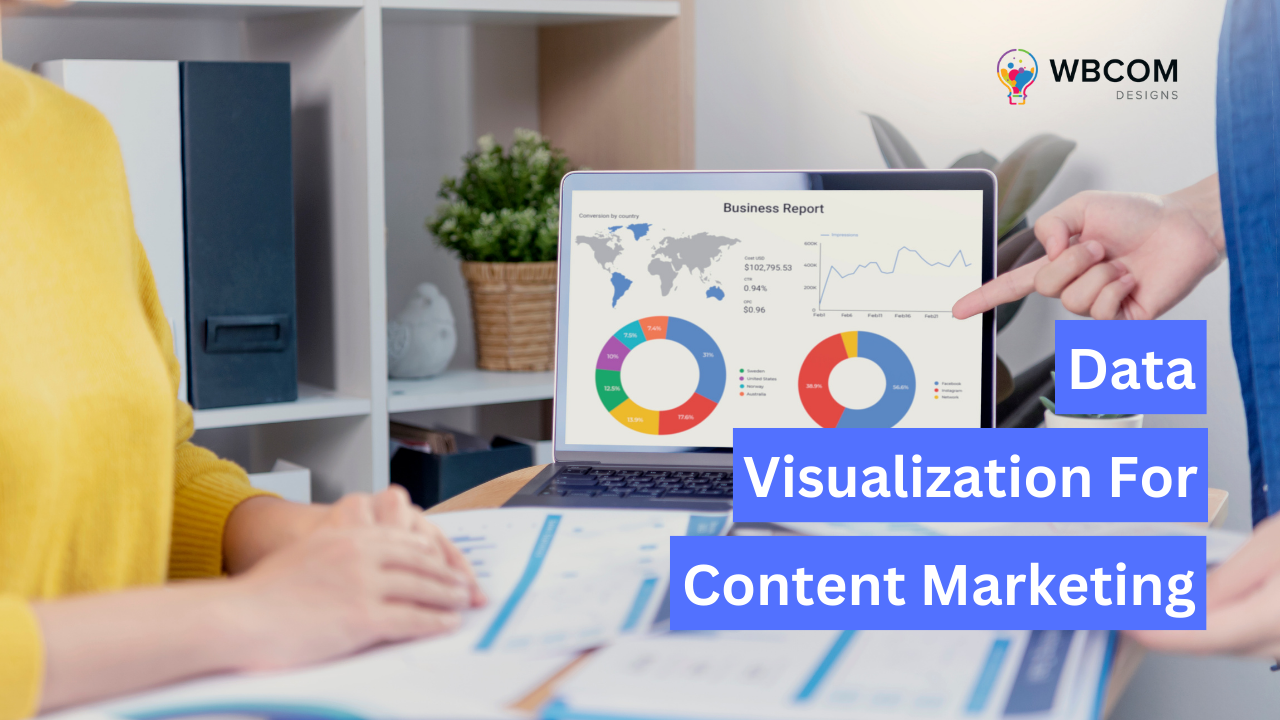
Data Visualization for Content Marketing
In the ever-evolving digital landscape, content marketers are constantly seeking new ways to engage their audience and communicate their message. Data visualization has emerged as a powerful tool in the content marketing toolbox, allowing marketers to tell compelling stories and bring data to life. This blog will explore the basics of data visualization, its role in creating engaging content, tools, and platforms for visualizing data, and how to create a data-driven content marketing strategy.

The Basics of Data Visualization
Data visualization is the graphical representation of data and information, helping users to understand complex data sets and identify patterns, trends, and correlations. It allows marketers to present data in a visually appealing and easily digestible format, making it an essential component of content marketing.
Common Types of Data Visualizations
Data visualizations are powerful tools for interpreting and presenting data in a meaningful way. Here are some common types of data visualizations:
- Bar Charts: Bar charts are one of the simplest and most common types of data visualizations. They consist of rectangular bars that represent the frequency or proportion of data within different categories. Bar charts are effective for comparing values across different categories.
- Pie Charts: Pie charts display data as a circular graph divided into slices, with each slice representing a proportion of the whole. Pie charts are useful for illustrating the composition of a dataset and showing the relative sizes of different categories.
- Line Graphs: Line graphs represent data points connected by lines, typically used to show trends or changes in data over time. They are particularly effective for visualizing continuous data and identifying patterns or relationships between variables.
- Area Charts: Area charts are similar to line graphs but with the area beneath the lines filled in with color or shading. They are used to represent cumulative data over time or to show the composition of a total value. Area charts are useful for visualizing trends and comparing the contributions of different categories to the overall dataset.
- Scatter Plots: Scatter plots display individual data points as dots on a two-dimensional plane, with one variable plotted on the x-axis and another variable plotted on the y-axis. Scatter plots are used to visualize the relationship between two variables and identify correlations or patterns in the data.
- Histograms: Histograms are graphical representations of the distribution of numerical data, divided into intervals or bins. Each bar in a histogram represents the frequency or proportion of data points within a specific range. Histograms are useful for understanding the shape and spread of a dataset.
- Heatmaps: Heatmaps represent data values using color gradients, with each color corresponding to a different value or intensity. Heatmaps are commonly used to visualize geographic data, density plots, or patterns in large datasets.
- Box Plots: Box plots, also known as box-and-whisker plots, display the distribution of numerical data through quartiles. They show the median, interquartile range, and outliers in the data, providing a visual summary of its distribution and variability.
- Stacked Charts: Stacked charts combine multiple datasets into a single visual representation, with each dataset represented by a different colored segment. Stacked charts are useful for comparing the contributions of different categories to a total value while also showing the overall trend.
- Tree Maps: Tree maps visualize hierarchical data structures using nested rectangles, with each rectangle representing a category or subcategory. The size of each rectangle corresponds to a quantitative value, making tree maps useful for exploring hierarchical datasets and understanding their composition.
Key Principles for Effective Data Visualization
Effective data visualization relies on several key principles to ensure clarity, accuracy, and engagement. Here are some key principles for creating effective data visualizations:
- Know Your Audience: Understand who will be viewing your visualization and what information they need to derive from it. Tailor your visualizations to match the knowledge level, preferences, and goals of your audience.
- Clarity and Simplicity: Keep your visualizations clear and easy to understand by eliminating unnecessary clutter and distractions. Use simple design elements, such as clear labels, intuitive scales, and minimal color palettes, to convey information effectively.
- Accuracy and Integrity: Ensure that your visualizations accurately represent the underlying data without distorting or misleading the information. Use appropriate scales, axes, and labeling to provide context and prevent misinterpretation.
- Relevance and Context: Provide context and relevance for your data visualizations by including explanatory text, annotations, and captions. Help viewers understand the significance of the data and how it relates to their interests or objectives.
- Consistency and Coherence: Maintain consistency in design elements, such as colors, fonts, and symbols, across all parts of your visualization to create a cohesive visual experience. Consistency helps viewers navigate the visualization more easily and understand the relationships between different elements.
- Interactivity and Engagement: Incorporate interactive elements, such as tooltips, filters, and drill-down features, to encourage viewer engagement and exploration of the data. Interactive visualizations allow viewers to interact with the data dynamically and gain deeper insights.
- Storytelling Narrative: Use storytelling techniques to structure your data visualizations and guide viewers through a narrative or storyline. Create a logical flow of information that leads viewers from the initial context to key insights and conclusions.
- Accessibility and Inclusivity: Ensure that your visualizations are accessible to all viewers, including those with disabilities or diverse backgrounds. Use accessible design practices, such as providing alternative text for images, using high-contrast colors, and designing for keyboard navigation.
- Responsive Design: Optimize your visualizations for different devices and screen sizes to ensure a consistent and user-friendly experience across desktops, tablets, and smartphones. Responsive design allows viewers to access and interact with your visualizations seamlessly on any device.
- Iterative Improvement: Continuously evaluate and refine your data visualizations based on feedback, analytics, and evolving data requirements. The iterative improvement allows you to adapt your visualizations to changing needs and optimize their effectiveness over time.
By following these key principles, you can create data visualizations that effectively communicate insights, engage viewers, and drive informed decision-making.
Also Read: Landing Page vs Sales Page: Which One Is Right for You?
Data Visualization for Engaging Content
Data visualization plays a crucial role in storytelling within content marketing strategies, offering a powerful means to convey complex information in a compelling and easily understandable manner. Here’s a detailed exploration of how data visualization contributes to engaging content:
Role of Data Visualization in Storytelling:
- Data visualizations serve as storytelling tools, allowing content marketers to weave narratives around data-driven insights. Instead of presenting raw data in text-heavy formats, visualizations bring numbers to life, making them more accessible and engaging.
- Visualizations help convey the story behind the data, highlighting trends, patterns, and correlations that might be overlooked in traditional formats. By transforming data into visually appealing charts, graphs, and infographics, marketers can capture their audience’s attention and communicate complex concepts more effectively.
- With data visualization, marketers can create a seamless flow of information within their content, guiding readers through a narrative that unfolds visually. This immersive approach enables readers to connect with the content on a deeper level, leading to better retention and understanding of the key messages.
Choosing the Right Visualization Format for Your Content:
- When selecting the appropriate visualization format, consider the nature of your data and the story you want to tell. Different visualization types, such as bar charts, line graphs, pie charts, and maps, are suited to different types of data and insights.
- Tailor your choice of visualization format to match your audience’s preferences and level of expertise. For example, if your audience is more visually inclined, interactive dashboards or animated visualizations may be more effective than static charts.
- Ensure that the chosen visualization format effectively conveys the intended message and enhances the overall narrative of your content. Experiment with various formats to find the most impactful way to present your data and engage your audience.
Enhancing Your Content with Interactive Visualizations:
- Interactive visualizations offer an immersive and engaging experience for readers, allowing them to interact with the data and explore insights at their own pace. Incorporating interactive elements such as tooltips, filters, and animations can enrich the storytelling experience and encourage deeper engagement.
- Use platforms and tools that support interactivity, such as Tableau, D3.js, or interactive infographic builders, to create dynamic and responsive visualizations. These tools empower readers to interactively explore data points, uncover hidden trends, and gain a deeper understanding of the content.
- Leverage interactive visualizations to make your content more shareable and memorable. When readers are actively engaged in the exploration of data, they are more likely to remember and share your content with others, amplifying its reach and impact.
Tools and Platforms for Data Visualization
Here are five tools and platforms for data visualization:
1. Tableau
Tableau is a renowned data visualization tool trusted by businesses and analysts globally. It empowers users to transform raw data into visually appealing and insightful dashboards, reports, and presentations. With its intuitive interface and robust features, Tableau facilitates the exploration and analysis of complex datasets, enabling users to uncover valuable insights and make data-driven decisions with ease.
Key Features:
- Interactive Visualizations: Tableau offers a plethora of interactive visualization options, including charts, graphs, maps, and dashboards, allowing users to explore data dynamically and gain deeper insights.
- Connectivity: Tableau seamlessly connects to various data sources, including databases, spreadsheets, cloud services, and big data platforms, enabling users to access and analyze data from disparate sources in one unified environment.
- Drag-and-Drop Interface: Its user-friendly drag-and-drop interface makes it easy for users to create and customize visualizations without requiring extensive coding or technical expertise, streamlining the data visualization process.
- Advanced Analytics: Tableau provides advanced analytical capabilities, such as predictive analytics, statistical analysis, and trend forecasting, empowering users to perform sophisticated data analysis and derive actionable insights from their data.
- Collaboration and Sharing: Tableau enables seamless collaboration and sharing of visualizations and insights across teams and organizations. Users can publish interactive dashboards to Tableau Server or Tableau Online, allowing stakeholders to access and interact with the visualizations in real time.
2. D3.js
D3.js, short for Data-Driven Documents, is a powerful JavaScript library widely used for creating dynamic and interactive data visualizations in web browsers. Developed by Mike Bostock, D3.js provides developers and data scientists with the flexibility and control to build custom visualizations tailored to their specific requirements. Leveraging web standards such as HTML, SVG, and CSS, D3.js empowers users to create stunning visualizations that seamlessly integrate with web applications and websites.
Key Features:
- Data Binding: D3.js facilitates the binding of data to DOM elements, enabling developers to dynamically generate visual elements based on the underlying data, thus ensuring synchronization between data and visuals.
- DOM Manipulation: With D3.js, developers can manipulate the Document Object Model (DOM) directly to create, update, and remove elements, providing full control over the structure and behavior of the visualization.
- Scalability: D3.js excels in handling large and complex datasets, thanks to its scalable architecture and efficient data processing capabilities, making it suitable for building visualizations for big data applications.
- Transitions and Animations: D3.js offers robust support for transitions and animations, allowing developers to create smooth and interactive visual effects that enhance the user experience and convey data insights effectively.
- Modularity and Extensibility: D3.js follows a modular approach, enabling developers to leverage its rich ecosystem of plugins, extensions, and community-contributed modules to extend its functionality and customize visualizations according to their specific requirements.
3. Power BI
Power BI is a robust business analytics solution developed by Microsoft. It empowers organizations to analyze data and share insights through interactive visualizations, reports, and dashboards. With its intuitive interface and integration with Microsoft products like Excel and Azure, Power BI enables users to make data-driven decisions effectively.
Key Features:
- Interactive Visualizations: Power BI offers a wide range of visualization options, including charts, graphs, maps, and tables, allowing users to explore and understand data dynamically.
- Data Integration: Users can connect to various data sources, such as Excel spreadsheets, databases, cloud services, and web APIs, to consolidate and analyze data from multiple sources.
- Business Intelligence Capabilities: Power BI provides advanced analytics features like predictive modeling, data forecasting, and machine learning integration, enabling organizations to gain valuable insights and uncover trends.
- Collaboration and Sharing: Users can easily collaborate on reports and dashboards by sharing them with colleagues or clients. Power BI offers robust sharing and collaboration features, including secure sharing links, permissions management, and real-time collaboration.
- Scalability and Flexibility: Power BI is scalable and flexible, making it suitable for organizations of all sizes. It offers both desktop and cloud-based versions, allowing users to access and analyze data anytime, anywhere, across various devices.
4. Google Data Studio
Google Data Studio is a free data visualization tool offered by Google that enables users to create interactive dashboards and reports from diverse data sources. It provides a user-friendly interface and seamless integration with other Google products, making it easy for users to visualize and share data insights.
Key Features:
- Drag-and-Drop Interface: Google Data Studio features an intuitive drag-and-drop interface, allowing users to easily create customized dashboards and reports without requiring advanced technical skills.
- Data Connectivity: Users can connect to various data sources, including Google Analytics, Google Ads, Google Sheets, SQL databases, and more, to import and visualize data from different sources.
- Interactive Visualizations: Google Data Studio offers a wide range of visualization options, such as charts, graphs, maps, and tables, with interactive features like filters, date range controls, and drill-down capabilities.
- Real-Time Collaboration: Users can collaborate in real-time on dashboards and reports by sharing them with colleagues or clients. Google Data Studio supports simultaneous editing, comments, and sharing permissions management.
- Data Sharing and Embedding: Users can easily share dashboards and reports with others by generating shareable links or embedding them on websites or intranet portals. Google Data Studio provides options for controlling access and permissions when sharing data visualizations.
5. Plotly
Plotly is a versatile data visualization library and platform renowned for its ability to create interactive graphs, charts, and dashboards. It caters to a wide range of users, from data scientists and analysts to developers and business professionals, offering robust tools for both exploratory analysis and creating production-ready visualizations.
Key Features of Plotly:
- Interactive Visualizations: Plotly allows users to create highly interactive visualizations that enable exploration and analysis of complex datasets. Users can zoom, pan, hover, and toggle elements on the graph to uncover insights dynamically.
- Support for Multiple Programming Languages: Plotly supports various programming languages, including Python, R, JavaScript, and MATLAB, making it accessible to a diverse user base. This versatility allows users to leverage their preferred programming language and seamlessly integrate Plotly into their existing workflows.
- Wide Range of Chart Types: Plotly offers a comprehensive library of chart types, including scatter plots, line charts, bar charts, histograms, heatmaps, and more. Users can choose from a plethora of options to visualize their data effectively and communicate insights with clarity.
- Customization Options: Plotly provides extensive customization options, allowing users to tailor their visualizations to suit their specific needs and preferences. Users can adjust colors, fonts, labels, annotations, and other design elements to create visually appealing and informative charts.
- Collaboration and Sharing: Plotly facilitates collaboration among team members by enabling seamless sharing and collaboration on visualizations. Users can easily share interactive graphs and dashboards with colleagues, stakeholders, or clients, fostering communication and facilitating data-driven decision-making. Additionally, Plotly’s cloud-based platform allows users to store, manage, and access their visualizations from anywhere, ensuring seamless workflow integration and accessibility.
6. Infogram
Infogram is an easy-to-use data visualization tool that helps users create infographics, reports, and dashboards. It caters to a wide audience, from business professionals and educators to marketers and data enthusiasts, providing a platform to convey complex data through visually compelling formats.

Key Features:
- Drag-and-Drop Editor: Infogram’s intuitive editor allows users to easily drag and drop elements, making the creation process straightforward and efficient.
- Wide Range of Templates: The platform offers a vast library of customizable templates, enabling users to quickly start their projects and tailor them to fit their specific needs and branding requirements.
- Interactive Maps and Charts: Infogram includes a variety of interactive maps and charts that users can incorporate into their visualizations to enhance data storytelling and audience engagement.
- Real-Time Collaboration: Users can collaborate in real time, making it easy for teams to work together on projects, share feedback, and make adjustments seamlessly.
- Data Integration: Infogram supports integration with various data sources, including Google Sheets, Dropbox, and cloud services, allowing users to import data effortlessly and keep their visualizations updated automatically.
- Export Options: Users can export their visualizations in multiple formats, such as PNG, PDF, and GIF, or directly embed them into websites and presentations.
Also Read: WordPress Plugins That Help In Doubling Your Website Traffic
Creating a Data-Driven Content Marketing Strategy
Integrating Data Visualization into Your Content Creation Process
- Identify relevant data: Start by selecting data that aligns with your audience’s interests and supports your content objectives. Consider using data from market research, industry reports, surveys, or internal analytics.
- Clean and preprocess data: Ensure the data you’ve collected is accurate, complete, and free from errors. This may involve removing duplicates, correcting inconsistencies, and filling in missing values to ensure the reliability of your analysis.
- Choose the right visualization: Select the most appropriate visualization format based on the type of data you have and the message you want to convey. Common visualization types include bar charts, line graphs, pie charts, and heat maps. Choose a format that effectively communicates your insights to your audience.
- Design and customize: Create visually appealing and on-brand visualizations that enhance the readability and comprehension of your data. Pay attention to color schemes, typography, and layout to ensure your visualizations are engaging and easy to understand.
- Test and refine: Gather feedback from your audience and stakeholders to assess the effectiveness of your visualizations. Make necessary adjustments to improve clarity, relevance, and impact. Iterate on your visualizations based on user feedback and performance metrics.
Tips for Using Data to Generate Content Ideas
- Monitor industry trends: Stay updated on industry trends and emerging topics by following relevant publications, attending conferences, and participating in online forums. Use data to uncover insights and develop content that addresses current challenges or opportunities in your industry.
- Leverage internal data: Tap into your organization’s internal data sources to uncover unique insights, success stories, or case studies. Use data to showcase your company’s expertise, achievements, and value proposition to your audience.
- Conduct original research: Conduct surveys, interviews, or experiments to gather original data and insights. Use this data to create authoritative content that provides valuable insights and answers pressing questions within your industry.
- Collaborate with influencers: Partner with industry experts, influencers, or thought leaders to co-create data-driven content. Leverage their expertise and credibility to enhance the authority and reach of your content.
Measuring the Success of Data-Driven Content
- Track engagement metrics: Monitor key performance indicators (KPIs) such as page views, click-through rates, social shares, and conversions to gauge the effectiveness of your data-driven content. Analyze how users interact with your visualizations and adjust your strategy accordingly.
- Analyze user feedback: Gather qualitative feedback from your audience through surveys, comments, or focus groups. Pay attention to user sentiments, preferences, and suggestions for improvement to refine your content strategy.
- Conduct A/B tests: Experiment with different visualization formats, content formats, and distribution channels to optimize your content’s performance. Conduct A/B tests to compare the effectiveness of different variations and identify the most effective strategies for engaging your audience.
Continuous Improvement through Data Analysis
Continually analyze your content’s performance data and user feedback to identify areas for improvement and refine your data-driven content marketing strategy over time. Use data-driven insights to inform your content creation process, prioritize content topics, and allocate resources effectively. Iterate on your strategy based on evolving audience preferences, market trends, and business objectives to stay ahead of the competition and drive meaningful results.
Conclusion On Data Visualization for Content Marketing
Data visualization is a powerful tool that can transform your content marketing efforts by making complex data more accessible, engaging, and memorable. By mastering the art of data visualization and integrating it into your content marketing strategy, you can create more compelling stories, enhance user engagement, and ultimately drive better results. Start exploring the world of data visualization today and unlock the full potential of visual storytelling in your content marketing efforts.
Interesting Reads:
Web Design 101: Best Practices for Building a Successful Online Presence
Related reading