
7 min read
Best Practices for eCommerce Web Design


Different industries fit into different website design molds, and eCommerce is no different. If you look at any of the leading eCommerce websites in 2026, you’ll see very similar design trends between them, because the design processes are tested and proven to work.
This article covers the eCommerce design practices that matter most, so that you can maximize your conversion rate and get your visitors to the checkout lane flawlessly. It focuses on the pages that sell: layout, search and filtering, product imagery, pricing, mobile and speed. For checkout friction, see our guide to reducing shopping cart abandonment in WordPress.
Last updated: 7 November 2026
Quick answer: The best eCommerce web design practices are a clear visual hierarchy, fast search with useful filters, large and consistent product images, upfront prices and shipping costs, a mobile layout equal to desktop, and pages that pass Google’s Core Web Vitals. Baymard Institute and Nielsen Norman Group research backs each one.
| Practice | What to do | Evidence |
|---|---|---|
| Visual hierarchy | Logo, search, navigation, hero, content, footer in a familiar order | Common pattern on leading stores |
| Search and filters | Offer filters for every detail shown in the product list | Baymard product list research |
| Product images | Large, consistent, specific, with context shots | NN/g on listing photos |
| Pricing | Show price and extra charges early | Baymard abandonment reasons |
| Mobile parity | Same content and structured data on mobile and desktop | Google Search Central |
| Speed | LCP within 2.5 s, INP 200 ms or less, CLS 0.1 or less | web.dev Core Web Vitals |
Emphasize the visual hierarchy

You’ll see a commonly used visual hierarchy on the most popular eCommerce websites, and it’s for a good reason - it works. Page elements will typically follow this hierarchy:
- Logo and company name in the header.
- Search bar in the upper right.
- Navigation menu and contacts.
- A hero image or slider.
- The main content area.
- Footer
People’s eyes generally travel in the F and Z reading patterns when looking at a website, and you can use this to your advantage to visually funnel visitors towards your conversion points.
User experience design is a fundamental part of the web design process for an eCommerce site, and users are more quickly converted into customers when they can easily get from one point to another.
Keep it simple and clutter-free
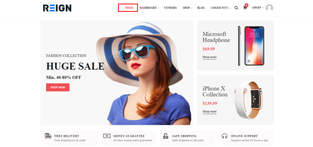
You don’t need to spring for all-out minimalist design (in fact that’s pretty inadvisable), but an eCommerce website should still be easy to use and browse. Take an objective look at your web design and ask yourself, “What can I remove that won’t negatively impact my pages?“. The more clutter you reduce, the better.
You should keep only the most important elements that serve a purpose. If an element isn’t designed to engage or funnel your visitors, it really doesn’t need to be there. A good eCommerce website has a refined and clean look that favors the products, doesn’t overload visitors with information, and makes navigation a breeze.
Focus on convenient navigation and product filtering
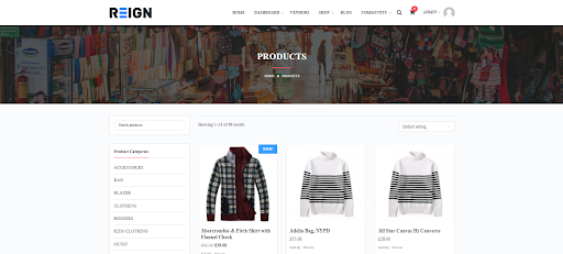
You simply cannot have a successful eCommerce website without focusing on convenient navigation. It’s true you want to funnel visitors, but not in the same way as a physical supermarket that puts the milk and eggs in the back so shoppers have to walk past all the impulse purchase displays.
People do “window shop” online, but generally, they know what they’re looking for. People go to the mall and window shop to pass time - people “window shop” on eCommerce websites to compare prices, but they already know what they’re looking for. That’s why you need to make it as convenient as possible for your visitors to find exactly what they want, so you can funnel them towards the checkout.
A search bar obviously works wonders, but filters also work wonders. For example, if someone searches “baby diapers” on your eCommerce website, you might want to offer these filters to help the customer narrow down their selection:
- Brand of diapers
- Cloth / disposable
- Pants/Pullups, Taped, Insert
- Product rating.
- Diaper sizes.
- Pack size
- Recommended gender
- Recommended age
- Color
- Min - Max price
That might sound like a lot of filters, but it will help your customer find the Huggies Dry Large (8-14kg) - 30pcs x 4 packs (120 pcs) - Diaper Pants in the $25 USD price range.
The research on how well stores actually do this is not flattering. Baymard Institute’s product list research reports that 38% of sites do not provide filters for all the information shown in the list, 61% do not promote their important filters, and 28% do not show an overview of the filters already applied.
Sorting matters as much as filtering. The same research finds that 64% of sites do not let shoppers sort by all four of price, user rating, best-selling and newest.
Another useful element is the ever-present search bar. No matter how far down your website a user scrolls, the search bar should follow them. A visitor should never need to scroll back to the top of a page to use the search bar.
Use product images that answer questions
Shoppers cannot touch the product, so images do the job of the shelf. Nielsen Norman Group’s research on product photos on listing pages says they should be large enough to show how a product differs from similar items, consistent in background, angle and lighting so shoppers can compare, and specific to the query. If someone filters for blue, the thumbnails should show blue.
On the product page itself, NN/g’s product page guidelines, drawn from research across 49 ecommerce sites, recommend images and video that answer questions, with multiple views such as detail shots and the product in use. For data-heavy specifications they suggest a comparison table.
Sites with many sellers should set a strict photo standard and enforce it. Mixed backgrounds and crops make a catalog look untrustworthy even when the products are good.
Show prices and extra costs early
Design cannot fix a surprise at checkout. Baymard Institute’s cart abandonment list puts the average documented rate at 70.22% across 50 studies, and 40% of US shoppers who abandoned said extra costs such as shipping, tax and fees were too high.
NN/g advises showing the price on the product page together with any product-specific charges, and surfacing shipping costs early. A shipping estimate near the price costs a line of text and removes the most common reason to leave.
Develop for mobile

Studies disagree on the exact split between mobile and desktop shoppers, and it differs by product and audience. Your own analytics will tell you more than any headline percentage.
The safe conclusion is to design for desktop and mobile equally.
In many cases, an online shopper will browse your eCommerce website on their mobile device, add items to their cart, and then make the final purchase from their desktop computer. Theories abound, it may have something to do with people believing desktop browsers are more secure than smartphones, but that’s beside the point.
Another reason to focus on mobile design is that Google uses “mobile first” web crawling some years ago. What this means is that Google’s bots will crawl and index your pages by accessing the mobile version of your website, and a weak mobile version can hold back your search rankings. Google’s mobile-first indexing documentation states that it uses the mobile version of a site’s content for indexing and ranking, and asks that mobile pages carry the same content, structured data (including Product and Breadcrumb markup), titles and meta descriptions as desktop.
For a deeper look at small-screen layouts, read our tips to create the best eCommerce mobile design.
Keep pages fast
A clean layout still loses sales if it loads slowly or jumps around. Google’s Core Web Vitals set the targets: Largest Contentful Paint within 2.5 seconds, Interaction to Next Paint of 200 milliseconds or less, and Cumulative Layout Shift of 0.1 or less, measured at the 75th percentile of page loads and split by mobile and desktop.
On product and category pages the usual culprits are oversized images, sliders and third-party scripts. Compress images, give them fixed dimensions so the layout does not shift, and remove widgets that do not help a visitor buy.
Frequently asked questions
What makes a good eCommerce website design?
A good design makes products easy to find and easy to judge. That means a familiar layout, working search and filters, large consistent product photos, clear prices and a fast mobile experience.
How many filters should an online store have?
Offer a filter for every detail you show in the product list, such as brand, size, color, rating and price. Baymard Institute reports that 38% of sites miss at least one of these, which makes shoppers scroll instead of narrow.
Does mobile design affect eCommerce SEO?
Yes. Google uses the mobile version of your content for indexing and ranking, so missing content or structured data on mobile can cost you visibility.
What are Core Web Vitals and why do they matter for stores?
They are Google’s measures of loading speed, responsiveness and visual stability. A good score means LCP within 2.5 seconds, INP of 200 milliseconds or less and CLS of 0.1 or less, which keeps shoppers from abandoning slow pages.
Should an eCommerce site be minimalist?
Keep it clean, not bare. Remove elements that do not help a visitor choose or buy, but keep the trust signals, filters and product details that shoppers need.
Interesting Read:
Plugins to enhance your WordPress Website Design
Related reading