4 min read
What Makes a Community Platform Easy to Use?

Ask ten people what makes software easy to use and nine will describe how it looks. Clean layout. Not too many buttons. A tidy dashboard.
They’re describing the wrong side of the screen.
Ease of use in a community platform has almost nothing to do with your admin dashboard. It lives on the member’s side, in the first few minutes, when a stranger shows up and tries to do the one thing they came for. If they can do it without being taught, the platform is easy. If they need a tutorial, it isn’t.
I learned this the slow way, watching sign-up numbers that looked healthy turn into communities where almost nobody posted.
Ease lives on the member’s side, not yours
There’s a name for this problem. Designers call it a Norman door. You know the one. A door with a flat handle you instinctively pull, except it only pushes, so someone tapes a little “PUSH” sign onto the glass.
That sign is an admission of failure. A well-made door tells you what to do just by its shape.
Most community platforms are covered in PUSH signs. Onboarding tours. Tooltips. “Getting started” checklists. We call them helpful. They’re apologies for a design that didn’t make the next step obvious on its own.

So here’s a better way to judge whether a community platform is easy to use. Watch someone touch it who has never seen it before, and count the moments they hesitate.
The front door decides everything
Start with sign-up, because that’s the front door, and every field you require there is a small reason to leave.
Name, email, password. That’s already a person deciding whether you’re worth the effort. Now pile on “upload a photo,” “write a bio,” “confirm your phone,” “pick five interests.” Each one feels reasonable to you. Together they’re a wall.
The easiest communities let someone in with almost nothing and let the profile fill in later, once the person actually cares. You earn the bio. You don’t gate the door with it.
Then comes the moment right after they get in, which is where most communities quietly die. They walk into an empty room.
A new member lands on a blank feed, sees no activity, knows nobody, and leaves. That isn’t a problem a nicer font can fix. Ease of use here means the platform does the work of making the place feel lived in. A feed with something actually happening. A clear way to see who else is around. A directory you can search, so you can find the one person who does the thing you care about.

Sit with that for a second, because it reframes the whole question. Ease of use isn’t only how easy the buttons are to press. It’s how fast the space gives you a reason to press them.
Most of your members are on a phone
This is the part people forget until their analytics rub their nose in it.
If posting, replying, or reading feels clumsy on a small screen, your platform is hard to use for most of the people using it, however polished it looks on your desktop. Speed belongs in the same sentence. A page that takes four seconds to load is a page plenty of people never actually see.
There’s a quieter kind of ease that matters just as much, and it sits on your side of the screen.
You should be able to run the place without hiring a developer. Spinning up a new space, approving a member, deleting a spam post, changing who can see what: none of that should mean touching code or filing a ticket and waiting two days. When daily management needs an engineer, your community moves at the speed of your engineering backlog, which is to say it barely moves at all.
The ease you never notice
Here’s the uncomfortable truth under all of this. Ease of use is mostly invisible.
You never notice the platform that gets out of the way. You only notice the one that doesn’t. So it rarely wins the demo, because demos reward features you can point at, and ease of use is the absence of friction. Hard to point at. Impossible to fake once real people show up.
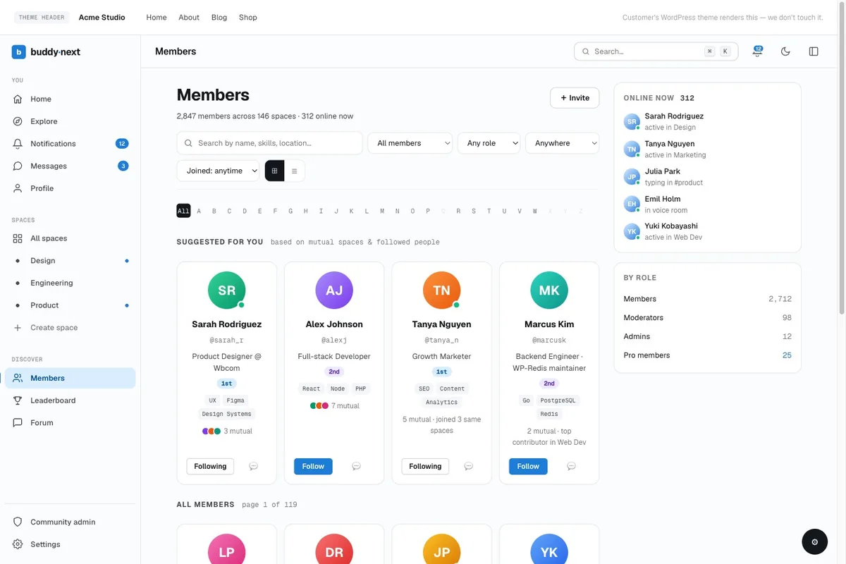
This is the lens I’d hold over any option you’re weighing, and it’s roughly why I point people toward BuddyNext when the goal is a community ordinary members can actually use.
It leans on patterns people already know. The activity feed works the way the social apps in everyone’s pocket already work, so there’s nothing new to learn. Spaces give members obvious rooms to walk into instead of one intimidating blank hall. Profiles and a searchable directory make finding your people quick. And because it runs on WordPress, the admin side is familiar ground, with moderation built in, so you can add a space or handle a bad actor yourself without calling a developer.
None of that shows off in a screenshot. That’s the point. The measure of an easy community platform is that nobody ever has to think about the platform at all. They show up, find their people, and stay.
So next time you’re comparing options, stop watching the demo. Hand it to someone who has never seen it, ask them to join and post one thing, and say nothing. Count the times they pause.
That number is the only ease-of-use score that matters.
Related reading