6 min read
UI Design Guidelines That Every Professional Ought To Bear In Mind

Consistency is essential in UI design since it encourages users to trust and remember your creation for longer. Two significant factors support the need for uniformity and standardization in user interface design. When developing the user interface, it’s crucial to remember how the human brain interacts with the screen. You may make life simpler for your users by not requiring them to pick up new skills or representations for each activity. Improving the user experience is as simple as reducing the time it takes to think about something by making it more transparent. The top UI design guidelines that we came up with highlight some of the most intriguing aspects of digital design. Check them out!

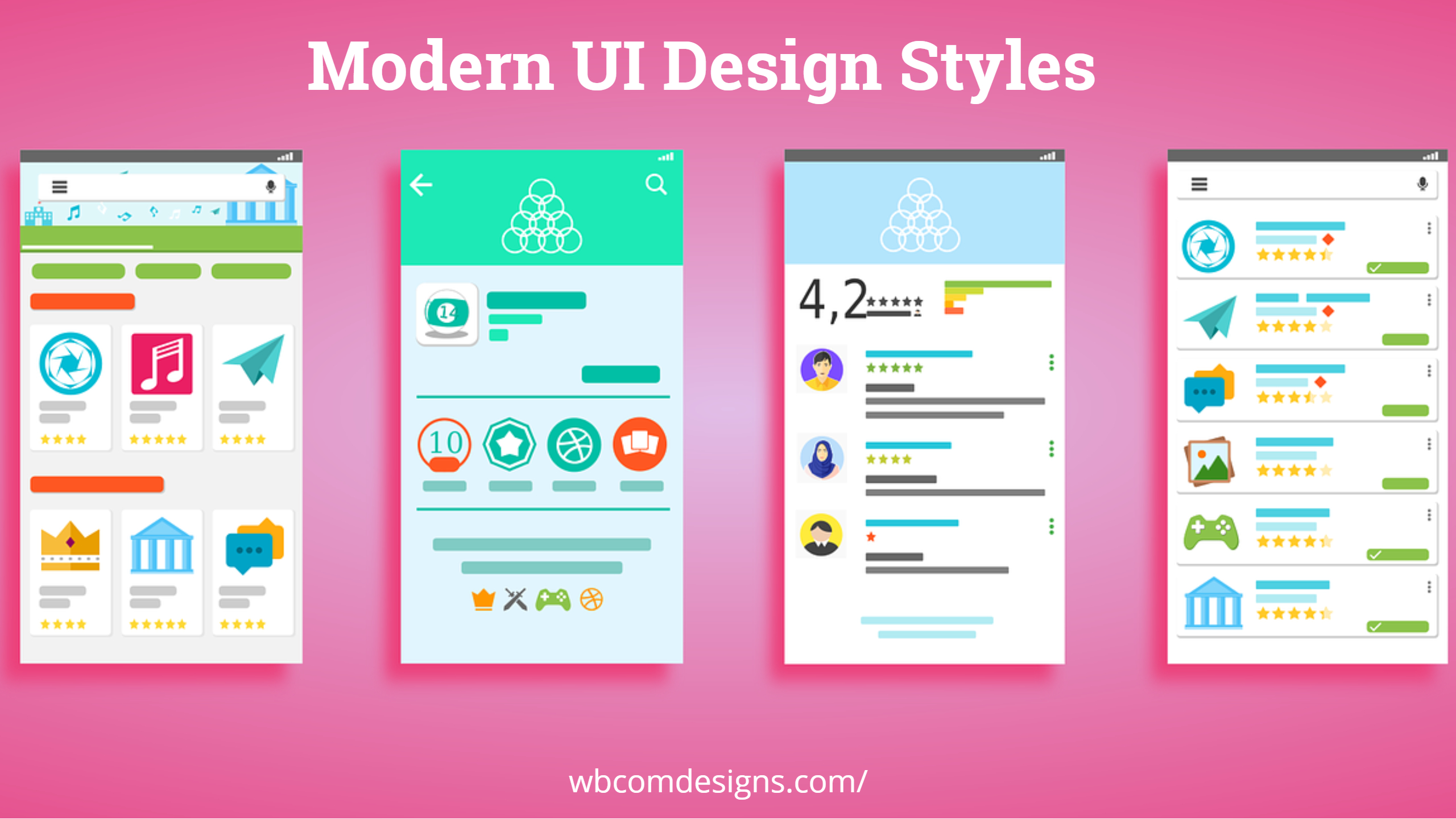
UI Design Guidelines
1. Reduce Learning- UI Design Guidelines
Consistency ensures that users do not need to learn different representations for each activity by reducing the number of ways in which actions and operations are represented. Furthermore, by adopting design standards like adhering to platform conventions, users may accomplish new jobs without acquiring a whole new set of tools.
Even though this seems like a no-brainer, numerous examples are inconsistent in their layouts. The Xfinity website from the American mass media conglomerate Comcast Corporation illustrates this problem. Aside from the significant menu changing practically every time a user navigates to a new page, the website’s secondary menu also seems randomly generated.
2. Avoiding Confusion- UI Design Guidelines
Users tend to apply standards they’ve encountered elsewhere, bringing expectations that may or may not be met by your website or product. Keeping this in mind, you should consider whether your departure from established design norms and conventions would result in the opposite of the intended effect (confusion and alienation). Also, your product’s customers shouldn’t waste time figuring out whether or not two seemingly dissimilar words, interactions, or actions have the same meaning.
People become confused when they cannot “piece together” knowledge, which can hinder their progress. Logically, anger or frustration might result when a user is prevented from completing a task. Frustration is a natural response to the ambiguity, and it is well-known that this, in turn, contributes to a negative user experience. For this reason, it’s crucial to avoid creating any room for ambiguity in any of your interactions.
Therefore, to refresh your expertise, below are a few basic guidelines for designing a consistent user interface.
1. Set up your visual hierarchy
You can use visual hierarchy to evaluate design elements and control how you want users to perceive your work. Using principles like contrast, scale, balance, and more, you can put everything where it belongs and draw attention to what matters most.
If your layout isn’t well organized, it will be difficult for users to find their way through your product. This can drastically lessen the work necessary to use your goods. Focusing on visual control is essential to achieving the goals of UX design, which are to reduce friction and enhance product use.
- Let’s look at how some guidelines might be applied to improve your content’s readability.
- Calling attention to something by making it larger or smaller
- Drawing attention to something by emphasizing its color or brightness
- Experimenting with a concept
2. Always Remain Within Grids
A grid is a simple structure made up of parallel lines (either vertical or horizontal) that split a page into sections. Page content editing is simplified with this layout. In most designs, the grid lines are hidden, but the structure still allows you to set precise distances between the various components that should be centered on the page. Our page layout will be based on this grid. Consider it a framework inside which the designer can comfortably fit the various parts of images (such as text blocks, photos, and other functional or decorative elements).
When designing, the grid is always the starting point. Design aspects such as size, rhythm, white space, and placement can significantly alter how quickly the viewer takes in something. Grids are used to ensure that all of the UI’s visual components are in sync with one another. Using the active grid makes scanning the screen faster and more enjoyable.
This is especially crucial for digital products because of their practical nature; users of these items seek to accomplish specific goals through their usage of the product, such as communicating with others, making travel arrangements, or complimenting an experience in a vehicle. Maintaining coherence makes it clear to the audience where they can go or what they should do next.
Also Read: 15 Best WordPress Gallery Themes
3. Consistency of Colors
The more consistent your product line is in following a revision or update, the more likely customers will notice the difference. Your company’s marketing efforts must always include some constants. You can tailor your ad delivery and selection of colors, images, fonts, and message markings to ensure maximum compatibility with your target audience.
A brand can successfully employ numerous color schemes if used consistently throughout ads targeting distinct demographics. Use warm colors for the middle class and those who value a business and cool colors for children and adults. Images chosen should be consistent with the color scheme you’ve established for each client ID and should also complement the subject matter of your products.
The similarity in style, especially in the form of safe, consistent decisions, can have a similar effect on the mind as a shared color palette. If you want to avoid a drop in quality for your product, be consistent with how it’s presented throughout digital and print mediums. Consistency in your UI design can be achieved mainly by using color.
Also Read: How to write Killer SEO content
4. Use fonts carefully- UI Design Guidelines
All typography needs to adhere to the notion of consistency. Use the same font style to receive the same information, as employing a variety of typefaces might lead to confused and sloppy appearances. Pick a specific style and stick to it. There could be a lot of positions in a sequence, but the overall tone should remain consistent.
Also read: Monstroid Review: A Powerful WordPress Theme for Any Business
5. Localize design- UI Design Guidelines
Designing for a particular locale is a novel yet crucial idea. Designing for a global market or the Internet increases the need for localization. People from all over the world, each with unique beliefs, values, and aspirations, interacting with the same layout is a significant contributor. A crucial part of any discussion about improving user interfaces is the importance and necessity of localization.
When designing a user interface (UI) for a product or service, it is essential to have a worldwide audience in mind, primarily when that product or service is delivered digitally. If a designer wants to appeal to as broad an audience as possible, they must make sure that no part of the design (including things like symbols and colors) runs counter to the audience’s beliefs.
Also Read: Changing Your WordPress Theme? Remember These Points
6. Make a complete set of UI design tools
When a product or service is delivered, that is not the conclusion of a UI design project. There will be a steady stream of foreseen and unforeseen faults that must be fixed after the design goes to market. Because of this, UI/UX specialists need to take the initiative when working on design tasks.
One of the most efficient methods of handling such persistent challenges is the creation of an all-inclusive UI design toolkit. After a project, a professional UI/UX designer will compile a kit containing all relevant design assets and standards. This package includes specifics regarding the project’s color scheme, font family, and other aesthetic choices.
Also Read: Simple Ways To Design Engaging Social Media Graphics
Conclusion of UI Design Guidelines
Keeping the user interface’s components uniform is central to the concept of consistency in UI design. In appearance and demeanor, they will be indistinguishable. This reinforces the user’s sense of familiarity and control by confirming their hypotheses about the correct interaction. Focusing on conformity with device UI rules and behaviors, similar applications/sites, and your own design will help you build a better user interface.
Updated on March 14, 2026
Best Free Dropshipping Themes For WordPress
Ten Knowledge-Based Cloud Services to Use for Different Business Processes
Related reading