4 Effective Tactics for Optimizing Website Navigation to Drive Conversions
Shashank Dubey
Content & Marketing, Wbcom Designs · Published Oct 24, 2023 · Updated Oct 24, 2023
With people’s attention spans growing shorter, a website’s success is intricately linked to its ability to engage and convert visitors effectively.
Your website is your business’s virtual storefront, and the way online users navigate through it can make or break a business. What website visitors find and how easily they find it determines whether they stay, engage, and eventually convert.
Therefore, optimized website navigation will keep visitors engaged and lead them towards taking desired actions.
In this article we’ll discuss four key website navigation best practices and tactics that will boost user experience, helping you drive more conversions. Let’s get started!
The foundation of a user-friendly website navigation system lies in clear and concise labels. Users should instantly understand what each menu item represents. When visitors can quickly identify menu items and categories, they are more likely to stay engaged with your website, and even take your desired actions.
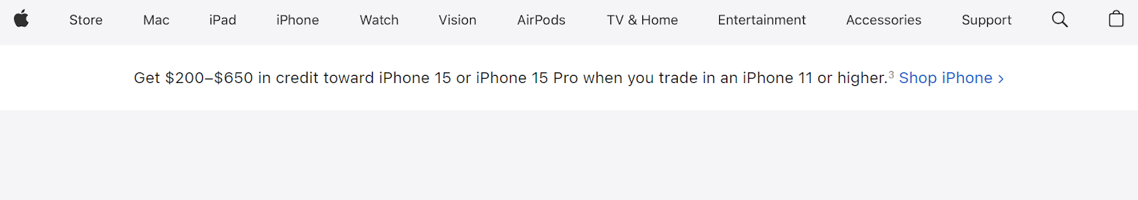
Ambiguous or confusing labels, on the other hand, will frustrate users, leading to high bounce rates. Therefore, employ descriptive and straightforward labels that resonate with your audience. For instance, if you’re selling electronics, use specific labels like “phones,” “laptops,” and “accessories” instead of vague terms like “Gadgets.” See how Apple does it.
Simple and straightforward labels also reduce cognitive load, which refers to the mental effort required to process information. So avoid jargon and use language that your target audience understands, to make it effortless for them to navigate your site. When users focus on exploring products or website content instead of trying to interpret menu labels, they are more likely to convert.
Clear and descriptive labels not only benefit users but also optimize your website for search engines. When you use relevant keywords to your products or services within the labels, it improves your website’s search engine visibility. For instance, if your website sells organic skin care products, incorporating key search terms like “Organic Face Serums” or “Natural Body Lotions” will enhance your site’s Search Engine Optimization (SEO).
2. Employ Dropdown Menus
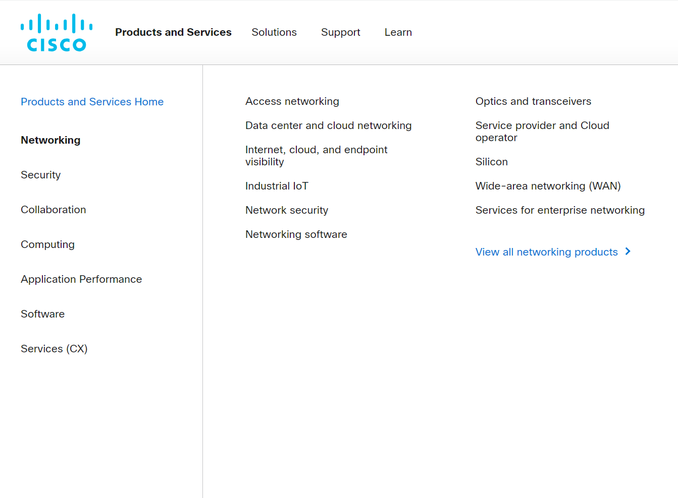
Employing dropdown navigation menus is a strategic and user-friendly way to organize complex or extensive content on your website. These menus are particularly useful when your website has a wide range of products, services, or content categories.
This makes them a great option for a manufacturer web design and other content-heavy sites that require numerous levels of website hierarchy. For instance, considering the giant list each menu item has in the example below, imagine how cluttered the navigation bar would be if they didn’t use drop-down menus.
Well-organized navigation structures also enhance the discoverability of your website’s content. Users are more likely to explore different sections when they are presented in a digestible manner. For instance, you can have a main category “Electronics,” with dropdown options like “Smartphones,” “Laptops,” and “Accessories,” guiding users to explore a variety of products.
When implementing dropdown menus, ensure they are intuitive to provide a seamless user experience. So, for instance, design your website to trigger a dropdown with relevant subcategories when a visitor hovers or clicks on a specific main menu item.
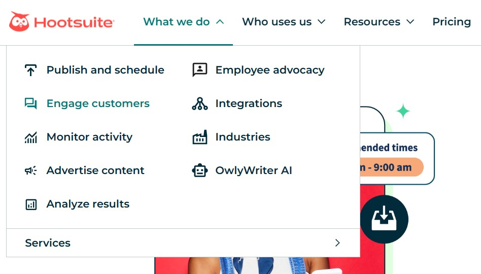
Additionally, use clear visual cues like arrows or highlighting to indicate which menu items have dropdowns, as shown in the Hootsuite website example.
You should also add color changes or subtle animations when users hover or click on a menu item. For instance, when you hover or click on any menu item in the example above, you’ll notice a color change.
These cues help users understand the interactive elements of your website, enhancing usability.
3. Prioritize Mobile-Friendly Navigation
With the continuous rise of more developed smartphones, a significant portion of internet traffic today comes from mobile devices. Mobile devices (excluding tablets) generate over 58% of global website traffic. Mobile-friendly navigation ensures that your website caters to this vast user base, allowing you to reach and engage with a broader audience.
Google also uses mobile-first indexing, which means it primarily uses the mobile version of a site for ranking and indexing. Hence, mobile-friendly navigation will also positively influence your site’s search engine rankings, leading to increased visibility and traffic.
To streamline mobile navigation, start by implementing a responsive web design, where your website layout adjusts dynamically based on the user’s device. This approach ensures that your navigation menus are optimized for various screen sizes, providing a consistent and user-friendly experience even on smaller screens.
Next, simplify your navigation menus for mobile devices. Limited screen space means you must prioritize essential menu items and reduce clutter. Hence, consider using collapsible menus, hamburger icons, or accordion-style navigation bar designs. These minimalist approaches ensure effective navigation, helping users find what they’re looking for quickly.
See how HubSpot uses the hamburger menu for their mobile web design.
Mobile devices rely on touch controls. So ensure that your navigation elements are large enough to be tapped without accidentally clicking neighboring navigation items. Adequate spacing between navigation terms prevents users from clicking the wrong navigation link, enhancing the overall user experience.
Additionally, consider the mobile device users’ natural grip. Important interactive elements, such as mobile menus and call-to-action buttons, should be placed within easy reach of the user’s thumb, reducing strain and effort.
Optimize images, scripts, and other elements to ensure fast loading times on mobile devices. Additionally, choose the best website for SEO hosting, offering features like caching and fast services to boost your site’s speed. Slow-loading websites can lead to high bounce rates, impacting both user experience and conversions.
While optimizing your website for mobile users, don’t make it too different that a user would be confused if they switched from one device to the other. Maintain a consistent user journey between desktop and mobile versions of your website.
4. Reserve Header Space for Core Content
Reserving header space for core content is also one of the website navigation best practices that can significantly impact conversions on your website. The header section is one of the first areas users see when they land on a webpage, making it a prime location for essential information and interactive elements.
Here are some of the core content types you should include to build a high-converting website.
Logo
Your logo is a fundamental part of your brand identity. Placing it in the header allows users to instantly recognize your brand, fostering trust and credibility.
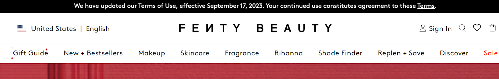
Ensure the logo is linked to the homepage, providing users with a quick way to return to the main page. For instance, you’ll notice that despite the page you’re on the Fenty Beauty website, clicking on the logo returns you to the homepage.
Navigation Menu
Include a streamlined navigation menu in the header that highlights the most important sections of your website. Use clear and descriptive labels (as mentioned earlier) to guide users to key pages such as “Home,” “Products/Services,” “About us,” “Contact,” and “Blog.”
Call-to-Action (CTA) Button
Place a prominent and compelling CTA button in the header to encourage users to take desired actions. Depending on your website’s goals, the CTA could be “Shop now,” “Get started,” or “Sign up for free.”
Make the button visually appealing, use persuasive language, and ensure it stands out from the rest of the content to attract user attention, as shown in the Markettailor example above.
Search Bar
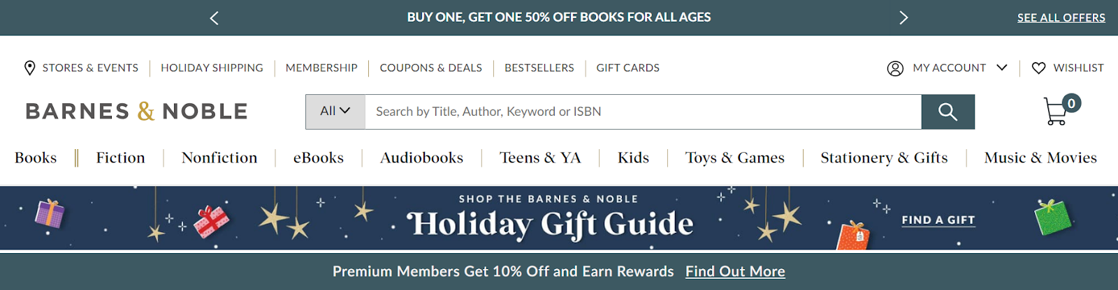
Incorporating a search box in the header allows users to perform quick searches for specific products, articles, or information. An efficient search function enhances user satisfaction and helps visitors easily find what they are looking for, especially if your website has a lot of content, like Barnes and Noble.
Additionally, if you have ongoing promotions, special offers, or important announcements, feature them briefly in the header space, as shown above.
However, keep the information concise, visually appealing, and easy to navigate. A cluttered or overwhelming header can have the opposite effect, driving users away, which will hurt your conversion rates.
In closing
Website navigation hugely affects user experience and conversions. Therefore, by adhering to our website navigation best practices, you can create a seamless journey for your web visitors. This will then ultimately drive higher conversion rates.
Use clear and concise labels, employ drop-down menus, prioritize mobile-friendly navigation, and reserve header space for core content. Implement these and more website navigation best practices today and see your web conversion rates grow to new heights. Best of luck!
Seriously, one of the best software tech experiences I've ever had!
After 16 years of buying WordPress themes and plugins, I know exactly what bad support looks like and Wbcom Designs is the polar opposite. My setup was a nightmare: multiple tools, deep integrations, custom configurations that required…
Duston McGroarty·US·
Great service, great plugins
I was using an excellent plugin created by Wbcom Designs and had both an error and discovered a slight bug in one aspect of the plugin. After creating a support ticket I got a super-quick response and discovered the error was on my part…
Edward Bonthrone·US·
Excellent Theme, Powerful Plugins and Outstanding Support
I am using the REIGN theme and several plugins from Wbcom Designs on my website. The theme is beautifully designed, and the plugins are user-friendly. Everything works smoothly, and the features are perfect for building professional…
S W Malcolm·US·
The best development team ever
It has been a very pleasurable experience working with Wbcom Designs. Anmybia Siddiqui has been a stellar leader of the dev team. Her communications are very professional and productive. Anmybia and her team have completed every task we…
Real America's Voice News·US·
Top notch support
Top notch support. I have been frustrated generally by the slow support for most themes and plugins, but they are helpful and quick to reply. Highly recommend.
Woods·DE·
I was impressed
I have worked with many WordPress plugins over the past 14 years part time. I have learned that if the support is not prompt and effective it is a sign to move on. Tonight, Wbcom has impressed me and I will be hiring them for some more…
Steve Valencia·US·
Perfect plugins for community sites
I wanted to build a community website and these guys created the perfect plugins for me. To be honest, I want to buy every single one of their plugins. If I had more money I would.
Sora Seaton·US·
Excellent Plugins and Outstanding Support
We use BuddyPress with several free BP plugins from Wbcom Designs, and we are extremely satisfied. The plugins add real value for our community, are updated regularly, and are continuously improved. They integrate seamlessly with their…
Peter Gibson·DE·
Great and very supportive
This company have been great and very supportive. I highly recommend them.
Steve s·GB·
Excellent template and first-class support
The template from Wbcom Designs is truly great, modern, flexible, and easy to use. The support is very helpful and friendly. For questions or problems you receive fast, competent assistance and feel well taken care of. Highly recommended.