Conversion rates can be increased in a variety of ways. Utilizing principles of color psychology is one such method. Studies and observations have shown that the colors used on websites account for over 90% of user judgments. Their early impressions are enough to convince them to stay.
Table of Contents
ToggleWhat is color psychology, and how does it affect your website?
Color psychology refers to the practice of using a variety of color palettes to persuade consumers to make a purchase. It doesn’t matter what kind of goods or services you’re offering online; you may always benefit from employing a variety of colors.
However, not every hue may be used for every service or product. It’s not necessarily true that a color that works well for one company will also work well for another. You can’t generalize about the effects of colors without knowing the sector or business you’re promoting.
In addition, websites that make creative use of and maximize a wide range of color schemes appeal to a wide variety of visitors. The proper color palette must influence and inspire clients to take action and convert successfully.
Here are some guidelines for using color effectively on a website:
How to Choose Website Colors

1. Know How Colors affect emotions
Get acquainted with the website color schemes and their impact on customers and potential purchasers to make the most of color psychology. Colors affect different individuals based on their age, gender, and cultural background, but it’s still important to pick the proper palette for your website.
Also Read: How to use CSS Level 4 Selectors?
2. Consider Gender-Color Psychology
While several websites are designed for either men or women, most of the web’s content is appropriate for anyone. The correct use of color in the website design affects users of either sex, thanks to the psychology of color.
According to the data, males lean toward the color blue while females lean toward the colors purple and blue (and away from orange and brown).
Also Read: How Colors Affect Conversion Rate Of Your Website
3. Target Demographic- Color Psychology
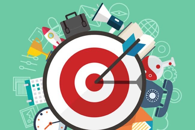
When designing a website, the optimal colors to choose depend on the demographics and preferences of your intended audience. If you can identify your target audience, you will have a far better chance of persuading them to make a purchase. Coloring your website to appeal to a specific demographic will increase conversions. In exploring the impact of color psychology on website conversion rates, considering insights gained from an online psychology degree can provide valuable perspectives on how different hues influence user behavior and decision-making processes.
4. Pick a brand-appropriate background color
Not every company, brand, or service can benefit from using every hue. It’s essential to pick a color scheme that communicates well with the target audience and reflects the brand being marketed. Either zero in on one hue to sway your target audience or choose a color scheme that serves your needs and takes advantage of the website’s aesthetic. The color scheme you use for your website’s background will go a long way toward making visitors feel at ease.
Also Read: 5 Must-Have Website Elements
Primary Colors and Their Psychological Effects on Humans
1. Red-Color Psychology
Red is the color most commonly associated with seriousness. The red catches the eye and encourages the user to take the next step in the interaction. The color red triggers feelings of loss of connection.
In terms of making a sale, this hue is ideal. When something is presented in red, the observer is compelled to pay closer attention to it. Since the color red is so striking, it is often used in advertisements for discounted items. A high stimulation level can be found in the hue red, which has the longest wavelength of any color. As a result, businesses frequently employ the color red in their marketing and advertising efforts.
The color red is also associated with ardent, consuming love. Red roses and heart-shaped chocolates are the foundation of the Valentine’s Day economy. Unfortunately, red is also associated with rage, violence, and envy. Typically, crimson indicates terrible news.
2. Blue
The color blue is associated with trust and dependability. For some reason, the color blue makes people feel safe. As a result, designers can use blue to build an emotional connection with their audience. Companies aim to create a sense of safety and trust in their customers to become loyal patrons. Several popular social networking platforms, like Facebook, have soothing blue color schemes. Because of its calming effect, blue is often used to convey a sense of reliability and safety. Dell, HP, and Intel, three industry titans, have blue logos and a devoted following among computer users.
There are several cultures in which the color blue is associated with melancholy rather than joy. Its origins could be found in Greek mythology. In some cultures, the color blue represents mourning. Hence it is commonly used for obituaries. Some shades of blue, including “soft blue,” are calming to look at.
3. White-Color Psychology
The color white is a symbol of purity and honesty. Many nations’ flags have the color white to symbolize these principles. White is a well-recognized symbol of cleanliness and purity, making it ideal for the healthcare sector. This is the hue worn by saints and nuns to signify their devotion to a life of chastity. Moreover, white symbolizes a blank slate, a simple beginning, and the birth of anything new.
All writing surfaces, from notebook paper to computer screens, are white. The usage of white on the websites of many media outlets, including newspapers and news networks, is intended to convey trustworthiness. White color schemes give a sense of reliability and respect, attracting more visitors.
4. Black-Color Psychology
Black is the hue of mourning, the night, and the grave. It is linked to the European custom of donning all-black attire upon attending a funeral. The color black has literary connotations of mystery and the unfathomable. However, in modern times, black has become synonymous with sophistication, power, and perfection. The color black is associated with passion and seduction.
Advertising for high-end products typically features a predominantly black color scheme. The usage of black can impart an individual air of sophistication. This tool can be used to establish a curated collection of goods, attracting a discerning clientele. Black’s ability to complement other bright colors makes it a versatile tool for crafting a classic and cutting-edge look.
5. Yellow
The sunny hue of yellow evokes positive thoughts and dispositions. The color yellow symbolizes optimism. Many people claim to feel better when exposed to bright colors. Palettes featuring yellow can evoke a joyful and otherworldly mood in the viewer. For this reason, websites in the travel industry often choose a yellow color scheme. Websites geared toward parents often utilize a warm, optimistic yellow color scheme.
To convey friendliness and optimism to the spectator, the color yellow should be used. Sites designed using a yellow color scheme appear welcoming and warm. It is not recommended to use a darker shade of yellow. However, it can be used if necessary. Because of yellow’s subdued intensity, it’s appropriate for use in more conservative settings, such as business software.
Also read: Do You Think You Understand Your Customers’ Psychology?
6. Green- Color Psychology
The color green represents the vitality and growth of the Earth’s ecosystems. Forests, untamed places, and health all have a green connotation. Websites dedicated to environmental causes tend to utilize a green color scheme. Additionally, green color schemes can be found on farming equipment and online stores providing agricultural goods. Like the color blue, green has a calming impact on people, and designers often use it to this end.
As a cheerful color, green strengthens one’s willpower. The color green has the power to make people feel joyful, accomplished, and satisfied. Companies selling sporting goods, pharmaceuticals, or agricultural products can all benefit from using green as a secondary color on their websites.
Also Read: CSS Live Editor WordPress Plugins
Conclusion of Color Psychology
There’s more to using color psychology than merely being incredibly creative to grab people’s attention. Marketers and web designers utilize it on purpose to boost sales and conversions.
Intersting Reads:
Top Five Banner snack (Now Creatopy) Alternatives

