5 min read
5 Must-Have Website Elements
What exactly do you need to do business in the modern world? The answer is simple: a well-designed website. Companies such as IBM, Nike, and Coca-Cola have directed their attention to design, and it’s a good thing they did. Design-led businesses succeed in maintaining a competitive advantage by focusing on their most important asset - the website. The reason why web design matters is that it affects the way the audience sees the brand. Incorporating key website elements can significantly enhance this perception.
The website should produce a good first impression. If it’s not attractive or if the user experience happens to be confusing, Internet users won’t take enough time to learn about your product, even if it’s extraordinary. Given that a well-designed website can make or break your brand image, make sure these essential website elements are present:
1. User-Friendly Website Navigation
Navigation can be simple or complex. This means that you can have a couple of main pages or a multi-tier architecture. Easy navigation is by far the most useful website feature. Visitors or potential customers know where they are, where they have been, and, most importantly, where they are going. The easier the navigation experience is, the more time they will spend on the website. An easily navigable site empowers users to discover information and take action.
The question now is: How do you make sure that people have an easy and smooth experience? Navigation on an online
platform can be achieved with the use of a website navigation menu or website navigation bar. A menu is a collection of links to the important pages of the site. The menu is usually placed in the site navigation area. Generally speaking, visitors expect to find horizontal menus at the top of the website and vertical menus down to the left side.
If you go for something else, you risk getting users confused.
2. A FAQ Page- Website Elements
A FAQ page isn’t essential to your success. Or is it? The truth is that it’s one of the most valuable and powerful parts of the website, helping those who land on your site find solutions to their problems. The list contains answers to common questions people have asked about a certain product or service. So, visitors or potential customers don’t have to go from one page to the other to find the information they need. And they don’t need to pick up the phone to call you.
When it comes to FAQ page design, you might want to keep in mind these tips:
- Answer people’s dilemmas from the very beginning.
- Ensure every FAQ page you have is accurate. It must showcase expertise, trust, and authority.
- Find customer questions through feedback forms, inquiries, social channels, etc.
- Make sure visitors have access to a search bar.
- Use fun colours, and themes, and include a touch of humour.
Undoubtedly, the FAQ page isn’t the most exciting part of your online platform, but it’s necessary as it’s a go-to destination for someone who goes to your website.
Also Read: Utilizing Online Community for Acquiring Customers
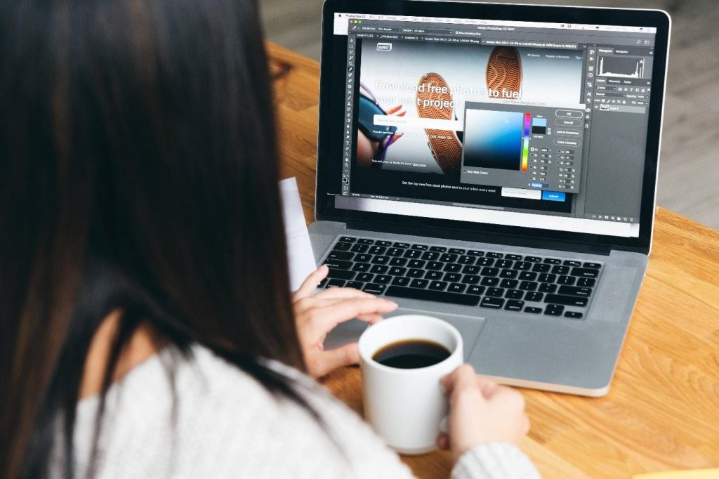
3. Bold Colors- Website Elements
In the old days, no one would resort to using bold colours on websites. This practice was regarded as immature or unprofessional. Now, we know otherwise. Bold colours are a good thing. Companies offering modern website design services don’t hesitate to use colours to provoke emotions in visitors. Whether it’s created by a professional website design company or an individual, the right colour scheme is essential in terms of having a high-quality site. Colours can evoke feelings of optimism, energy, authority, and so on. It all depends on various factors such as combinations, shades, context, vibrancy, etc.
Red
The human mind has a funny way of reacting to the colour red. Red is described by website users as warm, intense, and vibrant. Bright red is able to grab the attention, which is why it’s mostly used for call-to-actions. If you’re a fan of minimalism, combine red with black or white.
Yellow
Website designers use yellow right above the site to create a lively experience for those who end up there. If it’s used in the right way, the colour yellow can give the site a lot of personality. Don’t forget that yellow is the choice of renowned brands such as McDonald’s and Lipton Tea.
Orange
Similar to red, orange adds a little bit of excitement without severity. It represents fascination, enthusiasm, and determination. The colour orange isn’t challenging to work with. It’s an accent colour, so use it in combination with more toned-down shades like green, blue, and purple.
4. Informational Footer
The footer, which is located at the bottom of the page, makes it possible for you to connect with the audience without getting into the way of the design.
It should include valuable information such as a disclaimer, and copyright notice, not to mention a couple of links to relevant sources. The information should appear at the bottom of every webpage - in other words, there should be consistency. It’s okay if the text is smaller as compared to the size used for the main body, yet don’t go too small. It will make reading too difficult. What’s more, the icons and images should be of a readable size.
5. Web Fonts- Website Elements
Computers are equipped with standard fonts, which are locally installed. Examples include but aren’t limited to Times New Roman, Arial, and Baskerville Old Face. If a website is accessed using that device, the computer recognizes the font and displays it as such. There are literally thousands of typefaces available. If you’re sick and tired of Arial, choose something different. You can’t complain because there are enough options to choose from. If you select Verdana, Palatino or Impact, you can’t go wrong.
The typeface that you choose has a considerable impact on several aspects of the site, including mood, readability, perceived content length, and, most importantly, user experience. Various web fonts help make the difference between various messages. However, you want a strong brand identity, which is why it’s necessary to use the same typography across the pages of your website. Just make sure it doesn’t look like all the others.
Related Articles You Would Like to Read:
How To Output A List Of All Companies That Have Submitted Jobs
15 Things To Consider While Choosing A Perfect WordPress Theme
Related reading