7 min read
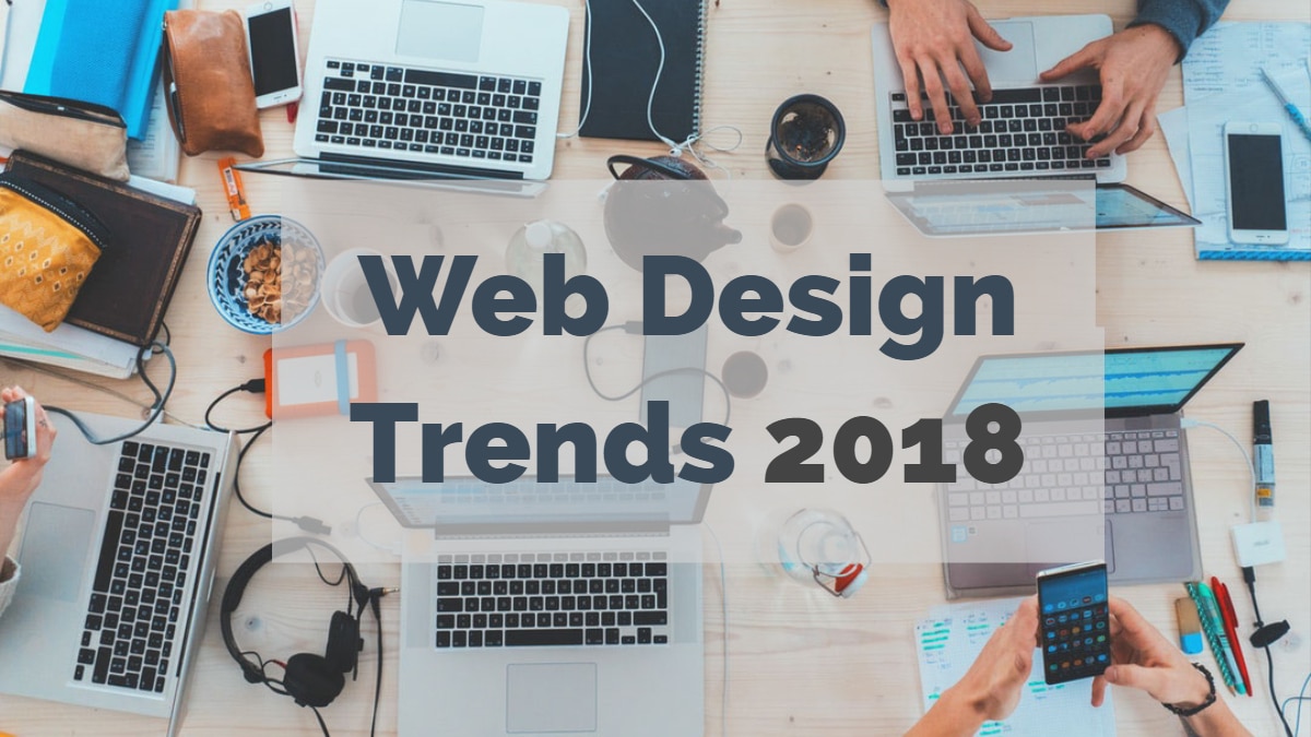
Web Design Trends For 2026
Web design is never static. Every year brings new technologies, shifting user expectations, and evolving aesthetic sensibilities that reshape how websites look and function. For WordPress site owners, staying current with web design trends is not just about appearances; it directly affects user engagement, conversion rates, accessibility, and search engine rankings. A site that looked cutting-edge two years ago can feel dated today if it ignores the direction the industry is heading.
In this article, we explore the most significant web design trends for 2026, explain why each one matters, and offer practical guidance on how to implement them on your WordPress site. Whether you are launching a new project or refreshing an existing one, these trends will help you create a website with strong design fundamentals that resonates with modern audiences.
1. AI-Driven Personalization
Artificial intelligence has moved beyond chatbots and product recommendations into the design layer itself. In 2026, leading websites dynamically adjust layouts, color schemes, content blocks, and calls to action based on individual user behavior, location, device, and even time of day. For WordPress sites, plugins and SaaS integrations now make it possible to serve personalized homepage experiences without writing a single line of code.
The business case is straightforward: personalized experiences increase time on site, reduce bounce rates, and lift conversion rates. Even simple personalization, such as showing different hero sections to returning visitors versus first-time visitors, can have a measurable impact.
2. Micro-Interactions and Purposeful Animation
Animation in web design has matured. The trend in 2026 is not flashy, attention-grabbing motion for its own sake but subtle micro-interactions that serve a functional purpose. A button that gently pulses when it becomes actionable. A progress indicator that smoothly tracks your scroll position. A form field that provides instant visual feedback when input is valid. These small animations reduce cognitive load, guide user attention, and make interfaces feel responsive and alive.
WordPress theme developers are increasingly building micro-interaction support into their frameworks, and lightweight JavaScript libraries make it possible to add these effects without bloating page load times. The key principle is restraint: every animation should serve the user, not distract them.
3. Bold and Expressive Typography
Typography continues its rise as a primary design element rather than a secondary one. In 2026, designers are using oversized headings, variable fonts that adjust weight and width fluidly, and mixed typeface combinations that create visual hierarchy through type alone. The availability of high-quality web fonts through Google Fonts and Adobe Fonts has made expressive typography accessible to everyone, including WordPress site owners on tight budgets.
Beyond aesthetics, strong typography improves readability and accessibility. Variable fonts, in particular, allow a single font file to cover multiple weights and widths, reducing HTTP requests and improving load performance. When choosing typography for your WordPress theme, prioritize legibility on all screen sizes and ensure sufficient contrast ratios for accessibility compliance.
4. Dark Mode and Dual-Theme Design
Dark mode is no longer a novelty; it is an expectation. Most operating systems and browsers now support dark mode preferences, and users increasingly judge websites that do not respect their system settings. In 2026, the best WordPress themes ship with built-in dark and light mode toggles, and CSS custom properties make it relatively simple to implement dual themes even on custom designs.
Dark mode reduces eye strain in low-light environments, saves battery on OLED screens, and gives your site a modern, sophisticated feel. The design challenge is ensuring that your color palette, imagery, and interactive elements look good in both modes. Test thoroughly across devices before shipping.
5. Mobile-First Is Now Mobile-Only for Many Users
Responsive design is table stakes. What has changed in 2026 is the recognition that for many audiences, especially in emerging markets and younger demographics, mobile is not just the primary device; it is the only device. This mindset shift means designing for mobile first is no longer optional; it is the starting point of every design decision.
For WordPress sites, this translates to prioritizing touch targets, minimizing horizontal scrolling, using collapsible content sections, and testing on real devices rather than just resizing a browser window. Performance on mobile networks is equally critical, and tools like Google PageSpeed Insights provide actionable guidance for improving mobile load times. A growing online business cannot afford to alienate mobile users with a desktop-first mindset.
6. Bento Grid Layouts
Inspired by the compartmentalized structure of Japanese bento boxes, bento grid layouts have become one of the defining visual trends of 2026. These layouts use a grid of varied-size rectangular modules to present different types of content, features, statistics, or imagery in a single view. Apple popularized this approach in its product pages, and it has since spread across SaaS, portfolio, and publishing sites.
Bento grids work especially well for feature showcases, service overviews, and dashboard-style landing pages. On WordPress, block-based editors and grid layout plugins make it straightforward to create bento-style sections without custom development. The visual variety keeps users scanning and engaged, while the grid structure maintains order and alignment.
7. Immersive Scrolling Experiences
Scroll-triggered animations and parallax effects are not new, but 2026 brings a more refined approach. Instead of entire pages driven by parallax, designers are using scroll-linked animations for specific storytelling moments: a product rotating as the user scrolls, data visualizations building progressively, or background colors transitioning between sections to signal narrative shifts.
The critical balance is performance. Heavy scroll effects can destroy page speed and frustrate users on lower-powered devices. Use the Intersection Observer API for efficient scroll detection, lazy-load animation assets, and always provide a static fallback for users who have reduced-motion preferences enabled in their operating system settings.
8. Accessible and Inclusive Design
Accessibility is no longer a checkbox; it is a core design philosophy. In 2026, legal requirements around web accessibility are tightening globally, and search engines increasingly reward sites that meet WCAG standards. Accessible design means proper heading hierarchies, sufficient color contrast, keyboard navigation support, screen reader compatibility, meaningful alt text, and visible focus indicators.
For WordPress site owners, accessibility starts with theme selection. Choose themes that are accessibility-ready, and test with tools like WAVE and axe DevTools. Beyond compliance, inclusive design broadens your audience and improves the experience for all users, including those on slow connections, small screens, or assistive devices. Accessibility and good design are the same thing when done right.
9. Minimalism with Personality
The pendulum has swung away from the ultra-minimal, borderline sterile aesthetic that dominated the late 2010s. In 2026, minimalism persists but with added warmth and personality. Sites use generous whitespace and clean layouts but inject character through hand-drawn illustrations, custom cursor effects, playful hover states, and conversational copy. The goal is to feel approachable and human, not clinical.
For WordPress sites, this means selecting a minimal theme and then layering in brand-specific touches through custom CSS, illustration assets, and thoughtful copywriting. The result is a site that is easy to navigate and delightful to explore, a combination that keeps bounce rates low and return visits high.
10. Floating and Sticky Navigation
Navigation patterns continue to evolve. Floating navigation bars that detach from the top of the page, shrink on scroll, and follow the user down the page have become standard practice. In 2026, designers are refining this pattern with context-aware navigation that changes based on which section the user is viewing, showing relevant CTAs or section links dynamically.
Sticky navigation improves usability by keeping key actions within reach at all times. For long-form WordPress content, combining a sticky header with an in-article table of contents gives readers both global and local navigation, reducing the effort required to find what they need. If your site relies on modern web design techniques, smart navigation is a must.
How to Implement These Trends on WordPress
You do not need to adopt every trend at once. Start by assessing which trends align with your audience and business goals.
- Audit your current site, Identify where your design feels dated or where user engagement drops off.
- Choose a modern theme, Select a block-based, accessibility-ready WordPress theme that supports dark mode and responsive layouts natively.
- Prioritize performance, Every visual enhancement should be weighed against its impact on page speed. Use lazy loading, modern image formats, and a caching plugin.
- Test on real devices, Design decisions that look perfect on a 27-inch monitor may fail on a 5-inch phone. Test across multiple screen sizes and input methods.
- Iterate based on data, Use analytics and heatmaps to measure whether design changes improve engagement before committing to a full rollout.
Final Thoughts
The web design trends for 2026 share a common thread: they put the user first. From AI personalization to accessible design, from purposeful animation to mobile-only thinking, every trend aims to create experiences that are faster, more intuitive, and more meaningful. WordPress site owners who embrace these principles will build sites that not only look contemporary but also perform better in search, convert more visitors, and earn lasting loyalty from their audience.
Related reading