Your brand’s logo design trends do matter a lot. It helps to create an association between your customers and your brand. Logos also have a big role to play in creating brand awareness. The color and shape of your logo can boost the recognition of your brand to a great extent. However, just having a logo for your brand is not sufficient.
Table of Contents
ToggleLogo Design Trends
A good logo with a proper brand message will increase the popularity of your brand.
So, here are a few interesting logo design trends for you that you might choose for your brand:
1. Minimalistic Approach:

Previously, logos mainly consisted of large and flashy images. They also had elaborate decorations on them. However, over the years, the logo trend has changed considerably. Today, most logos follow a minimalist approach. They are elegant, sophisticated, yet very professional. These days, most brands are opting for simple logos and only have the necessary details printed on them.
The basic concept of the logo is to include only the information which is necessary for effectively presenting your brand. This technique is quite difficult for all old-school designers as they are accustomed to designing big and flashy logos. You need to know how to bring the best out of a simple logo. Only then will your customers be able to connect with your brand. Your logo can be your brand name typed in simple fonts on a monochrome background. This will create an excellent impact on the viewers’ minds, and your customers will also feel attached to your brand. Sometimes, you may feel that this type of logo is too simple, but this is not the case. Simple logos are far more attractive as compared to elaborate ones.
2. Gradients:
If you are going for a minimalistic logo, you must be very careful about incorporating the right colors in your logo. Most people are confused regarding how to make their color eye-catching while maintaining a minimalist vibe. Well, the answer to your problem is gradients. Try using gradients in your logos. These days, many famous brands use gradient colors in their logos; the most popular of them is Instagram.
The previous Instagram logo only had rainbow stripes on it. However, the new design is a lot more attractive. The Redmi logo also has gradients on a purple spectrum. This makes the logo extremely attractive and also creates a sense of royalty. These types of logos are perfect to represent your brand. While using gradients, there are a few things that must be kept in mind. Do not go over the top. It is always advisable to use two or three colors in your gradient. Too many colors may appear flashy. The design should always be clean and sleek, and it should represent your brand perfectly.
3. Geometric shapes:
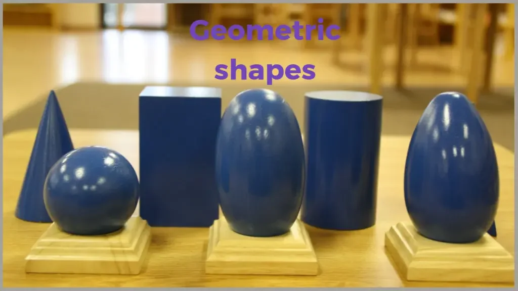
Geometric elements have always been an evergreen trend in logo designs. People have been incorporating geometrical trends in their logos since forever. This is mainly because geometric elements make your logos vibrant and elegant. Such geometric elements can also be highly symbolic yet quite minimalist. Another strong reason for using geometric shapes is that human beings have always responded strongly to geometric shapes. Their eyes feel comforted by looking at such shapes and straight lines. This makes geometric elements perfect for designing a logo for your brand.
A tremendous example of a logo where geometric shapes have been used effectively is the Mitsubishi logo. It has a bright red color on it. This appears to be extremely attractive to human eyes. Logo designers have also started using geometric shapes in one of the letters of the brand’s name. This will make the brand name look more sophisticated and stylish. While using geometric shapes, you must make sure that the element you are using for your logos is completely original. Otherwise, your logo may appear to be a copy of some previously-created logos.
4. Emblems:
Emblems have been in trend for hundreds of years now, and their charisma never seems to end. Monarchies and empires have used emblems for thousands of years. This is exactly why we are absolutely obsessed with logos that resemble emblems. Over the last few years, brands are using as emblems for their logos. These emblems create a feeling of exclusiveness and royalty. If your brand is about high-end products, then the best option for you is to go for an emblem-like logo. Your logo will highly attract your customers, and your business will become successful in no time. So, if you want your logo to make a difference, you must definitely go for an emblem.
5. 80s Style Logos:

Few trends never disappear. They always make it a point to come back after a certain interval of time. Such is the case for 80s style logos. These logos have always had an amazing effect on people. This is mainly because they create a feeling of nostalgia in our minds. They also remind us how things have changed over the years. 80s style logos were previously only restricted to the gaming industry. However, today these logos are not just restricted to the gaming industry. Various other brands are using them to create a unique vibe in the minds of the users.
Wrapping Up
And these were some of the best logo trends of 2020. Choose your logo design depending on your brand and give your brand a perfect identity. Also, remember that your logo has a huge role to play in giving your business a huge success in the long run.
Interesting Reads:
Top WordPress Payment Gateway Plugins For Easy Digital Downloads

