13 min read
The Best Data Visualization Tools 2026

The importance of data visualisation has surged in recent years as organisations increasingly rely on visual representations of data to enhance decision-making processes. By transforming complex datasets into accessible graphics, businesses can quickly identify trends, patterns, and insights that drive strategic initiatives. This shift toward data-driven decision-making is reflected in the projected growth of the data visualisation market. We’ve listed the top data visualisation tools for you in this blog.
According to industry forecasts, the global data visualisation market is expected to grow from $8.85 billion in 2019 to $19.20 billion by 2027, representing a compound annual growth rate (CAGR) of 10.2% during this period. This growth is driven by the increasing demand for analytics tools and the integration of visual data representation across various sectors, including finance, healthcare, and retail. As companies continue to leverage the power of data, the role of data visualisation in facilitating effective communication and insight generation will become increasingly critical.

Why Data Visualisation Matters in Business
- Enhancing Data Comprehension: Data visualisation plays a crucial role in enhancing data comprehension within a business context. Raw data can be overwhelming and difficult to interpret, especially when dealing with large datasets. Visualisation tools transform this data into visual formats like charts, graphs, and maps, making it easier to identify patterns, trends, and outliers. By presenting data visually, complex information becomes more accessible and understandable, allowing stakeholders at all levels of the organisation to grasp insights quickly and effectively.
- Facilitating Data-Driven Decision-Making: In today’s competitive business environment, data-driven decision-making is essential. Data visualisation tools provide the ability to analyse data in real time, enabling businesses to make informed decisions based on the latest available information. Visual representations of data highlight key metrics and performance indicators, making it easier to compare different variables and evaluate the outcomes of various strategies. This facilitates quicker, more accurate decisions that can lead to improved operational efficiency, better customer experiences, and increased profitability.
- Improving Communication and Storytelling: Effective communication and storytelling are vital for conveying the significance of data insights to diverse audiences. Data visualisation tools help in creating compelling narratives by turning data into visually engaging stories. These visualisations can be shared across teams, departments, and even with external stakeholders, ensuring everyone has a clear understanding of the data and its implications. By improving the way data is communicated, businesses can foster a data-driven culture where insights are readily shared, discussed, and acted upon, leading to more cohesive and strategic business operations.
Top Data Visualisation Tools
1. Tableau
Tableau is a powerful data visualisation tool known for its intuitive drag-and-drop interface and comprehensive suite of interactive charts, graphs, and maps. It allows users to connect to various data sources such as Excel, SQL databases, and cloud-based databases, making it versatile for different data environments. Tableau excels in real-time data analysis and collaboration, enabling teams to work together on data projects seamlessly. Its advanced analytics features, including integration with R and Python, allow for complex data analysis and predictive modelling. Tableau’s robust community support and extensive training resources further enhance its usability, making it a preferred choice for businesses looking to harness data for decision-making and reporting.
Pros
- Enhanced Data Visualisation: Tableau excels at creating visually appealing, interactive charts, graphs, and dashboards, with extensive customisation options to present data effectively.
- User-Friendly Interface: Tableau features an intuitive drag-and-drop interface that simplifies the creation of visualizations, making it accessible even for users with limited technical skills
Cons
- High Cost: Tableau’s pricing, especially for enterprise-level licenses, can be expensive, which might be prohibitive for small businesses or individuals
- Steep Learning Curve: While user-friendly, mastering Tableau’s advanced features and building complex visualisations can require significant time and effort
2. Power BI
Power BI is a business analytics service by Microsoft that provides interactive visualisations and business intelligence capabilities with an interface simple enough for end users to create their reports and dashboards. It integrates seamlessly with other Microsoft products like Azure, SQL Server, and Excel, making it an excellent choice for organisations already using the Microsoft ecosystem. Power BI offers powerful data modelling and transformation capabilities, AI-powered insights, and real-time data streaming, enabling comprehensive data analysis. Its collaboration features, such as integration with Microsoft Teams and SharePoint, facilitate easy sharing and collaborative data exploration within teams.
Pros
- Affordable Pricing: Cost-effective with a free basic version and reasonably priced Pro and Premium plans.
- Microsoft Integration: Seamlessly integrates with Microsoft products like Excel and Office 365.
Cons
- Limited Advanced Analytics: Less robust for in-depth statistical analyses compared to some specialised tools.
- Performance Issues: Can slow down with very large datasets.
3. Google Data Studio
Google Data Studio is a free, cloud-based data visualisation tool that integrates seamlessly with other Google products, such as Google Analytics, Google Sheets, and BigQuery. It enables users to create interactive, shareable reports and dashboards. With its user-friendly interface, customizable templates, and real-time collaboration features, Google Data Studio is accessible to users of all technical skill levels. Although it offers fewer advanced features than paid solutions, its ease of use and seamless integration with Google services make it a popular choice for small- to medium-sized businesses and marketing professionals.
Pros
- Free to Use: Google Data Studio offers a comprehensive suite of features at no cost.
- Seamless Integration: Works well with Google products like Google Analytics and Google Sheets, as well as other data sources.
Cons
- Limited Advanced Features: May not have all the advanced analytics and customisation options available in premium tools.
- Performance Issues: Can slow down with very large or complex datasets.
Also Read: What is WordPress Market Share?
4. D3.js
D3.js (Data-Driven Documents) is a JavaScript library for producing dynamic, interactive data visualisations in web browsers. It provides a framework for manipulating documents based on data, allowing developers to bind arbitrary data to a Document Object Model (DOM) and apply data-driven transformations to the document. D3.js is highly customizable and flexible, supporting a wide range of chart types and visualisations. It is well-suited for developers who need to create custom, complex data visualisations that are highly interactive and responsive. As an open-source library with a large community, D3.js offers extensive support and resources for developers looking to leverage its capabilities.
Pros
- Highly Customizable: Offers extensive control over the appearance and behaviour of visualisations, allowing for highly customised and interactive graphics.
- Powerful Data Binding: Efficiently binds data to DOM elements, enabling dynamic and responsive visualisations based on data updates.
Cons
- Steep Learning Curve: Requires a solid understanding of JavaScript and SVG, which can be challenging for beginners.
- Complexity: Building complex visualisations can be time-consuming and requires more development effort compared to some other libraries or tools.
5. Looker
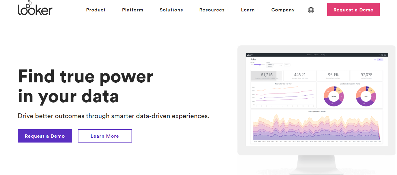
Looker is a modern data platform that provides powerful data modelling and analytics capabilities. It enables organisations to explore, analyse, and share real-time business insights across teams. Looker connects directly to databases, offering a consistent and accurate view of data. Its unique LookML modelling language allows for custom data models that can scale across an organisation. Looker also supports embedded analytics, allowing users to integrate Looker-powered data visualisations into other applications. Its collaboration features, such as shared dashboards and real-time data updates, make it an excellent choice for enterprises looking to leverage data for strategic decision-making.
Pros
- Robust Data Exploration: Provides powerful data exploration and visualisation capabilities with a user-friendly interface.
- Customizable Dashboards: Allows for the creation of highly customizable dashboards and reports that can be tailored to specific business needs.
Cons
- High Cost: Can be expensive, especially for larger enterprises or organisations with extensive data needs.
- Complex Setup: May have a complex setup process and require significant configuration to fully leverage its features.
6. QlikView

QlikView is a data discovery and visualisation tool that offers in-memory data processing, which allows for rapid data analysis and real-time insights. Its associative data model enables users to explore data freely, discovering hidden insights and making connections across various data sources. QlikView provides a comprehensive library of visualisation options, customizable dashboards, and robust data integration capabilities. It is particularly well-suited for organisations that need to handle large datasets and require powerful, interactive data visualisations for complex analysis. Despite its steep learning curve and higher cost, QlikView’s powerful features make it a valuable tool for advanced data analysis and business intelligence.
Pros
- In-Memory Data Processing: Utilises in-memory technology for fast data retrieval and processing, enhancing performance and responsiveness.
- Associative Data Model: Allows users to explore data freely with a unique associative model that helps uncover insights from multiple data sources.
Cons
- Steep Learning Curve: Can be complex to learn and master, requiring significant time and effort for new users.
- High Cost: Licensing and implementation can be expensive, which might be a barrier for smaller organisations.
7. Chart.js
Chart.js is a simple yet flexible JavaScript library for creating lightweight, responsive, and interactive charts for web applications. It supports eight different chart types, including line, bar, radar, and pie charts, and offers customisation options through JavaScript. Chart.js is easy to integrate and use, making it ideal for developers who need to quickly add basic charts to their web projects. While it may not offer the extensive features of more comprehensive data visualisation tools, its simplicity and ease of use make it a popular choice for creating straightforward, visually appealing charts. As an open-source project, Chart.js benefits from an active community and ongoing updates.
Also Read: Best WordPress CAPTCHA Plugins
8. Dundas BI
Dundas BI is a highly customizable business intelligence (BI) platform known for its interactive reports and dashboards. It caters to a wide range of users, from business analysts to executives, offering robust data exploration and analysis capabilities.
Dundas BI allows users to connect to various data sources, enabling the creation of tailored visualisations that can be shared across teams. Its standout feature is its flexibility, allowing users to build personalised dashboards that cater to specific organisational needs. The platform supports a wide range of visualisation types, including charts, maps, and tables, which enhance users’ analytical capabilities.
Pros
- Flexibility: Dundas BI offers extensive customisation options, allowing users to create dashboards and reports that meet their specific requirements.
- Variety of Data Sources and Charts: The platform supports multiple data sources and provides a rich library of visualisation types, facilitating comprehensive data analysis.
Cons
- No Predictive Analytics: Dundas BI does not include built-in predictive analytics features, which may limit its utility for users seeking forecasting capabilities.
- Lacks 3D Charts: The absence of 3D chart options may be a drawback for users who prefer more visually dynamic representations of data.
9. Zoho Analytics

Zoho, formerly known as Zoho Reports, is a comprehensive business intelligence and online reporting platform designed to help users create dynamic reports and dashboards. It offers a broad range of features to assist organisations in analysing data, uncovering insights, and making data-driven decisions.
Pros
- Easy Report Creation: Zoho Analytics features an intuitive drag-and-drop interface that simplifies the report creation process. Users can select from various chart types, pivot tables, and tabular views to effectively present their data.
- Useful Functionalities: The platform includes advanced analytical methods such as predictive analysis, anomaly detection, and cluster analysis. It also supports seamless collaboration by allowing users to share reports in multiple formats and embed them in blogs or presentations.
Cons
- User Training: Although the interface is user-friendly, some training may be needed for users to fully exploit the platform’s capabilities and create more sophisticated reports.
- Confusing Dashboard with Large Data: With large datasets, the dashboard can become cluttered and confusing, which may make it challenging to quickly identify key insights.
10. Visual.ly
Visually is a platform dedicated to producing high-quality graphics through a creative, team-driven approach. It specialises in crafting visually appealing content that effectively communicates information and engages audiences. Visual.ly emphasises collaboration among creative teams to generate graphics that are both informative and aesthetically pleasing. It is particularly suited for businesses and organisations aiming to enhance their visual communication strategies.
Pros
- Excellent Output Quality: Visual.ly is renowned for its high-quality graphic outputs, ensuring that the final products are visually striking and professionally designed.
- Superb Graphics Production: The platform excels in creating a variety of graphics, including infographics, presentations, and interactive content, making it a valuable asset for marketers and content creators.
Cons
- Few Embedding Options: Visual.ly offers limited options for embedding graphics into other platforms, which may restrict how users can share their content across different channels.
- Limited Scope: While it provides excellent graphic design capabilities, its scope of services may be narrower compared to more comprehensive data visualisation tools that offer extensive analytics and reporting features.
How to Choose the Right Tool for Your Needs
Matching Tools to Specific Requirements and Scenarios
Selecting the right data visualisation tool depends on several factors unique to your needs and circumstances. Here are some common scenarios and the corresponding tools that might be the best fit:
- Business Intelligence and Reporting. For businesses that need robust reporting and comprehensive business intelligence capabilities, tools like Tableau and Power BI are ideal. Tableau excels in creating detailed and interactive dashboards, making it suitable for in-depth data analysis and presentations. Power BI offers strong integration with Microsoft products, making it a great choice for organisations using the Microsoft ecosystem.
- Marketing and Web Analytics Google Data Studio is a perfect fit for marketing professionals and web analysts due to its seamless integration with Google Analytics, Google Ads, and other Google services. Its user-friendly interface and collaborative features allow teams to create and share interactive reports easily.
- Custom and Complex Visualisations For developers and data scientists who need to create highly customised and interactive visualisations, D3.js is the best choice. Its flexibility and ability to handle complex data structures make it suitable for bespoke data visualisation projects.
- Enterprise-Level Data Analysis Looker is designed for enterprise environments where data governance, scalability, and real-time data analysis are critical. Its powerful data modelling capabilities and embedded analytics options make it a strong contender for large organisations.
- Real-Time Data Analysis QlikView is known for its in-memory data processing and associative data model, making it excellent for real-time data analysis and exploration. It’s particularly suited for businesses that deal with large datasets and need rapid insights.
- Simple and Responsive Web-Based Visualisations. For lightweight, responsive charts in web applications, Chart.js is a suitable choice. Its simplicity and ease of integration make it ideal for developers who need basic yet visually appealing charts without the overhead of more complex tools.
Also Read: How to Create Temporary Login for WordPress (No Passwords)
Tips for Testing and Evaluating Tools
When deciding on a data visualisation tool, it’s essential to test and evaluate your options thoroughly. Here are some practical tips to guide you through the process:
- Define Your Requirements: Clearly outline what you need from a data visualisation tool. Consider factors such as the types of data you work with, the complexity of the visualisations you require, and the level of customisation needed. Also, take into account your team’s technical expertise and the available budget.
- Take Advantage of Free Trials and Demos: Most data visualisation tools offer free trials or demo versions. Use these opportunities to test the tool’s features and functionality. During the trial period, try to replicate your typical workflows and see how well the tool meets your needs.
- Evaluate Usability and User Experience: Assess the tool’s interface and ease of use. Consider whether the tool is intuitive and whether your team can quickly learn to use it. Look for features like drag-and-drop interfaces, pre-built templates, and interactive dashboards.
- Test Integration Capabilities: Ensure the tool can seamlessly integrate with your existing data sources and systems. Test the process of importing data from different sources and exporting visualisations for use in reports or presentations.
- Check Performance and Scalability: Evaluate how the tool performs with large datasets and complex queries. Consider whether it can scale as your data grows and whether it maintains performance under heavy usage.
- Explore Customisation and Flexibility: Test the tool’s customisation options. Check if you can easily modify visualisations to match your specific requirements. Look for features like customizable colours, fonts, and layouts, as well as support for advanced analytics and scripting.

Conclusion on Data Visualization Tools
In conclusion, selecting the right data visualisation tool hinges on understanding your specific requirements, including usability, customizability, integration capabilities, cost, and available support. Tools like Tableau and Power BI are excellent for business intelligence and reporting, Google Data Studio suits marketing and web analytics, while D3.js offers unparalleled flexibility for custom visualisations. Looker caters to enterprise-level analysis, QlikView excels in real-time data processing, and Chart.js is ideal for simple web-based visualisations.
By defining your needs, leveraging free trials, and assessing each tool’s features and performance, you can find the best fit for your data visualisation projects. I encourage you to explore and test different tools to discover which one aligns best with your unique requirements, enabling you to transform data into actionable insights effectively.
Interesting Reads:
How to Embed Video in WordPress?
Related reading