
Different industries fit into different website design molds, and eCommerce is no different. If you look at any of the leading eCommerce websites in 2022, you’ll see very similar design trends between them, because the design processes are tested and proven to work.
In this article, we’re going to explore some of the best practices for eCommerce design in 2022, so that you can maximize your conversion rate and get your visitors to the checkout lane flawlessly.
Emphasize the visual hierarchy
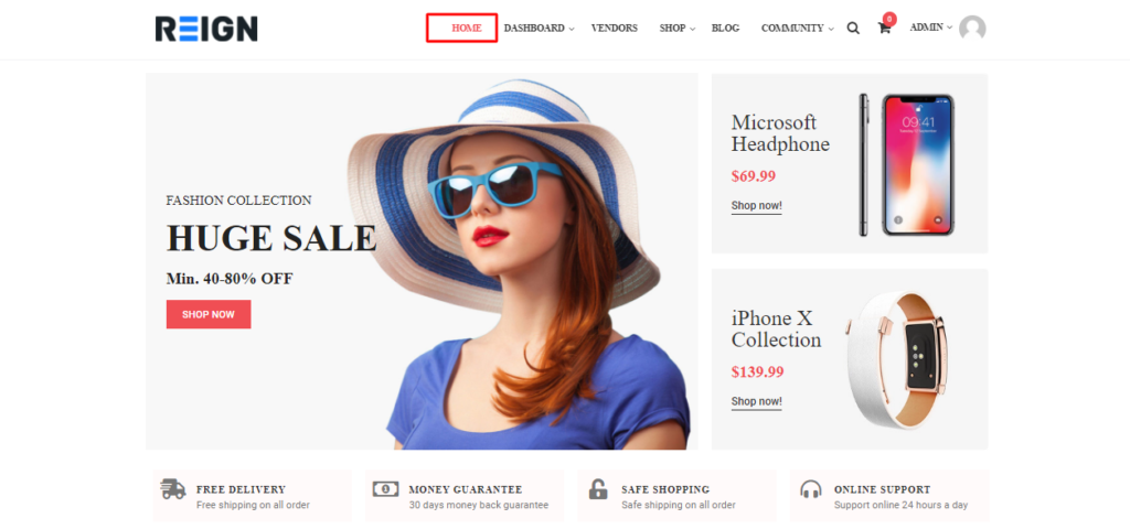
You’ll see a commonly used visual hierarchy on the most popular eCommerce websites, and it’s for a good reason – it works. Page elements will typically follow this hierarchy:
- Logo and company name in the header.
- Search bar in the upper right.
- Navigation menu and contacts.
- A hero image or slider.
- The main content area.
- Footer
People’s eyes generally travel in the F and Z reading patterns when looking at a website, and you can use this to your advantage to visually funnel visitors towards your conversion points.
User experience design is a fundamental part of the web design process for an eCommerce site, and users are more quickly converted into customers when they can easily get from one point to another.
Keep it simple and clutter-free
You don’t need to spring for all-out minimalist design (in fact that’s pretty inadvisable), but an eCommerce website should still be easy to use and browse. Take an objective look at your web design and ask yourself, “What can I remove that won’t negatively impact my pages?”. The more clutter you reduce, the better.
You should keep only the most important elements that serve a purpose. If an element isn’t designed to engage or funnel your visitors, it really doesn’t need to be there. A good eCommerce website has a refined and clean look that favors the products, doesn’t overload visitors with information, and makes navigation a breeze.
Focus on convenient navigation and product filtering
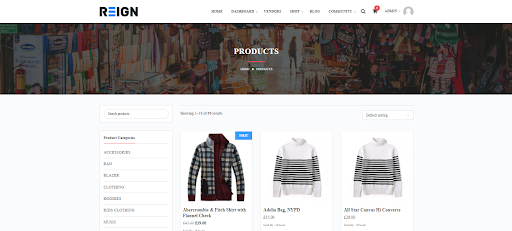
You simply cannot have a successful eCommerce website without focusing on convenient navigation. It’s true you want to funnel visitors, but not in the same way as a physical supermarket that puts the milk and eggs in the back so shoppers have to walk past all the impulse purchase displays.
People do “window shop” online, but generally, they know what they’re looking for. People go to the mall and window shop to pass time – people “window shop” on eCommerce websites to compare prices, but they already know what they’re looking for. That’s why you need to make it as convenient as possible for your visitors to find exactly what they want, so you can funnel them towards the checkout.
A search bar obviously works wonders, but filters also work wonders. For example, if someone searches “baby diapers” on your eCommerce website, you might want to offer these filters to help the customer narrow down their selection:
- Brand of diapers
- Cloth / disposable
- Pants/Pullups, Taped, Insert
- Product rating.
- Diaper sizes.
- Pack size
- Recommended gender
- Recommended age
- Color
- Min – Max price
That might sound like a lot of filters, but it will help your customer find the Huggies Dry Large (8-14kg) – 30pcs x 4 packs (120 pcs) – Diaper Pants in the $25 USD price range.
Another useful element is the ever-present search bar. No matter how far down your website a user scrolls, the search bar should follow them. A visitor should never need to scroll back to the top of a page to use the search bar.
Develop for mobile

You’re going to find different studies that show different statistics regarding the exact percentage of mobile vs desktop shoppers. Some studies say that 79% of smartphone users have made an online purchase, other reports say that eCommerce purchases are 24% higher on desktops.
Who to believe? Well both, actually. If you take anything away from those studies, it’s that you should be focusing on your desktop and mobile design equally.
In many cases, an online shopper will browse your eCommerce website on their mobile device, add items to their cart, and then make the final purchase from their desktop computer. Theories abound, it may have something to do with people believing desktop browsers are more secure than smartphones, but that’s beside the point.
Another reason to focus on mobile design is that Google switched to “mobile first” web crawling some years ago. What this means is that Google’s bots will crawl and index your pages by accessing the mobile version of your website, and will penalize you in search rankings if your mobile design is bad.
Interesting Read:
Plugins to enhance your WordPress Website Design


